| Author | Thread |
Comments Made During the Challenge  |
|
|
08/11/2002 04:59:00 PM |
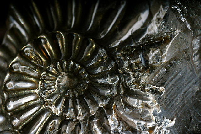
| I love the composition but it looks kinda shiny to be a fossil. It looks more like a casting of a fossil. I really do like it a lot though. |
|
|
|
08/11/2002 10:49:00 AM |
|
|
|
08/11/2002 07:01:00 AM |
|
|
|
08/10/2002 12:13:00 PM |
Something old. Use your photographic technique to emphasize the age of your subject.
Composition - good
Technical Aspects - good
Meets Challenge - yes
Visual Impact / Originality - good, but it takes a while to see what the subject is
|
|
|
|
08/08/2002 10:51:00 PM |
| the clean lines on the left fall into a jumble on the right - a side angle rather than head-on could have alleviated this |
|
|
|
08/08/2002 07:55:00 PM |
| Very nice capture. The top seems dark and out of focus (is that just me?) I really like the rest of this shot! 8 Swash |
|
|
|
08/08/2002 07:14:00 PM |
| i love the texture in this photo... the lighting is excellent :) - jmsetzler |
|
|
|
08/08/2002 04:31:00 PM |
| I like the tight cropping and the sheen to the stone which has come through in the photo. Though I like the way the pattern breaks and we see some straight lines at the right, I think you could lose a tiny bit from the right to improve the composition. |
|
|
|
08/08/2002 06:56:00 AM |
| Great subject and framing. Interesting lighting - well done. |
|
|
|
08/07/2002 12:32:00 AM |
| wow ,looks like metal. Nicely done. |
|
|
|
08/06/2002 08:35:00 PM |
| I like the left side of the picture, I think some cropping would have improved the subject. |
|
|
|
08/06/2002 09:28:00 AM |
| Very nice composition and DOF. |
|
|
|
08/06/2002 06:38:00 AM |
| Like it alot. Looks 'almost' Black & White, the very subtle highlights of colour work well for me. Great framing, lighting etc. Would have been even better had the fossil been slightly more intact on the right side, but to move the whole subject to compensate for this would have thrown out the whole composition. Well done - lamedos |
|
|
|
08/05/2002 07:33:00 PM |
| You have good focus on the subject. The title and the picture don't seem to support each other as the picture does not show just what you shot. Autool |
|
|
|
08/05/2002 12:02:00 PM |
| cool idea, but i think you have to work a little more with your lighting. the top is too dark and overall, there's too much contrast (light vs dark) in my opinion. i bet the gold doesn't help though, tough to photograph. -- gr8photos (4) |
|
|
|
08/05/2002 10:06:00 AM |
|
|
|
08/05/2002 02:09:00 AM |
| Detail and shadowing is nice. |
|
|
|
08/05/2002 12:48:00 AM |
| I repeatedly throughout the week kept asking myself, "What is old AND shows its age AND yet is graceful to view. I came up blank. You didn't. Congrats. Maybe a few more moments considering composition & lighting would have pushed this one to the top. |
|
Home -
Challenges -
Community -
League -
Photos -
Cameras -
Lenses -
Learn -
Help -
Terms of Use -
Privacy -
Top ^
DPChallenge, and website content and design, Copyright © 2001-2025 Challenging Technologies, LLC.
All digital photo copyrights belong to the photographers and may not be used without permission.
Current Server Time: 03/12/2025 11:06:36 PM EDT.