| Author | Thread |
Comments Made During the Challenge  |
|
|
10/31/2006 09:24:12 PM |
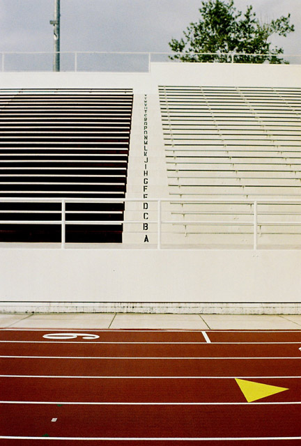
| I love the ascending alphabet. It's like a George Lucus film credit disappearing into the distance. But, what really makes this photo for me are the shadows in the seats on the left. I don't know how you got that effect, but it's genious. Should be one of the top 10. 8 |
|
|
|
10/31/2006 10:13:37 AM |
|
|
|
10/31/2006 09:47:23 AM |
| I wish the tree and the pole was not there. Although it didnt affect my vote. |
|
|
|
10/29/2006 08:43:22 PM |
|
|
|
10/29/2006 08:07:58 PM |
| In my opinion this would have been a much stronger image if you'd cropped just above the last row of seats and left out the tree and light. The lower part has beautiful lines to it. |
|
|
|
10/28/2006 01:54:40 AM |
| Nice sharpness, including alphabet. Wish for some angle, with this composition, go ahead and crop out distracting tree and pole. |
|
|
|
10/27/2006 08:52:51 PM |
| I'd crop out the top area with the sky and the trees, and perhaps shoot from a lower angle (squatting or kneeling, possibly). Some contrast and saturation could make it pop more. |
|
|
|
10/27/2006 03:34:09 PM |
| Very nice. Two distinct areas that both have good interest - one of the best so far! 9 |
|
|
|
10/27/2006 05:07:58 AM |
| 7 - it would have been a great graphic if you cut the sky, tree and the pole. |
|
|
|
10/27/2006 05:03:20 AM |
| good comp. I like the colours. the yellow red/brown and white. |
|
|
|
10/26/2006 10:22:29 PM |
| There's some trippy illusion going on here. I actually broke out a ruler trying to figure out why the shot feels like it's leaning to the right. Good shot, though. |
|
|
|
10/26/2006 10:06:10 AM |
Aw MAN! So close. I like this, don't get me wrong, but why didn't you crop off the top of this photo (just above the top row of seats)? Eliminate that distraction and you have some interesting lines and colors working together. For me it would have added at least 1-2 points in scoring. Honestly, when this loaded in my browser the first thing that jumped out at me was the alphabet leading up the steps. :D It's when I scrolled down to view the rest of it the whole composition thing really became obvious.
Best of luck to you in the challenge. |
|
|
|
10/26/2006 02:29:27 AM |
| I just love how you played with the composition. Good shot! |
|
|
|
10/25/2006 10:31:51 PM |
Meets Challenge - 2
Lighting/Processing - 2
Composition - 1
Overall Impression - 1
"WOW" factor - 0
Score: 6 |
|
|
|
10/25/2006 08:34:12 PM |
| love the vertical alphabet |
|
|
|
10/25/2006 08:29:27 PM |
Meets Challenge: 5
Lighting/Processing: 5
Composition: 8
Overall Impression: 5
"WOW" factor: 3
Average Score: 5.2 |
|
|
|
10/25/2006 07:50:43 PM |
| Great subject. The sky detracts. I may have cropped it out. 6 |
|
|
|
10/25/2006 07:35:27 PM |
| crop that sky off of there and you've got a much stronger photo IMO |
|
|
|
10/25/2006 05:06:11 PM |
| I love the contrast of dark vs light seats! |
|
|
|
10/25/2006 01:09:57 PM |
| Very strong use of lines. I really like this one. |
|
|
|
10/25/2006 08:30:38 AM |
| Good colours, DOF and composition |
|
|
|
10/25/2006 12:57:20 AM |
| I like the contrasts of colour and line in this. I think I'd have cropped out the sky, myself. |
|
 Photographer found comment helpful. Photographer found comment helpful. |
|
|
10/25/2006 12:57:00 AM |
| I'd like it better if you had cropped the tree and light pole out. Nice image nonetheless. |
|
| Photographer found comment helpful. |
|
|
10/25/2006 12:17:04 AM |
| really interesting composition!! i like it!! 7 |
|
| Photographer found comment helpful. |
Home -
Challenges -
Community -
League -
Photos -
Cameras -
Lenses -
Learn -
Help -
Terms of Use -
Privacy -
Top ^
DPChallenge, and website content and design, Copyright © 2001-2025 Challenging Technologies, LLC.
All digital photo copyrights belong to the photographers and may not be used without permission.
Current Server Time: 03/12/2025 08:41:19 AM EDT.