| Author | Thread |
Comments Made During the Challenge  |
|
|
08/09/2002 06:05:00 PM |
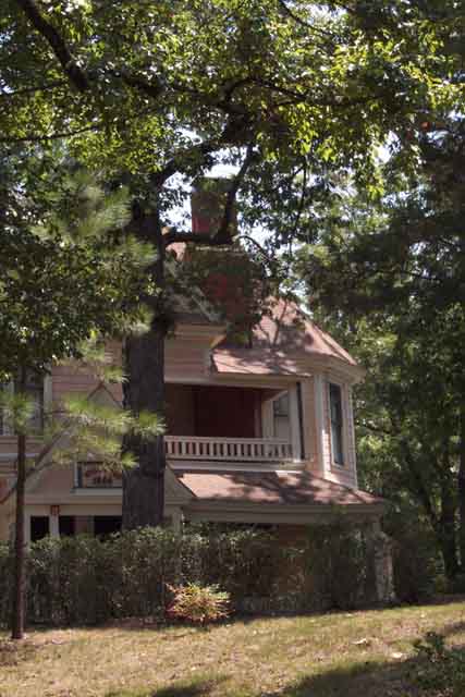
| Just doesn't grab me as a photo and, whilst the house may be reasonably old, it doesn't really shout the theme out in any way. |
|
|
|
08/08/2002 06:20:00 PM |
| It might be old, but it doesn't look that old to me. |
|
|
|
08/08/2002 09:50:00 AM |
|
|
|
08/08/2002 08:37:00 AM |
| this is a neat view, but I think the tree is blocking too much of your subject in this photo. I wonder if there would have been a better angle to photograph this house? - jmsetzler |
|
|
|
08/07/2002 08:47:00 PM |
| lovely colors and composition. Foreground could be sharper. |
|
|
|
08/07/2002 01:44:00 PM |
| It's a fine house, and a fine shot of that house. I think you needed the sign in front of the door to be clearly visible. If I am reading it right, the house is dated 1886, very old. Problem is, w/o the sign, it could be a relatively new house, it's in great shape! Is the focus a tad soft? 6 Swash |
|
|
|
08/07/2002 07:43:00 AM |
| I like the composition. It's like I can't quite see the house for the trees. Usually this would not be good, but it works for me here. |
|
|
|
08/07/2002 05:13:00 AM |
| Too much tree, not enough house. |
|
|
|
08/06/2002 10:49:00 PM |
Nice photo, but something is not quite working for me, but not sure what. I do like the angle and the distance with the dof. Still good work. 6
Ruthann |
|
|
|
08/06/2002 01:00:00 PM |
Hard to tell why you don't show the whole house, Remember the rule of
thirds |
|
|
|
08/06/2002 12:09:00 PM |
| Great shadows on the house, though I feel the house should fill more of the frame. |
|
|
|
08/06/2002 11:12:00 AM |
| I realize this is a technical issue but the jpg compression is probably too high because a lot of the sharpness and detail is lost that could have helped with the overall appearance of the photo. Aside from that there are a lot of shadowed areas, maybe too many if you are trying to use the house as the main subject. Plus, so much of the house is hidden by foliage or in shadow. |
|
|
|
08/05/2002 08:11:00 PM |
| the trees obscure the house too much |
|
|
|
08/05/2002 01:32:00 PM |
| maybe I'd like it more if the color were more striking. It's so soft, it almost has a hand-colored quality to it, which can be quite nice, too. |
|
|
|
08/05/2002 12:50:00 PM |
|
|
|
08/05/2002 02:12:00 AM |
| For me the house is too hidden, maybe a different angle? Nice subject. |
|
|
|
08/05/2002 01:07:00 AM |
| A nice old house, but I think it's too hidden by the trees. |
|
Home -
Challenges -
Community -
League -
Photos -
Cameras -
Lenses -
Learn -
Help -
Terms of Use -
Privacy -
Top ^
DPChallenge, and website content and design, Copyright © 2001-2025 Challenging Technologies, LLC.
All digital photo copyrights belong to the photographers and may not be used without permission.
Current Server Time: 03/12/2025 01:52:46 AM EDT.