| Author | Thread |
|
|
06/24/2007 01:13:59 AM |
| I really like this effect and it should have done much better re the score IMO..... |
|
 Photographer found comment helpful. Photographer found comment helpful. |
|
|
12/09/2006 03:31:10 PM |
|
| Photographer found comment helpful. |
|
|
12/09/2006 11:53:40 AM |
|
| Photographer found comment helpful. |
|
|
12/05/2006 08:16:43 PM |
| Sooooo close to your 5.5! Genius title! |
|
| Photographer found comment helpful. |
|
|
12/04/2006 08:42:01 AM |
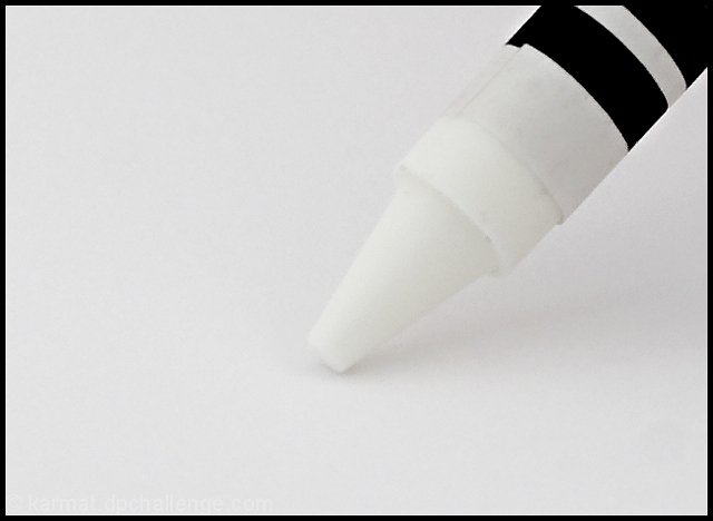
| you got great seperation on the tip and the the paper. |
|
| Photographer found comment helpful. |
|
|
12/04/2006 01:59:28 AM |
| Shame you didn't make the 5.5 (been sitting pretty close to it myself all week and rollover sucks!). Great title and neat idea :o) |
|
| Photographer found comment helpful. |
|
|
12/04/2006 12:59:30 AM |
| Oh, man, just about 5.5! It is 5.5 if you think of it as one decimal and round up. :) |
|
| Photographer found comment helpful. |
|
|
12/04/2006 12:50:14 AM |
| Love the title and it kinda goes with your obvious mood when writing the background to the shot! lol! I would have thought it'd jump over the 5.5 at rollover for you. So damn close... |
|
| Photographer found comment helpful. |
|
|
12/04/2006 12:17:03 AM |
| GREAT TITLE ! sure looks like a good shot to me... |
|
| Photographer found comment helpful. |
Comments Made During the Challenge  |
|
|
12/02/2006 12:57:25 PM |
|
| Photographer found comment helpful. |
|
|
11/30/2006 11:33:16 PM |
| Yeah, that would be. Like drawing in the air. I like the stark, graphic look, but I think the image needs to be cleaner and sharper to really work, because of its graphic characther. ~6 |
|
| Photographer found comment helpful. |
|
|
11/30/2006 11:22:04 AM |
| Almost...Just excite the creative mind! "It's a flock of geese in a blizzard!" :} |
|
| Photographer found comment helpful. |
|
|
11/29/2006 01:13:19 AM |
| pretty and futile, compositionally tip should be neare the point of intersection of thirds not in center |
|
| Photographer found comment helpful. |
|
|
11/28/2006 02:45:37 PM |
|
| Photographer found comment helpful. |
|
|
11/28/2006 07:49:29 AM |
| It's a bit dull subject wise and the border makes it a bit too fierce |
|
| Photographer found comment helpful. |
|
|
11/27/2006 06:28:19 PM |
| I wish there was more shadowing on the crayon itself, but I really like the idea and title :) |
|
| Photographer found comment helpful. |
|
|
11/27/2006 02:56:34 PM |
| Nice idea but the overall look is a bit fuzzy. |
|
| Photographer found comment helpful. |
|
|
11/27/2006 03:09:26 AM |
|
| Photographer found comment helpful. |
|
|
11/27/2006 01:42:55 AM |
| Could be more crisp, but I love it anyway. |
|
| Photographer found comment helpful. |
Home -
Challenges -
Community -
League -
Photos -
Cameras -
Lenses -
Learn -
Help -
Terms of Use -
Privacy -
Top ^
DPChallenge, and website content and design, Copyright © 2001-2025 Challenging Technologies, LLC.
All digital photo copyrights belong to the photographers and may not be used without permission.
Current Server Time: 04/28/2025 05:47:09 AM EDT.