| Author | Thread |
Comments Made During the Challenge  |
|
|
08/18/2002 11:38:00 PM |
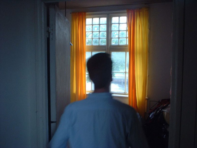
| having a bare room with nothing in it would have been a more relevant "new home"....Also, this photo is a bit too dark, and the person is blurry.... |
|
|
|
08/18/2002 04:53:00 PM |
| A new home is an exciting time! I think that you may have found some other way of showing the newness of it, other than a window. Generally a window doesn't really represent that "Newness" to me. But that's what makes us all different. I look forward to seeing your comments about this in the end. It did make me look closer and seek meaning and that is a good thing. I also like the way the curtains stand out, being so saturated with color in a mostly unsaturated setting. Good eye! |
|
|
|
08/18/2002 12:08:00 AM |
| Good contrast between color and B&W look. Camera shake on man's head |
|
|
|
08/15/2002 04:40:00 PM |
I like the idea and the strong contrast between the dark environment and the bright window and curtains.
BTW, I really wonder where this is. I might be totally wrong, but somehow it looks like it's in the Netherlands. - Remie |
|
|
|
08/14/2002 09:29:00 PM |
| looks like a guy not quite awake yet who just realized he has to work that day, but isn't ready to wake up and embrace the new day yet. |
|
|
|
08/14/2002 08:30:00 AM |
| I don't care for the action in the figure or the lack of detail in the environment. Went I have a new home, bright colorful curtains (although welldone in the photo) are the last thing I hang up, making me question the vaildity of the title. The same individual carrying boxes into a stunning door would've been another choice for the same title and one a bit more on the mark, easier to light, and able to be in sharper focus. But then, maybe I've just missed the point an dit's really all about those curtains which have a most captivating light behind them |
|
|
|
08/14/2002 06:39:00 AM |
| Nice idea but I think your framing needs changing. Portrait would have worked better in my opinion. |
|
|
|
08/13/2002 10:59:00 PM |
| interesting concept :) I really like the way the color of the curtains stands out in the flat color of this photo. Good shot :) - jmsetzler |
|
|
|
08/13/2002 06:36:00 PM |
Something new.
Composition - fair
Technical Aspects - fair. blurred figure hurts some, room should be lighter
Meets Challenge - yes, with title
Visual Impact / Originality � fair
Jim msp
|
|
|
|
08/13/2002 03:24:00 PM |
|
|
|
08/13/2002 12:33:00 AM |
| Sorry, not a very good shot. The blurring of the man irritated me, general exposure poor, some extra lighting would have brought out the image, and what is the pile of stuff in the background. |
|
|
|
08/12/2002 11:23:00 PM |
Composition4
Technical Aspects4
Appeal3
Creativity3
Rating4Autool
|
|
|
|
08/12/2002 07:59:00 PM |
| Very dark image with a distracting blur in the middle, oh, that's a person! It's very hard to say, "this is a new house...." or "this new to me (us)", except maybe the lack of lighting.....5 Swash |
|
|
|
08/12/2002 09:08:00 AM |
| I understand the approach, but the blurriness is distracting. Colors are good, though. |
|
|
|
08/12/2002 02:01:00 AM |
| photo is a little blury. Don't really have much room to talk though, so's mine. i also noticed that during upload to the site, some pics lose clarity, so I wont hold it against you. Beautiful view out that window. Congrats and good luck. |
|
Home -
Challenges -
Community -
League -
Photos -
Cameras -
Lenses -
Learn -
Help -
Terms of Use -
Privacy -
Top ^
DPChallenge, and website content and design, Copyright © 2001-2025 Challenging Technologies, LLC.
All digital photo copyrights belong to the photographers and may not be used without permission.
Current Server Time: 03/12/2025 11:26:10 AM EDT.