| Author | Thread |
|
|
11/03/2003 08:03:18 AM |
| gorgeous colors and tones man. a classy piece. |
|
Comments Made During the Challenge  |
|
|
10/30/2003 04:27:11 PM |
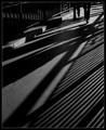
| This gives a lonely feel to it. I find the angle of the shadow a little distracting, but I like the depth of field. |
|
 Photographer found comment helpful. Photographer found comment helpful. |
|
|
10/29/2003 10:57:26 PM |
| could use a little more contrast |
|
|
|
10/29/2003 04:53:37 PM |
| Wonderful textures in the paint - and a great shape and shadow. Seems a bit "shiny" to the left - can't quite describe the effect but I'm not keen on it. Like the overall composition, though would shave a small touch off the left. |
|
| Photographer found comment helpful. |
|
|
10/28/2003 10:55:53 PM |
| Simple yet effective. Like the colors and the composition. I gave it a 7. |
|
|
|
10/28/2003 04:49:26 AM |
|
|
|
10/27/2003 09:42:26 PM |
| The simplicity works well. Maybe crop just a tad more on the left? I want to reach into the pic and pull that handle - what will it open? |
|
|
|
10/27/2003 08:29:25 PM |
| very simple and has a lot of character. It reminds me of the stowaway picture in the inside looking out challenge, which I loved. hope you do well! |
|
| Photographer found comment helpful. |
|
|
10/27/2003 05:55:24 PM |
| Love the simplicity. Beautiful. I'd just as soon not have a frame, though - something this simple doesn't need one - it should stay simple. 9 |
|
| Photographer found comment helpful. |
|
|
10/27/2003 04:42:11 PM |
| one of my favourites - i like the idea very much and it works very well, good focus and colour and off course shadow. 8 |
|
| Photographer found comment helpful. |
|
|
10/27/2003 12:14:25 PM |
| 8. Wonderfully simple. I am a fan of borders. I like the transition from focused to less so. |
|
| Photographer found comment helpful. |
|
|
10/27/2003 10:04:38 AM |
| I like this, needs a bit more contrast, but I like this. |
|
|
|
10/27/2003 07:25:14 AM |
| Nice composition and use of negative space. Good DOF. 7. |
|
| Photographer found comment helpful. |
|
|
10/27/2003 05:26:14 AM |
| Very nice photo, but I don't really like the border at all, I think it distracts. A thinner white or black one would look better in my opinion. |
|
| Photographer found comment helpful. |
Home -
Challenges -
Community -
League -
Photos -
Cameras -
Lenses -
Learn -
Help -
Terms of Use -
Privacy -
Top ^
DPChallenge, and website content and design, Copyright © 2001-2025 Challenging Technologies, LLC.
All digital photo copyrights belong to the photographers and may not be used without permission.
Current Server Time: 03/13/2025 10:44:58 AM EDT.