| Author | Thread |
Comments Made During the Challenge  |
|
|
08/18/2002 11:14:00 PM |
| A bit harsh on the lighting... |
|
|
|
08/18/2002 01:56:00 AM |
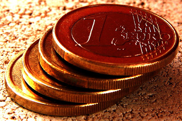
| These coins we either sitting on a piece of cork board, or a hamburger. It's definately got some interesting texture. I like how the coins are set up like that. The angle is nice, however there seems to be a distracting bright spot towards the bottom left. I have heard of a trick to lessen bright spots and make the lighting more balenced out. Try putting a thin piece of cloth or thin paper between the subject and the light source. Still lets the light through but not as harshly. You can also use different colors of cloth or paper to create some really neat color effects. Good luck in the challenge. |
|
|
|
08/18/2002 12:39:00 AM |
| I like thgolden cast of the entire picture. I am not too impressed with the lighting..The shadows seem too dark and the flare areas too bright. overall it is noci work though. =5 syamjonimi |
|
|
|
08/17/2002 04:14:00 PM |
| Good macro. Photo is overdriven, on the whole. |
|
|
|
08/16/2002 04:44:00 AM |
| there are more interesting ways to take pictures of money, but the idea is sound. |
|
|
|
08/15/2002 11:48:00 AM |
| looks overexposed to me a bit. cool idea and nice set up. |
|
|
|
08/15/2002 11:38:00 AM |
| Nice layout and subject. The only thing I would've done different is pick a less distracting background. The way you have your lighting set up it gives the background a lot of contrast and distracts the eye from the subject. I'm wondering if the coins are sitting on a rice crispy ... (I think I'm just hungry) ... sorry ... lol |
|
|
|
08/14/2002 07:34:00 PM |
| Interesting coins, kinda reminds me of some french coins I have (the two tone color coins). Speaking of color (or is that colour?), are the coins really this dark bronzy color? I was expecting lighter outside rings, with darker inside rings (than what I see here). Very sharp w/ WIDE DOF, very, very nice. I am going to bump your score up one from 7 to 8 (for a euro, I'll go one more!) Swash |
|
|
|
08/14/2002 12:23:00 PM |
| The framing is great, but the lighting is really bright on the left. 5 |
|
|
|
08/14/2002 12:26:00 AM |
| Nice composition. I would like to see the wording stand out just a wee bit more. |
|
|
|
08/13/2002 01:25:00 PM |
|
|
|
08/13/2002 05:43:00 AM |
| Great idea � I haven't seen a Euro yet� It meets the challenge. In my opinion, I think the colours of the background and subject are too close creating a cast. This may be due to white balance, but whatever it is, it doesn't seem right� |
|
|
|
08/13/2002 12:28:00 AM |
| Nice subject for the theme, well framed and good exposure. |
|
|
|
08/12/2002 09:40:00 PM |
Composition6
Technical Aspects5
Appeal7
Creativity7
Rating6Autool
|
|
|
|
08/12/2002 05:17:00 PM |
As a Euro babe (but not in a country with the Euro) I like this idea (though I do really miss the French Franc, I don't miss the Lira or Peseta).
I find this a little too contrasty though. Is that how it was taken or have you played with levels? I love the sheen on the coins and the real golden highlights.
6, Kavey |
|
|
|
08/12/2002 02:04:00 AM |
|
Home -
Challenges -
Community -
League -
Photos -
Cameras -
Lenses -
Learn -
Help -
Terms of Use -
Privacy -
Top ^
DPChallenge, and website content and design, Copyright © 2001-2025 Challenging Technologies, LLC.
All digital photo copyrights belong to the photographers and may not be used without permission.
Current Server Time: 03/12/2025 05:32:16 PM EDT.