| Author | Thread |
Comments Made During the Challenge  |
|
|
08/18/2002 01:42:00 PM |
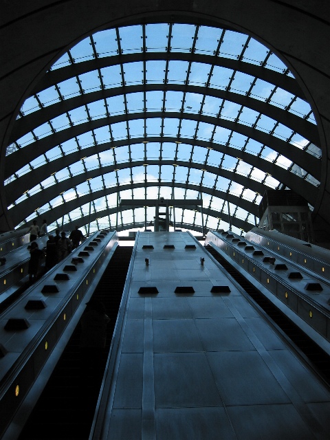
| Nice shot! Love your composition! How? The arches overhead with the sky provide a nice balance to the otherwise dark, harsh, and stern, but prettty colorered blue steel structures below. Give ya a 10. |
|
|
|
08/18/2002 01:57:00 AM |
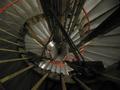
| The proportions of this structure seem enormous. It almost appears we are looking straight up until I noticed the people shadowed on the left. |
|
|
|
08/17/2002 11:33:00 AM |
| Not being familiar with Wharfs, I looked this up and I think I found a site related to this Canary Wharf. It helped me to understand exactly what I was looking at and realized that this is probably an escalator. At first I thought it might be a bit dark, but when I tried lightening it up a bit, I noticed that it looked like there was someone standing in the large dark strip to the left and figured you darkened it up a bit to make that person kind of dissapear. I also notice lots of people over on the far left. That's why I thought it was an escalator. Hard to tell though without being able to see the individual stairs in the dark vertical grooves. The roof/ceiling is beautiful. I bet it casts some really cool shadows when the suns just right. This is a nice angle. Good shot and good luck in the challenge. |
|
 Photographer found comment helpful. Photographer found comment helpful. |
|
|
08/16/2002 03:39:00 PM |
Very cool! Architecture is always fun>>Good score.
It maybe would have been a better shot if the Photographer was 10 feet over to the right... |
|
|
|
08/15/2002 03:27:00 PM |
| Kinda dark and imo, pushing the "new" quite a bit. (Edited sarcastic comment about the newness of your subject) Additional review cost you a point, slid from 7 to 6. Swash |
|
|
|
08/15/2002 12:51:00 AM |
| I guess 1999 could still be condsidered new ... it was only last millenium &all |
|
|
|
08/13/2002 10:00:00 PM |
Something new.
Composition - pretty good
Technical Aspects - pretty good.
Meets Challenge - yes
Visual Impact / Originality � pretty good
Jim msp
|
|
|
|
08/13/2002 07:28:00 PM |
| A very wonderfully done building shot, great sky and colors.. however, I dont see the "new" part besides reading the title. |
|
|
|
08/13/2002 02:40:00 PM |
| It looks a bit underexposed, or was that done on purpose? |
|
|
|
08/13/2002 01:47:00 PM |
Interesting pattern or light and dark.
5, Kavey |
|
|
|
08/12/2002 08:52:00 PM |
Composition7
Technical Aspects5
Appeal5
Creativity6
Rating6Autool
|
|
|
|
08/12/2002 08:06:00 PM |
| nice picture, but a little dark |
|
|
|
08/12/2002 03:15:00 PM |
| Cool picture. I think it would be even more effective if it were perfectly symmetrical. I would draw the viewer in more, I think. karmat |
|
|
|
08/12/2002 12:35:00 PM |
| Greetings :) This is a lovely architectural photo. It simply does not relay a sense of 'new' to me. I would have to live in this community to know that this is new and understand the ramifications of that. In my own mind, this image resembles many other train stations that I have seen in the past :) - jmsetzler |
|
|
|
08/12/2002 11:06:00 AM |
| This is an interesting shot. A think it's a bit too over-sharpened, as evidenced by the distortion on those metal things between each window. While I think it is a good image, and that the photographer thought out this shot and did a good job, if s/he hadn't put the date of construction in the title, what about the photographer reveals the 'newness' of this? Still, good work. |
|
|
|
08/12/2002 10:30:00 AM |
|
Home -
Challenges -
Community -
League -
Photos -
Cameras -
Lenses -
Learn -
Help -
Terms of Use -
Privacy -
Top ^
DPChallenge, and website content and design, Copyright © 2001-2025 Challenging Technologies, LLC.
All digital photo copyrights belong to the photographers and may not be used without permission.
Current Server Time: 03/12/2025 07:26:56 AM EDT.