| Author | Thread |
Comments Made During the Challenge  |
|
|
08/18/2002 10:30:00 PM |
| Great shot...I love it...Such a nice subtle connection and I smiled at the title :) |
|
|
|
08/18/2002 01:03:00 AM |
| Modern art.....not necessrily new. Actually just not visually appealing to me personally. sorry :>( |
|
|
|
08/17/2002 09:44:00 AM |
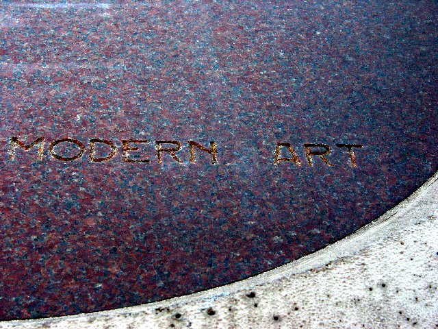
Modern art really is "something new". The curve makes the photo interesting. The lighting could have been better, so that its more visible that the letters are engraved. Especially the M. Also I would like a more uniform lighting here. There are reflections in the upper left corner while the right side is much darker.
-stephan |
|
|
|
08/17/2002 06:07:00 AM |
| Very cool idea and great post processing. The colours, textures and composition work for me. |
|
|
|
08/16/2002 11:25:00 PM |
| I understand your point. Modern art, must be new. However, This photo doesn't look like it is of modern art. The words themselves look like they've been there awhile. Could you have interpreted a piece of modern art in with this photo? Maybe this IS a piece of modern art. Who am I to judge when I wasn't there. However if it is, a wider shot of it would have made a larger impact so we could view more of the subject we are looking at. I have to have a high appreciation for the brindle marble, That's my Dad's business. I've seen lots and lots of marble in my day and this is one of the prettiest colors I've seen in awhile. You did a great job of keeping reflection off the surface and caught it at an angle that it's not too dark either. Good luck in the challenge. |
|
|
|
08/16/2002 09:14:00 AM |
| Subtle - yes, well photographed � yes� I can't offer constructive comments with the technical side of things; it's a great shot and it meets the challenge easily. But I can't decide if I like the picture for the sake of the picture. It lacks something, but I'm really not sure what� |
|
|
|
08/14/2002 05:39:00 PM |
| I'm not quite sure I get the relativity to "something new"... |
|
|
|
08/13/2002 10:12:00 PM |
Something new.
Composition - pretty good
Technical Aspects - pretty good.
Meets Challenge - I assume so, but not really obvious
Visual Impact / Originality � pretty good
Jim msp
|
|
|
|
08/13/2002 01:28:00 PM |
| Colors and textures blend a little too well. |
|
|
|
08/13/2002 12:28:00 PM |
| I like the crescent at the bottom and the modern simplicity but there isn't enough shadow in the etchings to allow easy reading and I would like a more vibrant colour. |
|
|
|
08/12/2002 11:25:00 PM |
Composition5
Technical Aspects5
Appeal4
Creativity5
Rating5Autool
|
|
|
|
08/12/2002 09:42:00 PM |
| well framed, interesting shot - slightly tilted ? |
|
|
|
08/12/2002 02:01:00 AM |
|
Home -
Challenges -
Community -
League -
Photos -
Cameras -
Lenses -
Learn -
Help -
Terms of Use -
Privacy -
Top ^
DPChallenge, and website content and design, Copyright © 2001-2025 Challenging Technologies, LLC.
All digital photo copyrights belong to the photographers and may not be used without permission.
Current Server Time: 03/13/2025 03:44:59 PM EDT.