| Author | Thread |
Comments Made During the Challenge  |
|
|
01/24/2007 11:51:59 PM |
|
 Photographer found comment helpful. Photographer found comment helpful. |
|
|
01/24/2007 10:23:38 PM |
| sorry, but this just doesn't do much for me. i have an idea as to what you were after, but it seems more confused than well-executed. |
|
| Photographer found comment helpful. |
|
|
01/23/2007 11:56:02 AM |
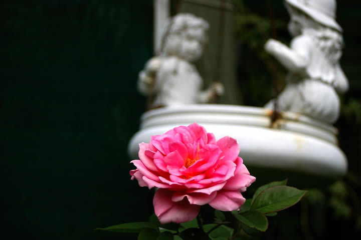
| Good use of depth of field and having the stone subjects in the background to make the composition strong. |
|
| Photographer found comment helpful. |
|
|
01/20/2007 02:21:18 PM |
| I think it would be better if the flower were not so close to the bottom edge of the photo. |
|
| Photographer found comment helpful. |
|
|
01/16/2007 04:19:08 PM |
| Great idea. I'd like to see it with a greater dof bringing the couple into focus, and with the flower off to the left into the (now) negative space balancing the statue. |
|
| Photographer found comment helpful. |
|
|
01/15/2007 09:55:41 AM |
| nothing interesting for me on this photo, sorry |
|
| Photographer found comment helpful. |
|
|
01/14/2007 11:48:30 PM |
| I like the dof you have chosen to use. However, the picture feels severely off balance to me. The rose is in the middle of the frame (well, almost) adn the statues are in the middle and right, but there is absolutely nothing in the left. It is not enough to be effective negative space, I think, and too much to add to the composition. Perhaps if you cropped it just at the edge of the flower and statue-thingys, then "mirrored" it, it would feel more balanced. |
|
| Photographer found comment helpful. |
|
|
01/14/2007 08:08:17 AM |
| Composition awkward. Not sure why you have the left 1/3 of the image - there's nothing there and the negative space doesn't add.The rose is in focus and colors are nice but not sure of your meaning here. |
|
| Photographer found comment helpful. |
|
|
01/12/2007 04:55:12 PM |
| Cropping out the dark (I'd even say black) on the left would have added a punch to this composition. |
|
| Photographer found comment helpful. |
|
|
01/12/2007 08:59:36 AM |
| Image seems off balance. Lots of dark space on the left that really doesn't add anything to the photo. I find the OOF statue in the background distracting and the rose seems too centered. |
|
| Photographer found comment helpful. |
|
|
01/12/2007 08:01:48 AM |
| Oo i like the theme youve set 6 |
|
| Photographer found comment helpful. |
Home -
Challenges -
Community -
League -
Photos -
Cameras -
Lenses -
Learn -
Help -
Terms of Use -
Privacy -
Top ^
DPChallenge, and website content and design, Copyright © 2001-2025 Challenging Technologies, LLC.
All digital photo copyrights belong to the photographers and may not be used without permission.
Current Server Time: 03/16/2025 07:29:19 PM EDT.