| Author | Thread |
|
|
08/28/2002 01:03:00 AM |
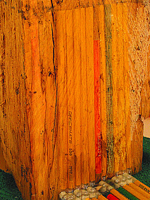
For those who haven't seen my post, I answer how this photo was achieved at:
//bartphoto.topcities.com/dpc/setup.htm
|
|
Comments Made During the Challenge  |
|
|
08/25/2002 05:24:00 PM |
| I'm interested how you got this picture. |
|
|
|
08/23/2002 09:41:00 PM |
| extremely original idea...wish this had been zoomed out a bit and maybe on a solid backdrop. Lisa |
|
|
|
08/23/2002 12:14:00 AM |
| This is a creatively excellent photo :) The concept works nicely.. I would love to hear how you did this shot after the challenge :) - jmsetzler |
|
|
|
08/22/2002 02:58:00 PM |
| This is one of my favorite 3 for this week. I'm still wondering how you achieved it. I would have chosen a black background rather than the green carpet. Why did you crop out so much of the pencils in the bottom? The ghostly pencils on the wood block are very cool. |
|
|
|
08/22/2002 10:39:00 AM |
| Neat idea. This looks like a shutter speed trick. But I'm not hugely educated on that, I'm guessing only by other photos I've seen similar. The concept behind this is great with the "chip off the ol block" theme. Very clever. I also like how you got the pencils lined up both on the block and the floor. The block seems unnaturally orange, which makes it look like the color has been messed with, but then again, maybe the block really is that color. Who am I to judge when I've never see that block before. Great job with this. Good luck in the challenge. |
|
|
|
08/22/2002 08:56:00 AM |
Composition: Subject Placement, Cropping, Background7,
Technical: Focus, Exposure, Lighting, Processing6,
Challenge: Does your entry meet it?10,
Appeal: Is it Interesting, Motivating, Etc.? 5,
Total Averaged Rating7. Autool
|
|
|
|
08/22/2002 02:51:00 AM |
| Intriguing.....Please tell us how tis was done |
|
|
|
08/22/2002 12:18:00 AM |
| the composition is muddy... not really sure what I'm looking at or what I'm supposed to be looking at. |
|
|
|
08/21/2002 08:42:00 PM |
| Very interesting and well executed shot. |
|
|
|
08/21/2002 12:49:00 AM |
| very cleverlydone..reverse reflections? good concept and execution |
|
|
|
08/20/2002 05:41:00 PM |
I love the texture in this. The detail (reflection?) at the bottom feels too low in the frame. I'd either like it higher or not at all. How did you do this effect? I am dying to know!
5, Kavey |
|
|
|
08/20/2002 04:43:00 PM |
Composition - very good
Technical Aspects - quite good
Meets Challenge - yes
Visual Impact / Originality – high/very good
Other comments – not sure how you did this, but good. Reflections at bottom bother me a little.
Jim msp
|
|
|
|
08/20/2002 03:27:00 PM |
| I can't wait to read how you did this! |
|
|
|
08/20/2002 03:02:00 PM |
| Now thats something. I like this. 8 -lennier |
|
|
|
08/20/2002 08:59:00 AM |
| I think I like this but I'm wondering exactly HOW you got this effect without use of filters or special effects? Mirrors, maybe? I find it hard on the eyes, but makes me keep looking to try to figure it out. |
|
|
|
08/20/2002 07:27:00 AM |
| A very creative idea! Colours seem a little strong and the reflections at the bottom right are a little confusing. |
|
|
|
08/20/2002 12:08:00 AM |
| I really like how you id this - the transparaency - maybe a tutorial is in order |
|
|
|
08/19/2002 10:02:00 PM |
| How did you do this effect - a glass sheet? Whatever it is, it's a great idea and it works well. |
|
|
|
08/19/2002 07:12:00 PM |
Meets Challenge Theme:oh yeah!
Technical :Good
Composition:good
Creativity:Good idea well executed
Visual Appeal to me:Nice
Remarks:Before I saw the title, it's exactly how it hit me.
Grayce...aka...Gracious |
|
|
|
08/19/2002 06:01:00 PM |
|
|
|
08/19/2002 05:20:00 PM |
|
|
|
08/19/2002 02:36:00 PM |
| did you glue those together befor you droped them. |
|
|
|
08/19/2002 02:17:00 PM |
|
|
|
08/19/2002 12:05:00 PM |
| I had to look at it a long time, but I like it. |
|
|
|
08/19/2002 10:16:00 AM |
| I am oh, so curious about this shot! Very creative and interesting. lhall |
|
|
|
08/19/2002 10:12:00 AM |
| Excellent idea! Good work! |
|
|
|
08/19/2002 08:08:00 AM |
| Very odd photo. It's a bit too grainy. |
|
|
|
08/19/2002 06:30:00 AM |
| This is a really good idea. The base of the picture is a little confusing on the eye (I think) but, other than that, it's OKâ€Â¦ |
|
|
|
08/19/2002 05:10:00 AM |
| I like the picture but don´t the bottom where the pencils meets I think a "crop" so you only can see the No2 in the OFFICEMATE pencil had done better at least in my case. -rocco22- |
|
|
|
08/19/2002 02:19:00 AM |
| Interesting. 7 for the effort. |
|
Home -
Challenges -
Community -
League -
Photos -
Cameras -
Lenses -
Learn -
Help -
Terms of Use -
Privacy -
Top ^
DPChallenge, and website content and design, Copyright © 2001-2025 Challenging Technologies, LLC.
All digital photo copyrights belong to the photographers and may not be used without permission.
Current Server Time: 04/26/2025 06:39:10 AM EDT.