| Author | Thread |
Comments Made During the Challenge  |
|
|
08/25/2002 07:20:00 PM |
| The title is more fun than the picture. The 3 negative spaces in the picture are pretty simple too. And so is the background. Good sharp pencils. 4 Journey |
|
|
|
08/25/2002 03:27:00 PM |
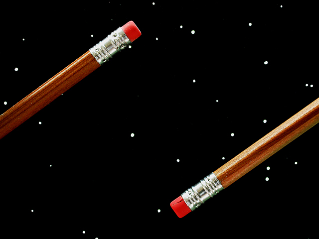
| the clarity and crispness of this picture are awesome--it reminds me (other than the obvious!) of some show i used to see as a kid like sesame street or electric company (can't remember which) where the big everyday items used to float thru the air in space--very cool. this pic would be a 10, but the negative space seems so balanced... so a 9.99999 for you! |
|
 Photographer found comment helpful. Photographer found comment helpful. |
|
|
08/24/2002 06:31:00 PM |
| I don't really get the concept... Little too contrived for my taste, and nothing about it really grabs me. 4 sjgleah |
|
| Photographer found comment helpful. |
|
|
08/24/2002 07:10:00 AM |
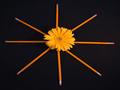
| Awesome! This photo made me laugh :). I'm not sure I like the rotational symmetry, I think if the pencils were at different angles I'd like it more. But the strong lighting and the background are cool :) |
|
| Photographer found comment helpful. |
|
|
08/24/2002 12:56:00 AM |
| Cool effect. I like the idea. Placement and angle are good. Lighting and focus are great. The only thing that stands out to me as odd is the blemish in the eraser at the bottom right of the photo. unless the rest of the eraser is like that or worse, maybe rotating the pencil to a different spot of the eraser could have avoided showing this. The background is absolutely great. Very nice job and good luck in the challenge. |
|
| Photographer found comment helpful. |
|
|
08/23/2002 09:37:00 AM |
| Excellent use of the rectangle, great control of negative space |
|
| Photographer found comment helpful. |
|
|
08/22/2002 10:35:00 PM |
I am amazed at how creative people can be with something as simple as a pencil.
Your idea here works well. |
|
| Photographer found comment helpful. |
|
|
08/22/2002 07:58:00 PM |
Composition: Subject Placement, Cropping, Background8,
Technical: Focus, Exposure, Lighting, Processing7,
Challenge: Does your entry meet it?10,
Appeal: Is it Interesting, Motivating, Etc.? 7,
Total Averaged Rating8. Autool
|
|
|
|
08/22/2002 12:48:00 PM |
| I liked your composition very much. Your pencils are the most elegant, and least used by other photographers this week. I only wonder about the crack in the right side pencil's eraser. One of my 3 favorites to win this week. |
|
|
|
08/22/2002 11:38:00 AM |
| good light/color rendition. how did u suspend the pencils? might be a tad over sharpened, but it's a clever idea. |
|
| Photographer found comment helpful. |
|
|
08/21/2002 11:54:00 PM |
| I lost the idea somewhere with this. Kind of plain. sharp but no real subject I can see to make it interesting |
|
| Photographer found comment helpful. |
|
|
08/21/2002 10:56:00 PM |
Composition - quite good
Technical Aspects - quite good
Meets Challenge - yes
Visual Impact / Originality � high
Other suggestions � cut in eraser keeps this from a 9
Jim msp
|
|
| Photographer found comment helpful. |
|
|
08/21/2002 06:41:00 PM |
| Cute title, well taken photo. (Where's the black cube thing?) 7 Swash |
|
|
|
08/21/2002 04:38:00 PM |
| I think this would have been superb with one of the pencils removed. But that�s only my opinion� Good luck�(7) |
|
| Photographer found comment helpful. |
|
|
08/21/2002 02:53:00 PM |
| This is a technically very nice photo... I can't see much that I would change about the photo. I love the 'space' theme and you have done a very good job of capturing that sense in this image. I think that the eraser on your lower pencil is defective. I would definitely take that back and exchange it for a good one :) - jmsetzler |
|
| Photographer found comment helpful. |
|
|
08/21/2002 02:24:00 PM |
| Can't think of anything it needs to improve. I like the "simplicity" of hte shot, and how the pencils leave the frame. karmat |
|
| Photographer found comment helpful. |
|
|
08/20/2002 09:01:00 PM |
| boldly goes but not far enough |
|
|
|
08/20/2002 05:46:00 PM |
Cute, and highly graphical. Love the texture of the brown pencils.
6, Kavey |
|
| Photographer found comment helpful. |
|
|
08/20/2002 05:05:00 PM |
| Wow be me the one to say too much saturation. |
|
| Photographer found comment helpful. |
|
|
08/20/2002 03:50:00 PM |
| Nice focus and framing. I like the bold colors. Very cute! |
|
| Photographer found comment helpful. |
|
|
08/20/2002 09:49:00 AM |
| Very original. Focus and lighting are excellent. 7 |
|
| Photographer found comment helpful. |
|
|
08/20/2002 02:09:00 AM |
| This should have a "how'd they do that" section when the votes are all in. innovative idea, good set up. May be a little harsh on the lighting and soft on focus. Not bad at all though. =6 syamjonimi ;-D |
|
| Photographer found comment helpful. |
|
|
08/20/2002 12:04:00 AM |
|
|
|
08/19/2002 11:13:00 PM |
| This is cool, and extremly sharp and clear. Good work |
|
| Photographer found comment helpful. |
|
|
08/19/2002 09:49:00 PM |
| This looks photoshopped to me ! :) -Gordon |
|
|
|
08/19/2002 06:44:00 PM |
| Bravo this is done well. I feel them floating. GOOD work! Score 8 ~Kee |
|
| Photographer found comment helpful. |
|
|
08/19/2002 06:22:00 PM |
Meets Challenge Theme:Definetely
Technical :Very good
Composition:very good
Creativity:simple but good.
Remarks:Very good idea....like the space idea
Grayce...aka...Gracious |
|
| Photographer found comment helpful. |
|
|
08/19/2002 10:15:00 AM |
| Is the eraser cracked on the lower pencil? Creative idea, but that line/crack in the eraser is a distraction. |
|
| Photographer found comment helpful. |
|
|
08/19/2002 05:46:00 AM |
| Cracking picture. Cracked eraser <wink>. Love your composition and lighting though. Well done! FloYdage |
|
| Photographer found comment helpful. |
Home -
Challenges -
Community -
League -
Photos -
Cameras -
Lenses -
Learn -
Help -
Terms of Use -
Privacy -
Top ^
DPChallenge, and website content and design, Copyright © 2001-2025 Challenging Technologies, LLC.
All digital photo copyrights belong to the photographers and may not be used without permission.
Current Server Time: 03/12/2025 10:56:14 PM EDT.