| Author | Thread |
Comments Made During the Challenge  |
|
|
08/25/2002 05:04:00 PM |
| Nice play with sharpness. The music of the background might have been more interesting. |
|
|
|
08/23/2002 10:51:00 PM |
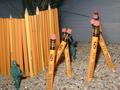
| Good composition however, DOF is shallow and the picture appears quite grainy. The stark black upper right corner seems a little distracting. All in All this is a worthy of note for the challenge topic. |
|
|
|
08/23/2002 09:59:00 PM |
REALLY GREAT - I can see the time and effort put into this one. It's simple - but not. I definately like the composition - the usage of lines. The choice of dof is also really great - it makes the primary subject REALLY stand out (isn't that the point of dof?). Great achievement of black background. At first, the extra contrast (if that's what it is) stood out as a negative, but as I really look at it, I think it adds more the photo. GREAT WORK 9
Ruthann |
|
|
|
08/23/2002 11:08:00 AM |
| Great patterns. I like how the front pencil was placed in opposite of the other pencils. you had very good spacing in the bottom pencils. Lighting is good and focus and angle are good. Sharp focus on the front pencil and soft focus on the others looks really nice in this case. I am curious about the very bottom pencil and why it is cut off at an angle like that. great job and good luck in the challenge. |
|
|
|
08/23/2002 07:09:00 AM |
Interesting and striking layout, love the graininess, is it deliberate? Also like the colours and vibrancy.
7, Kavey |
|
|
|
08/22/2002 09:04:00 AM |
Composition: Subject Placement, Cropping, Background6,
Technical: Focus, Exposure, Lighting, Processing5,
Challenge: Does your entry meet it?10,
Appeal: Is it Interesting, Motivating, Etc.? 4,
Total Averaged Rating6. Autool
|
|
|
|
08/21/2002 03:51:00 PM |
| A bit grainy, some of the detail is lost in the noise. Camera ISO setting? |
|
|
|
08/20/2002 05:27:00 PM |
| Good composition. Dark area lower left is slightly bothersome, as is the out of focus eraser. |
|
|
|
08/20/2002 12:10:00 PM |
| What's that cutting off the pencil at the lower left? It's not too distracting, but I would have like it better if it wasn't there. |
|
|
|
08/20/2002 07:45:00 AM |
| Nice simple arrangement and well shot with good light. |
|
|
|
08/20/2002 12:55:00 AM |
| I like the focus, and I even like the slight grain. The thing that distracts me is the black piece covering the last pencil at the bottom... it really disrupts the pattern. |
|
|
|
08/19/2002 06:00:00 PM |
|
|
|
08/19/2002 03:48:00 PM |
|
|
|
08/19/2002 02:49:00 PM |
| The yellow realy stands out, but to get it I feel you sacrificed the red of the erasure. |
|
|
|
08/19/2002 10:05:00 AM |
| I like your composition and "setup", but personally, would have like for all of the pencils to have been in focus. Nice shot though ! lhall |
|
Home -
Challenges -
Community -
League -
Photos -
Cameras -
Lenses -
Learn -
Help -
Terms of Use -
Privacy -
Top ^
DPChallenge, and website content and design, Copyright © 2001-2025 Challenging Technologies, LLC.
All digital photo copyrights belong to the photographers and may not be used without permission.
Current Server Time: 03/13/2025 07:59:15 PM EDT.