| Author | Thread |
|
|
11/22/2003 04:42:38 PM |
Critique Club
Composition:
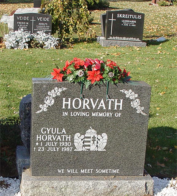
Your composition looks like you tried to balance a trio of objects. Your plan is good; balance the front subject with the two subjects in the background. A trio of subjects is almost always a good way to think of your subjects as you can create a triangle with three subjects. Triangles made up of the subjects in your photo help people, they provide lines that draw your viewer into your work and I think you started with a good concept. I think you ran into a couple of problems and your photo suffers because of those problems. The first being that the subject you chose doesn't have the "cleanest" background. The excess of leaves and the tree or bush that appears between the two grave markers in the background are all busy and they clutter the scene for a viewer. If any grave marker would have produced the same feeling you were trying to capture then I would suggest consider looking for a different subject in the foreground. Your choice of this marker might lead a viewer to believe that this marker is particularly special for you. Now if that's true then that can have a special impact for the viewers of this photo. They, too, can probably understand a sense of personal loss. But if that's the idea that you wanted to get across to viewers then perhaps you could have cut out the two grave markers at the top of the photo. Either way (select 3 grave markers that are less visually cluttered or crop your photo to present a more intimate view of a single grave marker) might have given you more impact. The way all the grave markers seem to be leaning to the right is also distracting. Perhaps tilting the camera or rotating and cropping the image in PhotoShop (or another graphics program) would have given a more finished, polished look. As this photo was submitted the angles tend to give a "snapshot" feel. The tilt doesn't seem to tell any particular story to the viewer. I think you saw something in this shot but I think you just missed capturing it for other viewers. Frankly, that's a more promising outcome because its much more difficult if you don't see something artistic but you have more technical merit as a photographer. At least this way you seem to have an artistic eye for a good image. This shot just needed a little more work before you took the picture to compose a good visual story for your viewers.
Color:
Here again you have a good starting point. The gray granite color of the grave markers is always a good neutral color that helps balance out more intense reds, yellows, blues, purples or whatever. The red and green color of the floral arrangement on top of the grave marker contrast well with the gray of the marker and the green of the grass in the background. While the colors are good, I feel that you might have bumped up the saturation and gotten even more impact from the colors available. The two markers in the background are far enough away and in strong enough light that they provide a deeper, more solid color to play off of with the grave marker in the foreground. They are set apart by perspective and distance and by how they sit on either edge of the subject in the foreground but the darker color also helps to reinforce the difference between the grave marker in the foreground and those in the background. We begin to run into a problem with the cluttered color both in the white gravel at the very bottom of the photo and that distraction is mirrored in the leaves at the top of the photo. Cropping the bottom foundation and the gravel out of the photo should not have drastically affected the visual impact of the grave marker in the foreground but it would have helped to cut down on the noise generated by the very bright gravel and their contrast with the dark shadows.
Focus:
The focus is pretty close in the foreground and it looks like you had an ample depth of field to capture both markers in the background. I don't think the focus is off, it just looks like it needs a little sharpening. If you aren't familiar with UnSharpenMask in PhotoShop or its kindred programs then I think one trip through that filter would have made a major difference in this image. I don't think you need to do anything else to this at the time you were taking the photo, just touch it up with a little USM in post-photo processing.
Lighting:
For an outdoor shot you choose a good time of day and you had direct sunlight to aid you. The shadows length show that you shot it either earlier in the morning or later in the afternoon when the light is "cooler" so that's a good practice to continue. Your main subjects are all well-lit. The shadows directly behind the grave marker in the foreground are a little harsh still but not totally distracting. Perhaps using flash on this might have lightened just those shadows a little but given the subject matter I think you have a good lighting scheme for this out of doors shot.
Overall:
Having seen your Perfume submission I believe this photo is strong evidence that you have a knack for seeing an artistic moment and noticing artistic views of subjects. I think that you missed a few technical points on this photo and that you could have, with a little more work on this photo, created an image worthy of what you were seeing. You can produce some very high quality, artistic photos and I believe that this photo is a promise of your potential but I think that just one or two changes in the camera angle (to keep the markers to seem more upright unless the angle contributed to the photo) or choosing to crop the photo (to remove some distracting visual elements) and maybe just a touch of USM would have rendered this photo as a much more powerful story for your viewers. The subjects you selected are from my point of view moving and easily within the realm of the sacred. I bet you probably got several other comments remarking on the solemnity of the subjects you chose. You have an eye for this shot, perhaps you could make a few more trips out to this (or a similar) gravesite and try your hand a few more times to see what kind of stirring photos you can capture. Good job and definitely keep submitting your work. It shows great promise. |
|
 Photographer found comment helpful. Photographer found comment helpful. |
Comments Made During the Challenge  |
|
|
11/15/2003 08:31:43 PM |
| This is a wonderful concept for the challenge and as you can see by the other entries, not the only one with this idea. I have loved them all because I know how important it can be to remember your past and respect them. As for this shot, a straighter crop and not so much background would really increase the drama in this shot, the bright sunshine actually hurts a bit on this, a little more subdued lighting would have worked better to give the concept the proper respect. A 6 |
|
| Photographer found comment helpful. |
|
|
11/15/2003 02:29:07 AM |
| Is it me, or are all the headstones crooked? A good, if common, subject for the challenge. But the colors and lighting are a bit flat, and the composition is not terribly interesting. Maybe b&w or duotone might have done something to help the emotion. Overall, an OK shot. |
|
| Photographer found comment helpful. |
|
|
11/12/2003 03:31:47 PM |
| Good composition, and generally good lighting. It feels like you need to move a couple of steps to the right and get it straighter -- if feels slightly tilted to me. |
|
| Photographer found comment helpful. |
|
|
11/11/2003 12:34:54 AM |
| A nice photo. And yes, a sacared place. But, I think you could have taken this a bit further. The photo seems to be missing something. Perhaps a candid looking shot of a couple of people observing the stone. Also, the straigt on shot seems to me to lack much creativity. Experiment with angles.. it will draw the eye through the photo and tell a better story. |
|
| Photographer found comment helpful. |
|
|
11/10/2003 09:46:58 PM |
| the red really stands out against the gray stone and the green grass. But everything tilts at odd angles. |
|
| Photographer found comment helpful. |
|
|
11/10/2003 06:41:22 PM |
Oh, what a lovely photo. Having just in the past couple of years lost my dear husband, cemeteries are special sacred places to me. This is a lovely marker for sure.
|
|
| Photographer found comment helpful. |
|
|
11/10/2003 12:50:09 PM |
| It's tilted to the right..sorry but I can't get too far beyond that. Your colors are nice and I understand you intent. |
|
| Photographer found comment helpful. |
|
|
11/10/2003 12:13:50 PM |
| This Hungarian name touched me, I am Hungarian, too. I like this,maybe I would like to see a little bit more in front of the grave (I am not sure about the 2 graves in the background), and some DOF would have highlighted the main subject better. With a little imrovement, this could be a really great shot! :-) |
|
| Photographer found comment helpful. |
|
|
11/10/2003 05:15:36 AM |
| Certainly meets the challenge, in my opinion. Your available light is great, but I think a shallow depth of field would have served better in this case. I'm not crazy about the angle the photo was shot at, I find the composition to be somewhat distracting. |
|
| Photographer found comment helpful. |
Home -
Challenges -
Community -
League -
Photos -
Cameras -
Lenses -
Learn -
Help -
Terms of Use -
Privacy -
Top ^
DPChallenge, and website content and design, Copyright © 2001-2025 Challenging Technologies, LLC.
All digital photo copyrights belong to the photographers and may not be used without permission.
Current Server Time: 03/12/2025 01:13:58 PM EDT.