| Author | Thread |
Comments Made During the Challenge  |
|
|
08/25/2002 06:42:00 PM |
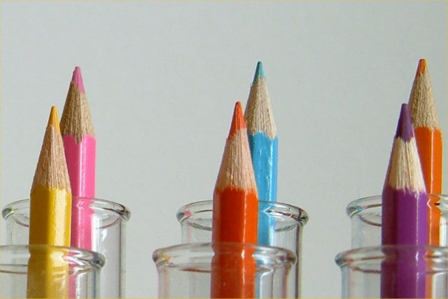
Nice idea! Very creative. Very good composition, lighting and focus. You chose an interesting angle. You also picked the right colours for each tube so that there are no mergers and the colours are on good contrast to each other. I like this photo very much.
-stephan |
|
|
|
08/22/2002 09:37:00 AM |
| Very beautiful colors. I love the angle this is at and the lighting is beautiful. You did a great job of keeping distracting glare and reflection off the glass tubes and shiny pencils both. The yellow pencil seems to have a bit more glare than the rest of the pencils. Not complaining, but I wonder why it did this. Would it have mattered if the pencil was rotated slightly cause I noticed that the flat side of all the other pencils are facing front, but the yellow pencil has a pointy corner facing forward. I also like how the background isn't pure white, but a grey-ish white. Sometimes pure white is better, but you made a great jugdement to go with the off white in this situation. Great job and good luck in the challenge. |
|
|
|
08/22/2002 08:53:00 AM |
Composition: Subject Placement, Cropping, Background6,
Technical: Focus, Exposure, Lighting, Processing5,
Challenge: Does your entry meet it?10,
Appeal: Is it Interesting, Motivating, Etc.? 4,
Total Averaged Rating6. Autool
|
|
|
|
08/21/2002 07:48:00 PM |
From my perspective:
Meets challenge:Yes
Technical:could be a little clearer, focus is a little soft
Appeal/Artistic:Very nice...I love the colors, and a good choice of background
Composition:good
Originality:good
Comments:Good luck in the challenge.
|
|
|
|
08/21/2002 12:22:00 PM |
I very much like this idea.The angle is good as well as composition. IMO - the lighting needs adjustment and the background, if supposed to be white, needs adjustment as well. If the grey was unintentional, i suggest manipulating the white balance (if possible) on your camera. Or perhaps with a black background. Personally, I have found that the white background is difficult at first, but with many many trial and errors, I think that I've gotten much better. Actually, when I first started - I didn't even realize it. I thought my photo was just fine, until someone pointed it out to me - then I compared the photo to my subject and realized that the entire coloring of the image was off. I'm say this in the assumption that this was not intended. I can tell that you had a vision - visualization. I like the way the shot is setup. good lines. Great job and effort. 7
Ruthann |
|
|
|
08/21/2002 06:03:00 AM |
you should shot on a wider angle.
good concept |
|
|
|
08/21/2002 01:53:00 AM |
| Nice color combinations. A little soft on the focus and a darker background and more even crop would give this more visual appeal. |
|
|
|
08/20/2002 06:03:00 PM |
Colourful, sort of abstract-ish, pretty. Would like a whiter background, and a more even distance between the sets of two. The middle set feels like it should be over to the left a bit. This matters (for me) on this shot because it's so highly graphical, like a repeating set.
6, Kavey |
|
|
|
08/20/2002 05:07:00 PM |
|
|
|
08/20/2002 04:48:00 PM |
| I would like to see this with the colors more vibrant and the background lighter -- playing with the levels in Photoshop (if you've got it) would help it out a lot. Otherwise, maybe stronger lighting from above? muckpond |
|
|
|
08/20/2002 11:19:00 AM |
| I think this would work better with a different background. The gray kind of mutes the colors of the pencils. |
|
|
|
08/20/2002 02:13:00 AM |
|
|
|
08/19/2002 04:41:00 PM |
|
|
|
08/19/2002 03:50:00 PM |
| Bravo! Well done, creative idea. Score 8 ~Kee |
|
|
|
08/19/2002 12:59:00 PM |
Creativity : 8
Maybe you wanted it like this but I think I would have prefer more 'sharp' colors and maybe not a grey background.
Overall 6 |
|
|
|
08/19/2002 11:56:00 AM |
| Nice idea, I guess the composition could have been worked on more. The lack of breathing space on the rightcould have been more.6 |
|
|
|
08/19/2002 10:25:00 AM |
| hmmm...i'm sure you already have about 6 comments telling you that the dof is kinda off here...focus on the back row as opposed to the front row...so i won't comment on that :P For some reason I *think* i would prefer this taken head on...the composition just seems a little off to me with the angle and the tubes being cropped out unevenly. Nice colors and focus on the pencil tips. Lisa |
|
|
|
08/19/2002 10:00:00 AM |
| Very creative, and very nice shot. I think I would have liked a little brighter backlighting to really make the colors of the pencils pop out. lhall |
|
Home -
Challenges -
Community -
League -
Photos -
Cameras -
Lenses -
Learn -
Help -
Terms of Use -
Privacy -
Top ^
DPChallenge, and website content and design, Copyright © 2001-2025 Challenging Technologies, LLC.
All digital photo copyrights belong to the photographers and may not be used without permission.
Current Server Time: 03/17/2025 01:25:59 AM EDT.