| Author | Thread |
|
|
04/25/2007 11:23:21 PM |
Greetings from the Critique Club.
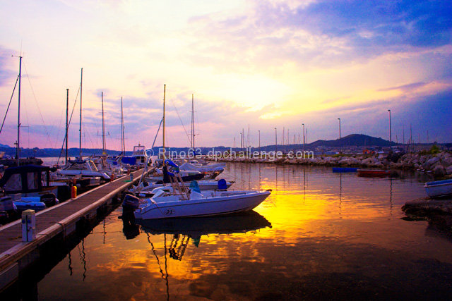
The first thing I noticed with this photo were the bright, saturated colors. They really catch the eye! Unfortunately, the expectation of a nice abstract (or perhaps surreal) photo isn't fulfulled. After the initial "wow", the subject is recognized and the colors just look unrealistic and oversaturated.
The photo is, paradoxically, both overexposed and too dark. There's just a really high dynamic range here that is very difficult to capture without special techniques.
The composition is great left-to-right. The boats are attractive and the placement of the elements gives a great impression of depth. But top-to-bottom the composition isn't well balanced. The centered horizon that's bright above and dark below just doesn't work for me, although the masts do their best to tie the photo together. I think cropping about a sixth from the top helps a lot. And perhaps a bit less from the bottom to give a panoramic format would suit this photo well.
But getting back to the original idea (or at least my original impression), I think this photo could work by taking a surreal approach: selectively darken the sky and mountains to give a sort of low key effect. Although the bright areas would still be bright, and there's far too much contrast for a true low key photo, I think the effect could be dramatic, and the "unreality" subtle enough to give the viewer the feeling of "something isn't quite right, but this sure is pretty." |
|
 Photographer found comment helpful. Photographer found comment helpful. |
Comments Made During the Challenge  |
|
|
04/24/2007 04:05:44 PM |
| Gah, I wish tht beautiful reflection had stayed present in the blown out sky. Not bad, but not the best. |
|
| Photographer found comment helpful. |
|
|
04/22/2007 10:45:18 PM |
|
| Photographer found comment helpful. |
|
|
04/21/2007 01:13:39 PM |
| How can you have a reflection of clouds that are not there!?? With other color tone too. This is just bad. |
|
| Photographer found comment helpful. |
|
|
04/20/2007 08:02:44 PM |
| The reflection color is much different than the washed out sky color |
|
| Photographer found comment helpful. |
|
|
04/20/2007 01:08:05 PM |
| The water in this image looks incredible. The tones and colors are perfect since the exposure was right on. I do think, however, that the sky is quite blown out. A split ND filter would have helped in this scene. The other thing that you could have done was shot in RAW and processed two seperate exposures: one for the sky and one for the water. Then you could have combined the two images into on using the sky from one and the water from the other. That would have made a perfect exposure where the sky and the water are equally dynamic. I still gave you a seven on this shot since the scene is so beautiful and the composition is right on. |
|
| Photographer found comment helpful. |
|
|
04/19/2007 07:05:07 PM |
| the big white spot in the sky is too blown for me, the boats are blue.. but nice image overall |
|
| Photographer found comment helpful. |
|
|
04/18/2007 09:32:02 PM |
|
| Photographer found comment helpful. |
|
|
04/18/2007 05:52:26 PM |
| Nice shot... I'm a big fan of landscape sunsets w/ boats. Saturation and white balance could be improved |
|
| Photographer found comment helpful. |
|
|
04/18/2007 02:15:30 AM |
| Good colors, but the sky is just too blown out. Overall, well done. |
|
| Photographer found comment helpful. |
Home -
Challenges -
Community -
League -
Photos -
Cameras -
Lenses -
Learn -
Help -
Terms of Use -
Privacy -
Top ^
DPChallenge, and website content and design, Copyright © 2001-2025 Challenging Technologies, LLC.
All digital photo copyrights belong to the photographers and may not be used without permission.
Current Server Time: 04/28/2025 06:00:45 AM EDT.