| Author | Thread |
|
|
09/17/2002 01:16:00 AM |
Chin up!!!! I read your post in the forum.......You have nothing to be embarrassed about. It takes a lot of moxxie to post the first time. Keep on shootin...
ps: I was second to last in my second challenge. It bent my ego a little too. ;'-D |
|
|
|
09/16/2002 12:33:00 AM |
| Believe you me...last place means you can't go any further down. I'm only going to get better...I promise. I am learning a lot about my cheap camera and am having better luck in getting photos to come out crisper. This one was taken inside where I found that lighting is very important in getting a good digital shot. I've gone outside with all my others. |
|
Comments Made During the Challenge  |
|
|
09/15/2002 01:09:00 PM |
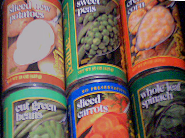
| focus + framing = better - 3 (sorry) |
|
|
|
09/15/2002 10:41:00 AM |
|
|
|
09/14/2002 09:04:00 PM |
Composition: Subject Placement, Cropping, Background5,
Technical: Focus, Exposure, Lighting, Processing5,
Appeal: Is it Interesting, Motivating, Etc.? 5,
Total Averaged Rating5. Autool
|
|
|
|
09/14/2002 08:50:00 PM |
| I'm afraid I'm just not at all crazy about this one. I don't quite understand the reasoning behind the soft focus, and the lighting is a bit questionable... |
|
|
|
09/14/2002 02:11:00 PM |
|
|
|
09/14/2002 10:34:00 AM |
hmmm
This seems to be a very bad digicam. so I will grade purely on the concept instead of technical qualities. |
|
|
|
09/13/2002 03:50:00 PM |
| I like the idea. I just wish that it was in focus. |
|
|
|
09/13/2002 01:11:00 PM |
| The thumbnail of this looks really clear, but then the full size is blurry; it almost looks like camera shake or something. Great idea, and one that i truly relate to 'cause that's where most of my veggies come from too! karmat |
|
|
|
09/13/2002 10:53:00 AM |
| the subject matter here is rather uninteresting, and it's also out of focus. a shot like this might also benefit from a straight on view with good strong 90 degree angles. it would help accentuate the repeating pattern of the cans. |
|
|
|
09/12/2002 01:46:00 PM |
| I'll give you 7 because I love the colours and the composition. I would have liked it more focussed. Good luck. |
|
|
|
09/12/2002 01:28:00 PM |
| Neat idea, but it looks like the camera was moving too much. |
|
|
|
09/12/2002 11:19:00 AM |
| Interesting idea BUT angle of shot is not to my liking and focus / colour is off. At least you used your imagination. |
|
|
|
09/11/2002 06:35:00 PM |
| The lack of focus hurts the eyes.... |
|
|
|
09/11/2002 04:23:00 PM |
|
|
|
09/11/2002 11:33:00 AM |
| if you aren't gonna submit a photo in focus... please don't feel a need to submit something. |
|
|
|
09/10/2002 11:53:00 PM |
| Is this a photo of a newspaper photo? Nice use of overdriven color. - mjcecil |
|
|
|
09/10/2002 10:59:00 PM |
| was this so out of focuse on purpose? the idea and composition are good. |
|
|
|
09/10/2002 08:43:00 PM |
| This is certainly colorful! Very good use of colors. The focus is off though. Anyway, best of luck in the challenge. Grayce...aka...Gracious |
|
|
|
09/10/2002 07:22:00 PM |
| Hey we shop in the same place! The image for me was grainy and fuzzy. |
|
|
|
09/10/2002 06:31:00 PM |
| Interesting approach to the challenge :) But the focus / lighting really hurts it for me. Also it looks like it's leaning to the left. |
|
|
|
09/10/2002 06:26:00 PM |
Since I rated this picture so poorly, I feel you deserve an explanation.
1. The picture is badly out of focus
2. The lighting is very poo--overall dark, but then glare is seen off the rims.
3. The picture has no visual appeal.
I usually try to find at least one good thing to say about the picture. Sorry. |
|
|
|
09/10/2002 03:11:00 PM |
Composition - good
Technical Aspects - fair, needs better lighting
Meets Challenge - yes
Visual Impact / Originality � fair
Other suggestions � looks under exposed and a tad blurred
A 4
Jim msp
|
|
|
|
09/10/2002 01:18:00 PM |
|
|
|
09/10/2002 01:13:00 PM |
| Wish this were in crisp focus. |
|
|
|
09/10/2002 12:05:00 PM |
|
|
|
09/09/2002 09:26:00 PM |
| I'd have preferred to see the real thing. |
|
|
|
09/09/2002 08:52:00 PM |
|
|
|
09/09/2002 04:34:00 PM |
| Not really sure where to begin. Lighting is a bit odd, focus is weird. Meets the challenge. |
|
|
|
09/09/2002 04:17:00 PM |
| Focus? Nothing is clear in this photo. Lighting isn't great. 5 Swash |
|
|
|
09/09/2002 03:31:00 PM |
| The concept here is not a bad one, but eh image quality is rather weak. I'm not sure if you were attempting to be out of focus or if it is an accident. I don't really see a reason for the lack of focus... - jmsetzler |
|
|
|
09/09/2002 02:43:00 PM |
| Would have been much better in focus! 3 Jak |
|
|
|
09/09/2002 02:11:00 PM |
| nice different take on the challenge, but the photo seems all blurred and there's a hotspot on the top left can. -- gr8photos. |
|
|
|
09/09/2002 01:29:00 PM |
| blurry, is this just from the use of a cheaper camera? It looks as if it was a picture of something on tv |
|
|
|
09/09/2002 01:22:00 PM |
| I like the angle and colors but it needs more focus. |
|
|
|
09/09/2002 10:08:00 AM |
| Too blurry for my liking. |
|
|
|
09/09/2002 09:20:00 AM |
| Great idea, but the soft focus takes a lot away from the shot... |
|
Home -
Challenges -
Community -
League -
Photos -
Cameras -
Lenses -
Learn -
Help -
Terms of Use -
Privacy -
Top ^
DPChallenge, and website content and design, Copyright © 2001-2025 Challenging Technologies, LLC.
All digital photo copyrights belong to the photographers and may not be used without permission.
Current Server Time: 03/12/2025 09:45:34 PM EDT.