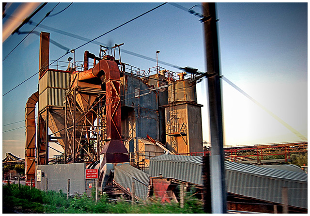
Taken as the train came up to the station in Norwich, England.
Processing:
I normally do "quick and dirty" edits in ACDSee Pro to see whether something might work, and then do the "real" editing in PSCS2. This time, I could not duplicate the edit I got in ACDSee Pro in Photoshop (I tried it about six times, out of pure obstinacy, before I gave up). So, I took the ACDSee edited JPG and finished it off in PSCS2. Processed as follows:
Initial processing for levels, shadow highlight and HSL in ACDSee Pro;
In PSCS2:
Neat image, high level pass for sharpening with some of the wires masked out to avoid haloing;
Resized
Another high level pass with more masking for the wires
Border
Saved for web
Statistics
Place: 499 out of 556 Avg (all users): 4.8655 Avg (commenters): 5.0000 Avg (participants): 4.8750 Avg (non-participants): 4.8261 Views since voting: 789 Views during voting: 166 Votes: 119 Comments: 7 Favorites: 0
Some mechanical monstrosity, shown out of any sort of context with numerous distractions obscuring the view and reflections showing up on a window between the camera and the subject. Sorry, I will agree that DPC challenges tend to be pretty narrow-minded in what sort of photo floats to the top but snapping a shot of something you happen to be passing by on a train isn't going to be interesting to most people on or off the site.
If this sort of image interests you, it begs the question why you wouldn't have gone back to it or something like it and put the effort into capturing it as you would like others to see it rather than just taking what chance gave you as you cruised by at 100kph. Free studies have a 30 day submission period after all.
Robert, these opinions are just my own. Photos that score well on this site tend to evoke some sort of strong emotion; the current free study winners clearly evoke a level of wonder, awe or tranquility with many voters.
I'm curious as to what emotion you feel your photo evokes? How is this photo different from any other photo that could be taken from a moving train moving through farmland? The scores you received are almost uniformly middle-of-the-road, which would suggest that people thought that your technicals were okay (given the difficulty of the shot) but that it didn't evoke a strong feeling either way.
Personally, it doesn't evoke any feeling from me. I don't even know what I'm looking at, except that it's agricultural. I suppose it's a grain silo. Maybe you're trying to evoke a sense of tradition? Making a comment on the decline of cooperative farming? I'm just not sure. But in the five seconds I would have given this shot when voting, none of those stand out.
I don't think that you have to be totally conventional to do well on the site, nor hit the voters over the head with your message, but it's been proven again and again that subtlety usually doesn't pay off.
I hope this makes sense. Best of luck in future challenges.
Rob:
I agree with cpanaioti. You said in the thread to not tell you to change it, just what's wrong with it. Well, the blurry pole distracts, as do the wires. I'm trying to imagine the building against a clear sky, and in the same position in the frame, and I'm liking what I'm imagining better than this.
It's also too sharpened - halos are visible in many places.
That said, sometimes you take and keep shots that mean something to you, or that you like, which is just fine. In those cases, just ignore the score. But at the same time, don't be surprised when it doesn't score too well. Remember that you're competing with people with very, very high levels of skill who are often taking great pains to set up their shots.
Colour, contrast and lighting is very good. What I find is letting the image down are the out of focus pole and wires and that the structure is very cluttered. It's hard to tell what was intended by the image (what the viewer should focus on).
Actually, that's a very good photograph considering you were on a moving train. I rather like your post processing too. However the pole with the wires & whatever the orange diagonal line in the top left hand corner is are hurting an otherwise great composition.
Good exposure. I think a faster shutter speed would have helped. Maybe also better timing to prevent the nearby pole from getting in front of the structure.