DPChallenge: A Digital Photography Contest You are not logged in. (log in or register
 
Challenge Entries
Portfolio Images
This image is not part of a public portfolio.
Get off me, man!
Get off me, man!
maknbacon


Photograph Information Photographer's Comments
Challenge: Fruits and Vegetables (Classic Editing)
Camera: Canon PowerShot G1
Location: Maple Valley, Wa
Date: Sep 7, 2002
Aperture: 5.31
ISO: 100
Shutter: 0.003992
Date Uploaded: Sep 8, 2002

N/A

Statistics
Place: 156 out of 201
Avg (all users): 4.6284
Avg (commenters): 5.4545
Avg (participants): 4.7770
Avg (non-participants): 4.4590
Views since voting: 917
Votes: 261
Comments: 11
Favorites: 0


Please log in or register to add your comments!

AuthorThread
 Comments Made During the Challenge
09/14/2002 01:19:00 PM
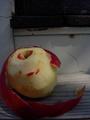
B&W needs quite a bit more contrast to really make the whites white and the blacks black. Otherwise it's a nicely framed, lit and focussed shot. 7 - floyd
09/14/2002 01:57:00 AM
I've never been good at doing a b/w or even knowing what to look for in a b/w candidate. The tonal ranges here are good, there is nothing "blown out" (just learned that term) nor unappealingly too dark. Still, I don't think the subjects were a good candidate for b/w. Technically it is good picture, but the artistic appeal is not of the caliber that would make me want to frame it.
09/13/2002 03:27:00 PM
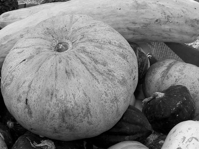
Though i like this in black and white, it seems a little flat to me. Maybe if the angle or perspective were different. Also, it seems a little too tight for me at the top. karmat
09/11/2002 09:45:00 PM
Composition: Subject Placement, Cropping, Background7,
Technical: Focus, Exposure, Lighting, Processing8,
Appeal: Is it Interesting, Motivating, Etc.? 7,
Total Averaged Rating7. Autool
09/11/2002 07:25:00 PM
I dont think B&W works too well with this photo....
09/11/2002 09:46:00 AM
nice idea, and i like the composition of it all. i'm sure you are getting this question a lot, but why b&w? pumpkins have great colors usually, and i'm wondering whether that wouldn't have looked better. but then, i haven't seen the original ... oh, and btw, i'm not universally opposed to b&w, i know there's been much discussion in the forums about that. -- gr8photos (5)
09/10/2002 01:14:00 PM
I would prefer color
09/09/2002 07:46:00 PM
I would have ranked you higher had this been in color,,,,,,,,,,,,,,,,,,it lacks the contrast needed for a strong black and white photo
09/09/2002 07:40:00 PM
Cute title. I think this shot needs more contrast, esp. between the round melon/squash and the oblong squash-thing. Color might have helped, IMO.
7 Swash
09/09/2002 12:17:00 PM
All I can really say about this photo is that my mind is begging to see it in color... - jmsetzler
09/09/2002 10:47:00 AM
nice job done with the b&w


Home - Challenges - Community - League - Photos - Cameras - Lenses - Learn - Help - Terms of Use - Privacy - Top ^
DPChallenge, and website content and design, Copyright © 2001-2025 Challenging Technologies, LLC.
All digital photo copyrights belong to the photographers and may not be used without permission.
Current Server Time: 03/12/2025 01:31:38 PM EDT.