| Author | Thread |
Comments Made During the Challenge  |
|
|
09/15/2002 11:30:00 PM |
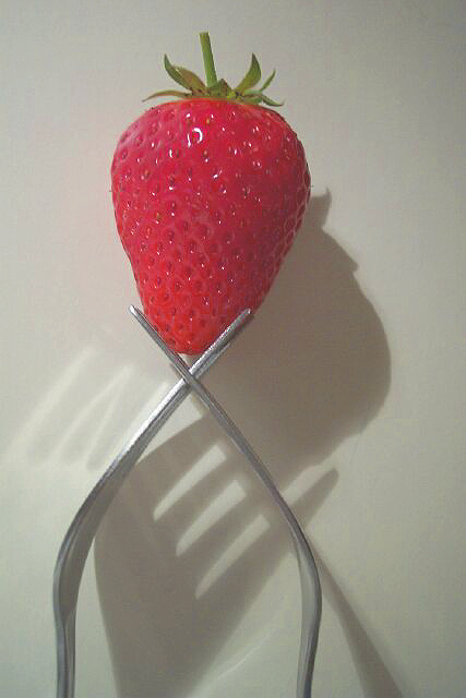
| Interesting setup, but I think the side light was not well chosen. The deep shadows are a bit distracting in my opinion. I think a frontal lighting would have been better. Also the photo seems to be tilted to the right. -stephan |
|
|
|
09/15/2002 01:43:00 PM |
| Great concept and use of shadows, however the colour and levels could have been greatly improved just by using levels & hue/saturation. |
|
|
|
09/15/2002 11:32:00 AM |
| Nice shot - love the shadows |
|
|
|
09/14/2002 08:25:00 PM |
Composition: Subject Placement, Cropping, Background7,
Technical: Focus, Exposure, Lighting, Processing8,
Appeal: Is it Interesting, Motivating, Etc.? 6,
Total Averaged Rating7. Autool
|
|
|
|
09/14/2002 02:46:00 PM |
| Nice composition... its just seems to me that it should be centred in the frame, being as symmetrical as it is. The shadows / reflections are very cool effect. |
|
|
|
09/14/2002 01:53:00 PM |
| VERY WELL DONE. Great imagination. |
|
|
|
09/14/2002 11:40:00 AM |
| Great shadows and reflection. Nice idea. |
|
|
|
09/14/2002 09:45:00 AM |
| More contrast can be helpfull. Excelent idea! |
|
|
|
09/13/2002 09:03:00 PM |
Composition - quite good
Technical Aspects - quite good
Meets Challenge - yes
Visual Impact / Originality � quite high
Other suggestions �
7
Jim msp
|
|
|
|
09/13/2002 03:18:00 PM |
| This is a very interesting shot. At first I recommended moving the forks to the middle of the frame, but then the strawberry would be off cener and teh shadows would overflow. If you find something to stick the forks in (styrofoam, etc) and take the picture without the shadows, I think that would ahve been cool. karmat |
|
|
|
09/13/2002 02:33:00 PM |
| I like the artistic qualities of this image, but think that it could be better with some lighting improvements. I think that it is the shadows that bother me a bit. FWIW, my preference would be to use more fill, increase the contrast, and then center the subject. |
|
|
|
09/13/2002 05:15:00 AM |
Interesting idea and I really like the shadows of the fork tongues but the overall composition isn't working for me.
5, Kavey |
|
|
|
09/12/2002 05:50:00 PM |
| Very creative. Love the lighting. |
|
|
|
09/12/2002 05:47:00 PM |
| love the shadows and reflections |
|
|
|
09/12/2002 05:57:00 AM |
| Nice, simple concept using the shadows well for contrast. |
|
|
|
09/12/2002 12:31:00 AM |
|
|
|
09/11/2002 09:15:00 PM |
|
|
|
09/11/2002 08:10:00 PM |
| very interesting composition :) The color looks a bit flat overall.. i think a brighter background or a darker background may set this image in motion a little better :) - jmsetzler |
|
|
|
09/11/2002 12:44:00 PM |
| I like the light/shadow effect and the concept. I'm thinking that I might have like a more "oblique" angle on the forks. lhall-7 |
|
|
|
09/11/2002 11:18:00 AM |
| interesting presentation of subject. well done!!! |
|
|
|
09/10/2002 10:57:00 PM |
| Striking composition. The lighting is a little flat, and the reds could be a bit more saturated. |
|
|
|
09/10/2002 06:57:00 PM |
| Really great idea! I wish that there were not so many shadows. It looks like you might have tried to correct that by brightening the photo. The reason I say that is because the strawberry looks kind of light, like it's almost washed out. the angle is good. I would like to have seen the forks more to the center of the photo though. Framing is good. The lighting is good for the photo. Focus and clarity are also very nice. Overall nice photo. Good luck in the challenge. ~Hbunch7187~ |
|
|
|
09/10/2002 04:33:00 PM |
Nice setup. I like the arrangement of the forks. The strawberry is very red.
9 Swash |
|
|
|
09/10/2002 01:03:00 PM |
| I think in this case centered and a bit more filling the frame would be okay, imho. Interesting idea to use the forks. Strawberry could be a bit more focused. |
|
|
|
09/10/2002 06:33:00 AM |
| This is a really great shot � and I'd have to say that it's also a first class example of how to use negative space � this would do well in next weeks challenge as well :o) The shadows, and the reflection from the fork, add interest to, and enhance, the subject. Superb shot (10) |
|
|
|
09/09/2002 11:42:00 PM |
| I like the concept. And the geometry and the shadows are appealing. 7 sjgleah |
|
|
|
09/09/2002 08:23:00 PM |
| I like the overall composition, but I find the heavy shadow of the fork to be a little distracting. |
|
|
|
09/09/2002 05:36:00 PM |
| Nice idea, but I don't really like the shadows. |
|
|
|
09/09/2002 02:44:00 PM |
|
|
|
09/09/2002 02:23:00 PM |
| I like the fork's shadow ! A bit too vertical for me. I guess it's the only way to get a strawberry to stay put though :-) |
|
Home -
Challenges -
Community -
League -
Photos -
Cameras -
Lenses -
Learn -
Help -
Terms of Use -
Privacy -
Top ^
DPChallenge, and website content and design, Copyright © 2001-2025 Challenging Technologies, LLC.
All digital photo copyrights belong to the photographers and may not be used without permission.
Current Server Time: 03/13/2025 02:35:13 AM EDT.