| Author | Thread |
|
|
09/05/2009 01:09:20 AM |
| It's really amazing how much my photography has improved in the two years I've been on this site. My last photo scored 6.0 and this was the lowest rated one in the challenge. Someone even mistook me for whiterook! |
|
Comments Made During the Challenge  |
|
|
07/29/2007 11:46:42 PM |
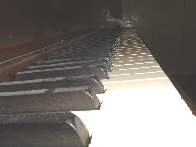
| I get the idea but the foreground is too washed out and the piano should have been dusted. The picture overall lacks contrast. Keep trying. |
|
 Photographer found comment helpful. Photographer found comment helpful. |
|
|
07/29/2007 11:36:18 PM |
| Couple of things about this shot to make it better, either really go for the off angle approach or try and get your leading lines level. Your flash really blew out the foreground keys. There are a couple of ways around this, use a tripod or set the camera on the piano, do not use flash but set your shutter speed and aperture to expose this without your flash. Low aperture and longer shutter speeds will produce some great effects. Finally, the dust on the keys isn't really doing anything for your subject. Hope this helps. |
|
| Photographer found comment helpful. |
|
|
07/29/2007 10:58:55 PM |
| i would have chosen a different angle and without the flash, but it's an interesting image--heck you can even see the dust (in a good way)- it adds character. |
|
| Photographer found comment helpful. |
|
|
07/29/2007 06:25:03 PM |
| good idea, but I do not like the dust....I wish the lighting was a little better and it was not dusty. I think that would help this photo a lot. |
|
| Photographer found comment helpful. |
|
|
07/29/2007 12:06:48 PM |
| Nice rhythm and composition. I would have scored this much higher if it wasn't so dusty. The dust on the piano is one thing, but the dim "dusty" look to the image does not appeal to me. |
|
| Photographer found comment helpful. |
|
|
07/29/2007 01:56:28 AM |
| Too hazy for me! I love the picture but with the haze and the too subdued depth of color are a detraction and a half. Could have added a couple of points to the score otherwise. Sorry!! (6) |
|
| Photographer found comment helpful. |
|
|
07/28/2007 01:48:36 PM |
| the lighting seems a little harsh in this shot, good idea and perspective! |
|
| Photographer found comment helpful. |
|
|
07/28/2007 12:33:27 PM |
|
| Photographer found comment helpful. |
|
|
07/28/2007 09:22:39 AM |
| Great interpretation of the theme and I think your idea deserved that you put a little more time taking the shot: the dust is really bothering, it is turning blacks into grays and the front part is overexposed from the use of flash. |
|
| Photographer found comment helpful. |
|
|
07/25/2007 05:36:36 PM |
| This shot looks a little too much like a snap shot. I think a different angle and changing it to a high contrast B&W would have helped. Keep on taking pics, the more you do the better you'll get. |
|
| Photographer found comment helpful. |
|
|
07/25/2007 03:17:11 AM |
|
| Photographer found comment helpful. |
|
|
07/24/2007 10:47:52 PM |
| Poor lighting, composition, contrast. Meets the challenge, otherwise has pretty much no appeal at all. |
|
| Photographer found comment helpful. |
|
|
07/24/2007 08:37:56 AM |
This was a very quick and hastily set up picture, wasn't it?
The dust on the keys is not removed, lighting on the back part really does not exist, while the front is blown out. The background (white door) does not really add anything, except bouncing back some of the light. I do like the perspective of your view. I would have set up the picture such that tops of the white keys would be parallel to the right border of your photo creating a vanishing point in the upper right corner. Not using flash but 2-3 simple lamps to lighten up the entire length of the keys. Just an idea and some suggestions. |
|
| Photographer found comment helpful. |
|
|
07/23/2007 11:17:08 PM |
| Maybe a little soft but love the angle re this rhythm challenge..... |
|
| Photographer found comment helpful. |
|
|
07/23/2007 07:06:41 PM |
|
| Photographer found comment helpful. |
|
|
07/23/2007 01:55:02 PM |
| nice idea, but the lighting makes the balance of the image a little difficult to find. perhaps a shot without seeing the far end of the piano would be 'cleaner'? |
|
| Photographer found comment helpful. |
|
|
07/23/2007 02:03:47 AM |
| Ohh most voters will hate the blown highlights and lack of contrast. But I love this image :-) |
|
| Photographer found comment helpful. |
Home -
Challenges -
Community -
League -
Photos -
Cameras -
Lenses -
Learn -
Help -
Terms of Use -
Privacy -
Top ^
DPChallenge, and website content and design, Copyright © 2001-2025 Challenging Technologies, LLC.
All digital photo copyrights belong to the photographers and may not be used without permission.
Current Server Time: 03/14/2025 01:02:51 PM EDT.