| Author | Thread |
Comments Made During the Challenge  |
|
|
09/21/2002 10:49:00 AM |
| Apologies for not leaving a proper comment. Please email me if you'd really like one. I�ve voted this image a 6. Kavey |
|
|
|
09/20/2002 03:34:00 PM |
| I like this very much. Meets the challenge in a very pleasing way. Nice job! Good luck in the current challenge! Grayce aka Gracious |
|
|
|
09/20/2002 02:24:00 PM |
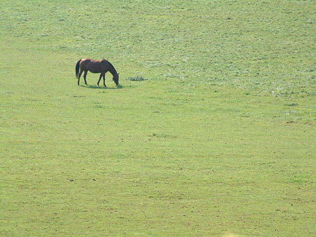
| Good use of space. Focus is a bit soft on the horse, but that may be a limitation of the camera/lens. |
|
|
|
09/19/2002 01:22:00 PM |
This is an interesting photo overall, but it's a little over exposed I believe... I think that a polarizer or a neutral density filter would assist here quite a bit...
Meets Challenge: 10
Technical Merit: 4
Artistic Merit: 5
Creative Merit: 5
WOW Factor:3
Score: 5 - JMSetzler |
|
|
|
09/19/2002 11:18:00 AM |
|
|
|
09/19/2002 08:58:00 AM |
| Love this composition - good use of rule of thirds. I like your chosen size ratio of subject to background. |
|
|
|
09/18/2002 03:29:00 PM |
| The field looks so big, and the horse looks so small . . . . Good framing I think, and I like the simplicity of the colors, etc. karmat |
|
|
|
09/18/2002 03:05:00 AM |
| This makes the horse seem lonely. Good job in using the negative space. 7 |
|
|
|
09/18/2002 01:56:00 AM |
Composition: 5
Lighting: 5,
Appeal: 5, Total Rating 5 Sulamk
|
|
|
|
09/17/2002 09:48:00 AM |
| Could be a great photo if the horse had better lighting and the green was more saturated. |
|
|
|
09/16/2002 09:18:00 PM |
| Very good composition, simple and effective use of negative space. It appears that lighting was a bit harsh so as to make for a difficult exposure. Couldn't order a nice little puffy cloud huh? |
|
|
|
09/16/2002 08:13:00 PM |
| Great use of neg. space. There is a tan spot near the bottom right of the photo that kind blemishes the neg space, however does not distract from the photo. The angle and framing are really nice. The lighting seems perfect for this photo. The focus and clarity are in the right spot. Overall really nice. Good luck in the challenge. ~hbunch7187~ |
|
|
|
09/16/2002 05:24:00 PM |
| if possible, I would prefer the sun to be shining on the picture side of the horse that way you wouldn't lose any of the details of it but would have been able to darken the grass. little too bright for me. great concept |
|
|
|
09/16/2002 04:38:00 PM |
| Good work, color is flat. Good luck. Score 6 Justine |
|
|
|
09/16/2002 10:20:00 AM |
| I think this is a good representation of negative space. The picture, however, looks a bit over exposed. Perhaps some post processing could have brought the colors out a bit. |
|
|
|
09/16/2002 10:13:00 AM |
| All that space is doing is showing that there is a large distance between you and the horse. I'd prefer you to use the space to give a sense being is a expansive place, like when you get out into barren places, and the land and sky feel so big and huge. |
|
|
|
09/16/2002 08:26:00 AM |
| There's a little too much going on inside your negative space but it's there... |
|
Home -
Challenges -
Community -
League -
Photos -
Cameras -
Lenses -
Learn -
Help -
Terms of Use -
Privacy -
Top ^
DPChallenge, and website content and design, Copyright © 2001-2025 Challenging Technologies, LLC.
All digital photo copyrights belong to the photographers and may not be used without permission.
Current Server Time: 03/12/2025 02:46:55 PM EDT.