| Author | Thread |
|
|
02/10/2004 05:59:04 AM |
Missed this in the votes - only 5.8? Guess it's not colourful enough for the masses...
Great shout with unjustified score.
|
|
 Photographer found comment helpful. Photographer found comment helpful. |
|
|
02/04/2004 12:03:32 AM |
| this was my fav...should have placed MUCH higher! great pic, G. |
|
| Photographer found comment helpful. |
Comments Made During the Challenge  |
|
|
02/03/2004 01:35:25 AM |
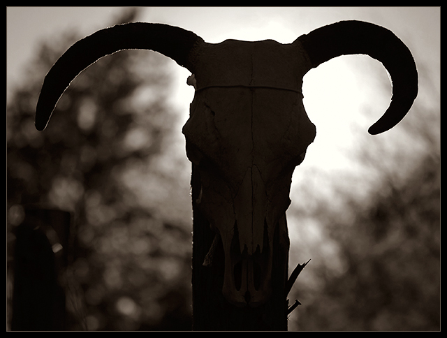
| i like the dof, but wish there was less shadows and more details in the subject. the positioning right in front of the light hurts my eyes when I try to look at the ram. O_o |
|
| Photographer found comment helpful. |
|
|
02/01/2004 08:25:49 AM |
| This grabbed my attention straight away. Very atmospheric |
|
| Photographer found comment helpful. |
|
|
01/31/2004 08:18:13 AM |
| I THOUGHT AREAS WAS A RAM NOT A BULL OR COW? |
|
|
|
01/30/2004 05:11:42 PM |
Mmm Goat on a stick!
I think it needs some fill in light to bring out the skull detail BUT I really like the halo effect of the backlighting which you wouldn't want to lose.
Basically it's just that the shape of the goat on a stick silhouette doesn't really appeal so much to me as a shape... |
|
| Photographer found comment helpful. |
|
|
01/30/2004 04:57:47 PM |
| I like the simplicity of the silhouette, but the trees in the background kind of detract from it. Adds complexity to a simplistic subject. Only my opinion though. Good luck! |
|
| Photographer found comment helpful. |
|
|
01/29/2004 06:04:54 PM |
| Really like this alot! Love the lighting and also don't mind that some detail is lost in the face because I think there's just enough there to draw you into the picture to really look at it. Excellent subject! |
|
| Photographer found comment helpful. |
|
|
01/29/2004 08:59:45 AM |
|
| Photographer found comment helpful. |
|
|
01/29/2004 07:40:51 AM |
| Nice - wish I could see some more details on the skull on the lower part... |
|
| Photographer found comment helpful. |
|
|
01/28/2004 03:52:08 PM |
| this is really archaic looking (in a good way i mean!), very paegan and dark! super shot |
|
| Photographer found comment helpful. |
|
|
01/28/2004 03:34:57 PM |
| Wavers between light and shadow. I think it would have been better one way or the other... that is, more light, or make it darker for more contrast. B&W was a good choice for this. |
|
| Photographer found comment helpful. |
|
|
01/28/2004 12:35:03 PM |
| I love this backlit effect but would have liked to see some detail in the skull/post. |
|
| Photographer found comment helpful. |
|
|
01/28/2004 11:10:11 AM |
|
| Photographer found comment helpful. |
|
|
01/28/2004 08:47:17 AM |
| terrific silouette ... love the lighting. |
|
| Photographer found comment helpful. |
|
|
01/28/2004 01:35:35 AM |
| This is cool... and a great idea, just wish there hadn't been the black behind it and only sun so you got a true sillouhette all the same wonderful idea! Great use of natural light and tying it into the challenge. very cool 8 |
|
| Photographer found comment helpful. |
|
|
01/28/2004 12:31:36 AM |
Wowza..... me likes!
Whiskey |
|
| Photographer found comment helpful. |
Home -
Challenges -
Community -
League -
Photos -
Cameras -
Lenses -
Learn -
Help -
Terms of Use -
Privacy -
Top ^
DPChallenge, and website content and design, Copyright © 2001-2025 Challenging Technologies, LLC.
All digital photo copyrights belong to the photographers and may not be used without permission.
Current Server Time: 03/12/2025 03:28:15 PM EDT.