| Author | Thread |
Comments Made During the Challenge  |
|
|
02/06/2004 04:01:25 PM |
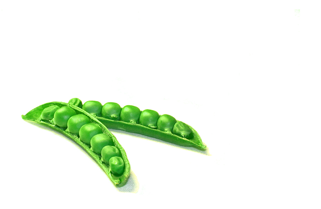
very nice but the peas look a bit over exposed
I like the concept though |
|
|
|
02/05/2004 03:30:54 PM |
| Very nice, good use of negative space. Also, not putting your subject in the centre works well. Seems a tiny wee bit bright, but I do really like this! 10 |
|
|
|
02/05/2004 07:40:36 AM |
| I had this idea but couldin't have pulled it off as well as you did. Nicely composed, great color. |
|
|
|
02/04/2004 03:16:42 PM |
| Very simplistic but it works... one of my favourites in this challenge because of an original idea and composition. |
|
|
|
02/04/2004 01:41:54 PM |
| Very good idea, love the fact that the shot is simple and on a white background |
|
|
|
02/03/2004 05:36:49 PM |
| The white background is ltlle too stark for my taste. |
|
|
|
02/03/2004 02:51:40 PM |
| I like it a lot. Strength in simplicity. Would be my choice for second. |
|
|
|
02/03/2004 10:02:59 AM |
| Though your shot is crisp with great color, I would like to see a bit less negative space. |
|
|
|
02/03/2004 05:28:28 AM |
| Simple and effective, good color and light. I feel that a "third" would have made a more dynamic composition, but nevertheless, this shot really stands out. |
|
|
|
02/02/2004 09:05:04 PM |
|
|
|
02/02/2004 08:08:56 PM |
| very clean. simple elegant and the idea is well presented |
|
|
|
02/02/2004 07:02:45 PM |
| Nice work, maybe a bit heavy on the filters, but no doubt this is done well. |
|
|
|
02/02/2004 06:48:16 PM |
| I almost did this one too, nice execution. |
|
|
|
02/02/2004 06:05:48 PM |
| like the shot...not sure about the negative space..little too much white ...nice shot though |
|
|
|
02/02/2004 12:30:54 PM |
| The peas look like a painting. The whole shot is very bright (i like bright colors). |
|
|
|
02/02/2004 11:54:41 AM |
| Greate no, not great ... I mean PERFECT picture ... and you know that perfect is best so that must mean 10 ;) |
|
|
|
02/02/2004 11:19:42 AM |
| I think a little bit tighter crop would look better, not much, maybe a touch off the top and right side. I love the picture though! Great color and contrast. There just seems like a little too much space for my eye to investigate. Good luck!! |
|
|
|
02/02/2004 07:46:10 AM |
| nice use of white space. I had the same idea go through my head but had no subject to work with at the time ;) you did a great job. |
|
|
|
02/02/2004 06:29:21 AM |
| So simple and so effective |
|
|
|
02/02/2004 04:55:22 AM |
| Composition within the empty frame works well, could see this used in an advertisement. Nicely done! |
|
|
|
02/02/2004 02:34:05 AM |
| Beutifull, just squeeses under my radar for fitting the mandate and slots right into a 10 |
|
|
|
02/02/2004 02:22:35 AM |
| Nice take on the challenge theme. I like the space concept here. The peas are all tightly bunched up, so you've given a lot of white to balance. Nice. The peas, though, look a bit plasticky. 8 |
|
|
|
02/02/2004 01:19:23 AM |
| Sharp focus and details. Great color of the peas and of the pod. I like the lighting although it seems a bit bright for my tastes. One minor detail I would have like to see fixed is the shadow of the pods. Looks like this was taken on a bedsheet as I see texture in the details. Perhaps you could have cloned out the lines to make a smooth shadow. Also, I think a little could have been cropped off the top but it's an excellent picture nonetheless and great use of negative space. 8. |
|
|
|
02/02/2004 12:58:36 AM |
|
Home -
Challenges -
Community -
League -
Photos -
Cameras -
Lenses -
Learn -
Help -
Terms of Use -
Privacy -
Top ^
DPChallenge, and website content and design, Copyright © 2001-2025 Challenging Technologies, LLC.
All digital photo copyrights belong to the photographers and may not be used without permission.
Current Server Time: 03/12/2025 02:01:40 AM EDT.