| Author | Thread |
|
|
09/24/2002 11:34:00 AM |
| This is the kind of picture that doesn't do well on crappy monitors. I think that explains a lot of your poor marks. I wish you had submitted the cropped versions I saw afterwards. I bet you do too. |
|
 Photographer found comment helpful. Photographer found comment helpful. |
|
|
09/23/2002 11:35:00 AM |
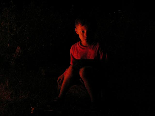
| My negative space kind of goes without saying. It was too much space. I was sort of torn between cropping or not. My wife's opinion was to not crop. So I left it as is. I like it better this way. But I think I might have done better if I did. I was lost Sat. before the challenge. I figured if I did turn something in, it would be something too produced and sort of cheesy. I happened to be at a bonfire and saw this shot. I ordered my son to stay still and had my daughter get the camera. I took about 10 of him, fixing the exposure after each one. I took about 10 of my middle son too who is naturally a little more photogenic, but also much more antsy. I saw this one and knew it was the one. Problem solved. Then I submitted it and it started off pretty well. And as the days passed, it went down and down and down. I was hoping to do a little better than 160th place. Thats not something to be proud of. But I like the shot regardless of what you all think. I did get a couple of nice comments too. Thanks to everyone for looking at this. Thanks for the commenters, good, bad or otherwise. I need the comments.... I really don't know what I'm doing good or bad, so they are really beneficial. |
|
Comments Made During the Challenge  |
|
|
09/21/2002 11:14:00 PM |
| I really like the lighting on this. And he looks so innocent sitting there. karmat |
|
|
|
09/20/2002 03:43:00 PM |
| Nice shot, and hard for some cameras to do. I know I have tried fireside shots and with not very good luck. I really like the expression on his face. |
|
| Photographer found comment helpful. |
|
|
09/20/2002 01:47:00 PM |
that little splash on the left could be cropped out, its a little distracting (i thought my monitor was smudged at first)
nice photo, good implementation of theme |
|
| Photographer found comment helpful. |
|
|
09/20/2002 11:49:00 AM |
Atmospheric and the darkness portrays that feeling at campfires, when the scary stories are being shared, and the fire represents safety from the uknown terrors in the darkness. A little too grainy and soft focus for my tastes.
6, Kavey |
|
| Photographer found comment helpful. |
|
|
09/19/2002 06:26:00 AM |
| you could have added some more lights |
|
|
|
09/18/2002 03:38:00 PM |
| definately got some neg space, however the subject its self almost blends in with the neg space, not really jumping out at us. I think it might have a higher visual impact if the neg space wasn't cluttered to the left. however, being a night/dark shot you did a great job. my camera would have pooped out and left colored speckles all over the place. lol. the angle and framing are very nice, and the clarity is good. Overall nice photo. Good luck in the challenge. 5 ~hbunch7187~ |
|
| Photographer found comment helpful. |
|
|
09/18/2002 08:08:00 AM |
| I think it would have helped your negative space to move the subject off to one side a little - probably to the right. Nice concept and good colour. I think I'd have tried to bring the subject up a little brighter too. 7 - floyd |
|
| Photographer found comment helpful. |
|
|
09/17/2002 09:47:00 AM |
| Yes, neg space, but it doesn't have the wow that I'm needing. |
|
|
|
09/17/2002 08:53:00 AM |
| Nite shots are tough. Good try. Maybe a longer exposure, and the boy not looking straight into the lens. .. then crop to put the boy on one of the thirds (make him further right). |
|
| Photographer found comment helpful. |
|
|
09/17/2002 02:23:00 AM |
Composition: I would prefer a little less central 6 Lighting: good 5,
Appeal: 6, Total Rating 6 Sulamk
|
|
|
|
09/16/2002 08:16:00 PM |
| I love this photo! Two toned, black & red. Everything about it is compelling. The child's facial expression perfectly adds to the mood. joanns 10! |
|
| Photographer found comment helpful. |
|
|
09/16/2002 04:30:00 PM |
| Very nice. Try moving the kid to one side of the image to help create more mood |
|
| Photographer found comment helpful. |
|
|
09/16/2002 04:06:00 PM |
| Little more focus ? IMHO, but I don't dislike this. Score 6 Justine |
|
|
|
09/16/2002 03:55:00 PM |
| Good job! Good luck in the challenge. Grayce aka Gracious |
|
|
|
09/16/2002 03:31:00 PM |
|
|
|
09/16/2002 01:26:00 PM |
| This is a very interesting shot. There is plenty of negative space :) The soft focus here, i believe, is VERY effective in this situation. When I look at this image, I am drawn directly to the child's face. The interest that i find there is the fact that it is split between light and dark right down the middle. I believe that this would have been a GREAT composition of just the head and shoulders of this boy in the firelight :) As the image is presented here, I would have preferred a minor movement of the subject to the right side of the frame to make the entire image more off balance :) - very nice shot and great idea :) - jmsetzler |
|
| Photographer found comment helpful. |
|
|
09/16/2002 06:03:00 AM |
| the shot is great though the scan isnt the best i have seen, the picture looks all dotty |
|
|
|
09/16/2002 01:31:00 AM |
| This shot isn't bad. I don't know but I just kinda don't like the red in this. 5 |
|
|
|
09/16/2002 12:53:00 AM |
| Tough lighting situation to get good focus. Did you use a tripod and tell him to FREEZE! :o) Might be good with him not centered. The really cool part is his face. You don't need all the extra space around him. His face alone has enough neg space. |
|
| Photographer found comment helpful. |
Home -
Challenges -
Community -
League -
Photos -
Cameras -
Lenses -
Learn -
Help -
Terms of Use -
Privacy -
Top ^
DPChallenge, and website content and design, Copyright © 2001-2025 Challenging Technologies, LLC.
All digital photo copyrights belong to the photographers and may not be used without permission.
Current Server Time: 03/13/2025 01:01:28 AM EDT.