| Author | Thread |
|
|
02/10/2004 10:47:12 AM |
Greetings from the critique club.
This is a very creative shot. I like the angle a lot!
Some of the problems have been pointed out during the challenge.
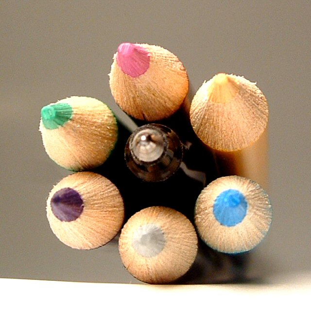
The focus is a bit off. How to correct that, I understand wanting to try this as a macro to capture all that lovely detail in the pencils. But at this angle it makes it very hard to have everything in focus.
This may have been a time to use a shallower DOF and concentrate on one or two pencils and the pen. Because the pen is smaller it would need to be more inline with the pencil(s) you choose to focus on.
Now, having said that, if you choose a different angle of approach, say straight on, your DOF would not be such an issue. I could see, having the pen stick out just a bit further than the pencils, with the DOF on it so that it was the main focal point. Your title is Pen and Pencils, so that would play into it being the centre of attention.
Just my thoughs, I hope they help. Feel free to email me if you have any questions.
JC |
|
 Photographer found comment helpful. Photographer found comment helpful. |
Comments Made During the Challenge  |
|
|
02/06/2004 04:07:12 PM |
| Nice idea but I dont like the white at the bottom of the image a maybe a little out of focus |
|
| Photographer found comment helpful. |
|
|
02/04/2004 11:53:28 AM |
| The unusual angle makes this shot. Very nice. I also like the colors, which create an interesting composition. |
|
| Photographer found comment helpful. |
|
|
02/04/2004 05:45:25 AM |
| would have been a nice shot but for the bottom also a bit of noise reduction using Neat Image would help |
|
| Photographer found comment helpful. |
|
|
02/04/2004 01:51:10 AM |
| OK, for the theme, though to me, pen and pencil seem a bit more contrasting than going together (you use a pen OR pencil), but that's a bit nit-picky. :) The setup is really interesting - how you got the bundle balanced on the one pencil. DOF is a bit too narrow I think, since the tip of the pen is out of focus (again stressing the contrast, not the togetherness, though I assume unintentionally). Lighting and use of colors are good. I think this would really stand out in a "one of these things doesn't belong here" type competition. Still, a good entry. |
|
| Photographer found comment helpful. |
|
|
02/03/2004 05:44:13 PM |
| the colored pencils made the touch...but then pen in the middle needs to be in focus just a tad more |
|
| Photographer found comment helpful. |
|
|
02/03/2004 05:54:22 AM |
| This picture has potential. I would have liked a slightly greater DOF and the bottom of the picture takes away from the symetry. |
|
| Photographer found comment helpful. |
|
|
02/03/2004 02:47:37 AM |
Really good idea here, I like how you have set up the pen to be inside the pencils. Your DOF is good, like how the front is the main focus point.
It does however seem a little blurred. If you have a macro mode on your camera that may have helped, or move your camera back a bit. A good shot though! 7 |
|
| Photographer found comment helpful. |
|
|
02/02/2004 09:22:08 PM |
|
| Photographer found comment helpful. |
|
|
02/02/2004 07:59:12 PM |
| White at bottom is a bit distracting and not sure why the pen is out of focus and the pencils are not.... must be closer to the camera. Nice textures and colors |
|
| Photographer found comment helpful. |
|
|
02/02/2004 07:07:13 PM |
| The lighting is way too harsh and the shadow is tilted to the right. I think your light washed out the colors leaving this a little flat. I like the idea and composition. Do you shield your lights? Try that with some foil/plastic bag, or a light towel. |
|
| Photographer found comment helpful. |
|
|
02/02/2004 01:11:38 PM |
| Very interesting idea. Sharp line between light and dark on left is out of balance with gradual change on right. Pencil colors are a bit overexposed. Good composition, just needs more color definition. |
|
| Photographer found comment helpful. |
|
|
02/02/2004 12:19:51 AM |
| I like shallow depth of field in shots but there needs to be one focal point that is pin sharp and here, everything is too soft. the base upon which the pencils are resting is also a distraction. |
|
| Photographer found comment helpful. |
Home -
Challenges -
Community -
League -
Photos -
Cameras -
Lenses -
Learn -
Help -
Terms of Use -
Privacy -
Top ^
DPChallenge, and website content and design, Copyright © 2001-2025 Challenging Technologies, LLC.
All digital photo copyrights belong to the photographers and may not be used without permission.
Current Server Time: 03/12/2025 01:15:26 AM EDT.