| Author | Thread |
|
|
09/23/2002 12:01:00 AM |
| Nice. Beautiful tones. Without the title I thought it was a shot of a tunnel. Interesting photo; makes me want to kep looking. That's an accomplishment. 7, just-married |
|
Comments Made During the Challenge  |
|
|
09/22/2002 03:03:00 PM |
|
|
|
09/22/2002 12:30:00 PM |
| nice capture, but it could have been more symmetric. nonetheless, 8 |
|
|
|
09/21/2002 11:44:00 PM |
| Cool effect. It took me a while ot figure out the perspective here, and I'm still not sure. :-) karmat |
|
|
|
09/21/2002 05:04:00 PM |
|
|
|
09/21/2002 10:21:00 AM |
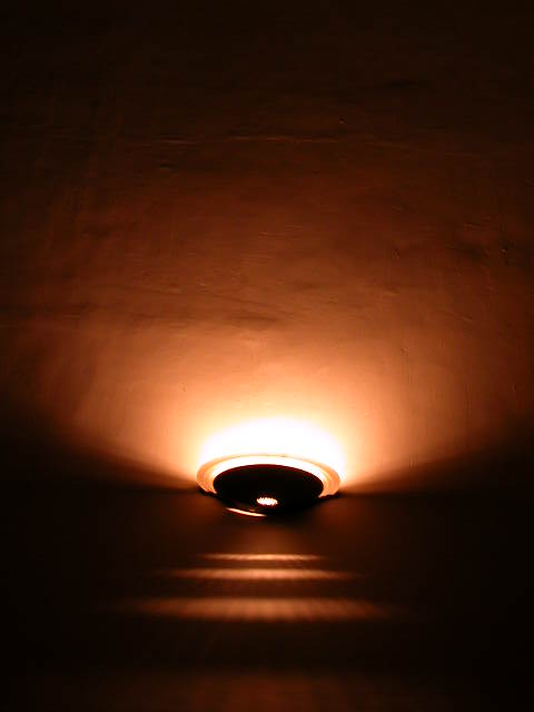
This makes an interesting abstract of light, shadow and texture. The shapes created are quite interesting.
6, Kavey |
|
|
|
09/20/2002 02:47:00 PM |
|
|
|
09/20/2002 04:51:00 AM |
| In a non-DPC context, this would be stronger if you could clone out the small glare at the bottom of the lamp, but I like the overall concept/design. |
|
|
|
09/19/2002 12:12:00 PM |
| nice abstract. i like the play of light and shadow in this shot. (9) ~mcmurma |
|
|
|
09/19/2002 10:32:00 AM |
|
|
|
09/18/2002 03:45:00 PM |
|
|
|
09/17/2002 02:06:00 AM |
Composition: 6 Lighting:5,
Appeal: 6, Total Rating 6 Sulamk
|
|
|
|
09/17/2002 12:06:00 AM |
|
|
|
09/16/2002 06:10:00 PM |
| OK. The subject (as stated in the title) is the light on the wall. That would make the neg. space the darkness then. right? I like the 3 lines of light on the wall toward the bottom middle of the photo. The angle and framing are good. clarity is also good. the lighting is what makes this photo what it is! overall nice job. good luck in the challenge. ~hbunch7187~ |
|
|
|
09/16/2002 12:43:00 PM |
| Good composition. Great color. Distracted by the lower diffraction from the sconce, though. Good marks, overall. |
|
|
|
09/16/2002 02:20:00 AM |
| Good idea. I like the shadows in this one. 5 |
|
Home -
Challenges -
Community -
League -
Photos -
Cameras -
Lenses -
Learn -
Help -
Terms of Use -
Privacy -
Top ^
DPChallenge, and website content and design, Copyright © 2001-2025 Challenging Technologies, LLC.
All digital photo copyrights belong to the photographers and may not be used without permission.
Current Server Time: 03/12/2025 02:38:03 PM EDT.