| Author | Thread |
|
|
09/23/2002 10:38:00 AM |
| Congrats karmat!!!! Great work! |
|
 Photographer found comment helpful. Photographer found comment helpful. |
Comments Made During the Challenge  |
|
|
09/22/2002 11:30:00 PM |
| For being a set up shot, I think the leveling could be better. Ther is a very strong horizontal line, and it's making a bit of a left turn. Overall though, the photo is very nice. I do like it a lot, and the use of neg. space is clear, and very good. 8 good luck in the challenge. ~hbunch7187~ |
|
| Photographer found comment helpful. |
|
|
09/22/2002 11:00:00 PM |
| Seems like an obvious idea when someone else thinks of it...well conceived and well executed. |
|
| Photographer found comment helpful. |
|
|
09/22/2002 10:53:00 PM |
| Very well composed, though I would've had your model clench a bit harder to show struggle. |
|
| Photographer found comment helpful. |
|
|
09/22/2002 04:45:00 PM |
| A perfect concept, Simple, Artsy, a masterful work of art. - good luck - Gotcha |
|
| Photographer found comment helpful. |
|
|
09/22/2002 04:03:00 PM |
| The black and white contrast is a great effect, nice job! |
|
| Photographer found comment helpful. |
|
|
09/22/2002 03:06:00 AM |
| Nice shot. I like the contrast in this one. 7 |
|
| Photographer found comment helpful. |
|
|
09/21/2002 12:19:00 PM |
I like this simple image a lot. It's a great rule of thirds example and yet still original and punchy.
7, Kavey |
|
| Photographer found comment helpful. |
|
|
09/20/2002 02:40:00 PM |
| cute! Good luck in the challenge. Grayce aka Gracious |
|
| Photographer found comment helpful. |
|
|
09/20/2002 12:34:00 PM |
|
| Photographer found comment helpful. |
|
|
09/20/2002 06:57:00 AM |
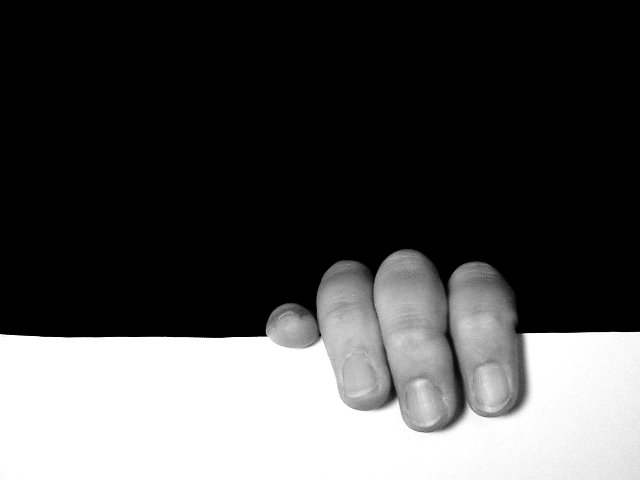
| To me, this photo poses a friendly debate over which of the spaces is the negative space. It's the debate that keeps me interested, after the initial grin at this poor soul clinging to the edge. I would have preferred a perfectly even white area (the line is a tiny bit crooked), but the general composition is right on. Good lighting (maybe a bit more contrast?) and good use of negative space up top ... it weighs down on top of the fingers. 8 |
|
| Photographer found comment helpful. |
|
|
09/19/2002 11:27:00 PM |
| Wonderful division of space. |
|
| Photographer found comment helpful. |
|
|
09/19/2002 09:15:00 PM |
| Very original. I like the composition. ... makes you wonder what is behind the person hanging on. 8 |
|
| Photographer found comment helpful. |
|
|
09/19/2002 02:01:00 PM |
Interesting :) This is definitely a unique interpretation of the challenge... The focus on the fingers is a tad soft for my taste, and the flash appears to have washed out some of the finer detail in the fingers.
Meets Challenge: 10
Technical Merit: 4
Artistic Merit: 5
Creative Merit: 7
WOW Factor: 5
Score: 6 - JMSetzler |
|
| Photographer found comment helpful. |
|
|
09/19/2002 10:48:00 AM |
|
| Photographer found comment helpful. |
|
|
09/19/2002 10:21:00 AM |
| What can i say??? I love this..awesome clean lines...contrast...use of negative space...great idea! Lisa |
|
| Photographer found comment helpful. |
|
|
09/19/2002 09:58:00 AM |
| Very clever - really jumps out at you! I wish there was no thin grey line around our photos when they are displayed for us to judge - yours would otherwise be even more powerful, I think! - not your fault, I know! :) I do like the use of neg space here - a good example of where a single color is more effective in a negative space than a texture or other treatment. |
|
| Photographer found comment helpful. |
|
|
09/19/2002 01:33:00 AM |
Defines the concept of the topic.... besides it gives us the Whole grayscale on 3 elements.... Clear and Precise... I like it a lot
Victor R Ojeda |
|
| Photographer found comment helpful. |
|
|
09/18/2002 08:36:00 PM |
|
| Photographer found comment helpful. |
|
|
09/18/2002 08:35:00 PM |
| Not only does the image use negative space to show the image, the hand comes out of negative space itself. A douple meaning negative space--gets my 10 for this alone although it is not necessarily the most pleasing image to look at. |
|
| Photographer found comment helpful. |
|
|
09/18/2002 05:48:00 PM |
| Well done - I like the contrast between black and white! |
|
| Photographer found comment helpful. |
|
|
09/18/2002 11:15:00 AM |
| Good image, it really looks like someone is holding on for dear life, good use of negative space |
|
| Photographer found comment helpful. |
|
|
09/17/2002 11:50:00 AM |
| Great idea! Would love to see a more homogenous tone across the white area. 8 |
|
| Photographer found comment helpful. |
|
|
09/17/2002 06:43:00 AM |
|
| Photographer found comment helpful. |
|
|
09/16/2002 11:40:00 PM |
| great image. good use of negative space. the hand seems a bit out of focus, but barely noticable. cmcvety. |
|
| Photographer found comment helpful. |
|
|
09/16/2002 11:36:00 PM |
| I like. Something I would buy. Nice! - bamaster (8) |
|
| Photographer found comment helpful. |
|
|
09/16/2002 10:24:00 PM |
| I like this. It is almost a bit startling. Very unique . |
|
| Photographer found comment helpful. |
|
|
09/16/2002 08:02:00 PM |
| Simply Great! I would like to see the white edge evened out, other than that 9. |
|
| Photographer found comment helpful. |
|
|
09/16/2002 07:35:00 PM |
|
| Photographer found comment helpful. |
|
|
09/16/2002 04:35:00 PM |
| Very good! I like the contrast between the black and white |
|
| Photographer found comment helpful. |
|
|
09/16/2002 02:07:00 PM |
| I wish I could see more stress on the fingers... as if they were really hanging on. Right now it looks like they are just resting. |
|
| Photographer found comment helpful. |
|
|
09/16/2002 12:34:00 PM |
| Another of these well taken shots, good framing etc, but ultimately my feeling is: Whats the point? Theres nothing really to hold any interest, nothing really being shown to me. |
|
| Photographer found comment helpful. |
|
|
09/16/2002 11:11:00 AM |
Excellent!!! Nice contrast and composition (I almost detect that the 'line' is uneven - could be me). I like this very much - grrrreat work 10
Ruthann (update)
Neg Space: Does it make a difference? yes |
|
| Photographer found comment helpful. |
|
|
09/16/2002 11:00:00 AM |
| Clever, Creative. Good b&w. Score 8 Justine |
|
| Photographer found comment helpful. |
|
|
09/16/2002 09:02:00 AM |
Composition: Good 6
Lighting: 5
Appeal:6, Total Rating6 Sulamk
|
|
| Photographer found comment helpful. |
|
|
09/16/2002 09:02:00 AM |
| classical yin and yang ......... I can hear the sound of one hand clapping. |
|
| Photographer found comment helpful. |
|
|
09/16/2002 12:57:00 AM |
| This is a good use of negative space and it is an interesting photo. Well-done! |
|
| Photographer found comment helpful. |
Home -
Challenges -
Community -
League -
Photos -
Cameras -
Lenses -
Learn -
Help -
Terms of Use -
Privacy -
Top ^
DPChallenge, and website content and design, Copyright © 2001-2025 Challenging Technologies, LLC.
All digital photo copyrights belong to the photographers and may not be used without permission.
Current Server Time: 03/12/2025 02:46:26 PM EDT.