| Author | Thread |
|
|
10/13/2007 01:38:06 PM |
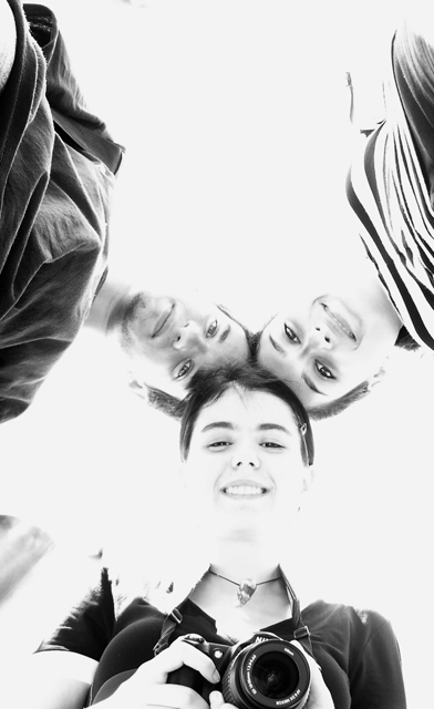
| i think the girl's camera is the best part of the photo since it gives the mirror effect of the photography vs. the photographed |
|
 Photographer found comment helpful. Photographer found comment helpful. |
Comments Made During the Challenge  |
|
|
10/09/2007 01:26:36 PM |
|
| Photographer found comment helpful. |
|
|
10/08/2007 11:29:21 PM |
| I like this perspective (I do this with bridal parties), and I don't mind the blown highlights here. I don't know how it would look in print, but I like the shot here. I would've gotten rid of the camera on the bottom, though (distracting). |
|
| Photographer found comment helpful. |
|
|
10/08/2007 09:17:54 PM |
| it look a waaaaay over exposed |
|
|
|
10/08/2007 05:10:07 PM |
| OK, the blown highlight work well here. Good idea, very fun picture, I'd expect this to finish quite well.. 7 |
|
| Photographer found comment helpful. |
|
|
10/08/2007 11:45:54 AM |
| Like the HiPass treatment |
|
| Photographer found comment helpful. |
|
|
10/08/2007 10:47:28 AM |
Neat idea and technique. Sorry, it doesn't do it for me. The camera she's holding is distracting. Maybe a tighter cropping of just the 3 heads would do better.
Good luck. |
|
|
|
10/08/2007 01:24:19 AM |
| I really like the composition. The deliberate overexposure to wash out background is overdone. |
|
|
|
10/07/2007 07:30:50 PM |
| too blown out for my taste, realize it was probably done for effect, but do not like it personally, so 5 |
|
|
|
10/07/2007 03:52:39 AM |
|
| Photographer found comment helpful. |
|
|
10/06/2007 10:45:50 PM |
| A bit washed out but maybe just enough detail. Good choice to go B&W. Is that Jupiter in by her right shoulder? |
|
|
|
10/06/2007 06:54:40 PM |
|
| Photographer found comment helpful. |
|
|
10/06/2007 04:36:18 PM |
| Unusual perspective and high-key treatment work to make this more interesting. |
|
| Photographer found comment helpful. |
|
|
10/05/2007 09:48:40 PM |
|
| Photographer found comment helpful. |
|
|
10/05/2007 07:12:25 PM |
| Too harsh for my liking. Cool shot anyway! |
|
|
|
10/05/2007 04:19:44 PM |
| extremely over exposed to no effect imho |
|
|
|
10/05/2007 09:18:01 AM |
| Nice composition, but would have been stronger if cropped square imo. Furthermore, a big part of your pic is blown out. This can in some case be functional, but here it destroys the form of the faces, which I wouldn't like to see in a portrait (4) |
|
|
|
10/05/2007 04:25:53 AM |
| nice idea, not sure about the camera, it breaks the symmetry |
|
|
|
10/05/2007 01:01:54 AM |
| I like the high key white. gives a sense of I don't know, waking. |
|
| Photographer found comment helpful. |
|
|
10/04/2007 10:09:56 PM |
| I don't really like the high key look here. I don't understand t(h)e title. Otherwise a nice, creative picture. |
|
|
|
10/04/2007 09:56:34 PM |
| Appears very blown-out, otherwise it would have been good. |
|
|
|
10/04/2007 11:50:23 AM |
| over exposed - too bad it's a cute shot |
|
|
|
10/04/2007 05:16:59 AM |
| I like the high key you've used here, it works for me. |
|
| Photographer found comment helpful. |
|
|
10/04/2007 03:08:03 AM |
| different..prpbably a bit too blown out for my liking but that is only my opinion |
|
|
|
10/03/2007 04:35:08 PM |
| I like the composition of the shot, but the exposure is not to my liking. |
|
|
|
10/03/2007 11:49:17 AM |
| I like the high key, POV os good too. |
|
| Photographer found comment helpful. |
|
|
10/03/2007 10:54:45 AM |
| Nice shot. I like the lighting, though I would've voted it higher if you had cropped out the camera. It distracts from the rest of the shot. |
|
|
|
10/03/2007 10:49:23 AM |
| Cute high key. I think it would work better if the camera were not in the shot or ALL of them were holding cameras. |
|
Home -
Challenges -
Community -
League -
Photos -
Cameras -
Lenses -
Learn -
Help -
Terms of Use -
Privacy -
Top ^
DPChallenge, and website content and design, Copyright © 2001-2025 Challenging Technologies, LLC.
All digital photo copyrights belong to the photographers and may not be used without permission.
Current Server Time: 03/11/2025 02:13:24 PM EDT.