| Author | Thread |
Comments Made During the Challenge  |
|
|
09/29/2002 05:15:00 PM |
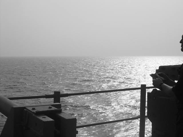
| I would like to see more of the man on the right, very intriguing photo. rcrawford |
|
|
|
09/29/2002 11:49:00 AM |
Composition: Subject Placement, Cropping, Background6,
Technical: Focus, Exposure, Lighting, Processing6,
Appeal: Is it Interesting, Motivating, Etc.? 6,
Total Averaged Rating6. Autool
|
|
|
|
09/28/2002 10:44:00 PM |
| I would have liked to have seen either more or less of the guy on the right. It seems a little distracting to have only half of him there. |
|
|
|
09/27/2002 09:21:00 AM |
| interesting shot :) I like the sun glare on the water quite a bit... compositionally, I think you should have included more of the person on the right side of the frame... having the face sliced as it is here seems a bit odd... good shot :) = 7 - setzler |
|
|
|
09/26/2002 09:15:00 PM |
| I like it, but would like to see a TEENY bit more of the person's face. |
|
|
|
09/26/2002 08:40:00 PM |
| I think the figure on the right should be included more, or eliminated. While framing the shot, the object on the left could be seen less than the figure. |
|
|
|
09/26/2002 12:33:00 PM |
| I would have liked to see a little bit more of the man's face - maybe about half his head. Great Shot. |
|
|
|
09/26/2002 08:26:00 AM |
| not framed properly, but had potential. good start. |
|
|
|
09/25/2002 07:17:00 PM |
| I don't really get your title....does it have something to do with the man that is almost cropped out of the photo? (also a problem to me) 6 Swash |
|
|
|
09/24/2002 04:34:00 PM |
| Perhaps more of the body on right. Interesting. JEM |
|
|
|
09/24/2002 03:30:00 PM |
| Nice idea. However, I would like to see a bit more of the profile on the right. The way it is looks a bit odd. I see a profile and no neck. Sort of like a head floating into the picture. Black and white works well. |
|
|
|
09/23/2002 03:23:00 PM |
| I would have liked to c a little more (or nothing at all) of the face |
|
|
|
09/23/2002 11:37:00 AM |
| For me personally I'd of liked more of the guy to the right. Either more or none at all. I don't think he adds much here and is distracting. Over all I love the shot, the b&w is very good as is the reflecting water. Score 8 Justine |
|
|
|
09/23/2002 09:30:00 AM |
| The light on the sea is very nice. I'd like to have seen either more of the person, or not at all. The very little showing makes me feel something is cut off. What is the object on the left? Perhaps if more of that were included it would enhance the theme. Your horizon is nice and even. So often people unitentionally tilt it. Like ME!!! Good job! Good luck in the challenge. Grayce aka Gracious |
|
|
|
09/23/2002 01:40:00 AM |
| Ive been there before.. I feel for you. Nice shot. What ship is this? -byetko |
|
|
|
09/23/2002 01:39:00 AM |
| Great photo, but I wish wish the person on the right was either included more or not at all. |
|
|
|
09/23/2002 12:43:00 AM |
| The man and object need to be in or out of the photo. It's distracting:( I think it would rate much higher if you just fixed that |
|
Home -
Challenges -
Community -
League -
Photos -
Cameras -
Lenses -
Learn -
Help -
Terms of Use -
Privacy -
Top ^
DPChallenge, and website content and design, Copyright © 2001-2025 Challenging Technologies, LLC.
All digital photo copyrights belong to the photographers and may not be used without permission.
Current Server Time: 03/13/2025 03:44:55 PM EDT.