| Author | Thread |
Comments Made During the Challenge  |
|
|
09/29/2002 02:37:00 PM |
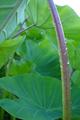
| This is a great invitation to your corner of the world, but I fail to visualize your corner of the world |
|
|
|
09/28/2002 11:18:00 PM |
| I love the colours and textures in this. Nice work! 10 - lisae |
|
|
|
09/28/2002 11:22:00 AM |
|
|
|
09/27/2002 06:53:00 PM |
| I enjoyed the contrasts of the textures and colors! |
|
|
|
09/27/2002 09:05:00 AM |
Composition: Subject Placement, Cropping, Background7,
Technical: Focus, Exposure, Lighting, Processing9,
Appeal: Is it Interesting, Motivating, Etc.? 7,
Total Averaged Rating8. Autool
|
|
|
|
09/25/2002 07:58:00 PM |
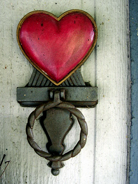
| Very nice colors and textures. I like the composition as well. Only thing I do not like is the title but it does not impact my notation. 8. Lionel |
|
|
|
09/25/2002 03:49:00 AM |
| Lovely subject and composition. I would however, crop out the dark edge on the left and take out that twig on the right (IMO). Overall a fantastic homely photo - 9 :) |
|
|
|
09/24/2002 11:03:00 PM |
| One of my favorite shots this week...great job..what would I have done differently? Well, if possible, I would get rid of whatever those dark lines are on the lower left, and, if possible, I would try and get a bit more of the blue on the right...but, what do I know :) -9 zadore |
|
|
|
09/24/2002 01:43:00 PM |
|
|
|
09/24/2002 09:53:00 AM |
| That something in the bottom left is distracting. |
|
|
|
09/24/2002 08:31:00 AM |
| I love this photo. I love the meaning and I love the subject. It has that Americana red white and blue that just works ! Shiiizzzam |
|
|
|
09/24/2002 06:12:00 AM |
| Love this shot, although it lacks that *something* that would make me rate it higher. Can't say that there is anything I would do differently though! Moderate to high visual impact for me. lhall-8 |
|
|
|
09/24/2002 03:38:00 AM |
| Would have been better centered in the image. But maybe there was something to the left which you didn't want to include. |
|
|
|
09/24/2002 12:25:00 AM |
| I don't doubt it was intentional, but the off center crop doesn't seem to add anything |
|
|
|
09/23/2002 03:43:00 PM |
| Good job, excellent title |
|
|
|
09/23/2002 03:25:00 PM |
| At first, I thought hey what's that blue edge doing there. Bet that should've been cropped out. Now I like it more and more. The knocker is stunning. The framing is exactly right...even with the blue edge. It's beautiful and beautifully done. 9 crisa58 |
|
|
|
09/23/2002 01:53:00 PM |
This pic is a little off center on the cropping but has a very familiar feel to it....Nice work mom i give it a ten!
Melissa |
|
|
|
09/23/2002 01:19:00 PM |
| Would of liked the right cropped tighter.....still I like this, .....it's homey. Good luck. Score 7 Justine |
|
|
|
09/23/2002 02:08:00 AM |
| To me the little bit of blue on the right is distracting but I still like the photo, nice color. |
|
|
|
09/23/2002 01:52:00 AM |
| Nice details -- great colors, too! |
|
|
|
09/23/2002 12:38:00 AM |
| I think this is a very good image, but the strip on the right side of the frame is a bit distracting from your subject... - jmsetzler |
|
Home -
Challenges -
Community -
League -
Photos -
Cameras -
Lenses -
Learn -
Help -
Terms of Use -
Privacy -
Top ^
DPChallenge, and website content and design, Copyright © 2001-2025 Challenging Technologies, LLC.
All digital photo copyrights belong to the photographers and may not be used without permission.
Current Server Time: 03/12/2025 12:51:28 PM EDT.