| Photograph Information |
Photographer's Comments |
Challenge: Design & Engineering (Advanced Editing I)
Camera: Olympus C-750UZ
Location: My living room
Date: Mar 3, 2004
Aperture: 8.0
ISO: 50
Shutter: 1/2 second
Galleries: Studio, Advertisement
Date Uploaded: Mar 3, 2004
|
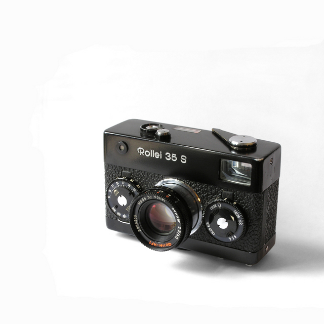
A tribute to the Rollei 35 or 'baby Rollei', my first camera which I still use. In design terms it was a classic because of its size, its unorthodox design (shutter and apertire controls, hot shoe on the base etc.) and its quality. It remains, arguably, the best quality compact film camera ever produced.
This shot is my first attempt at a 'studio' photograph. I've seen plenty on DPC and felt I need to try it out. I'm quite pleased with the result. I don't care how it fares in the voting - I like it! I would appreciate any comments on the technical aspects of shooting this kind of subject. As I examined the various shots, I became aware of so many details - lighting, colour casts, reflections, tone etc. - it's been a great learning experience.
Photo was shot next to a window and post shot editing included cloning dust spots, extending the white background, desaturating and blurring the shadows, slight sharpening and adjusting the levels. |
| Author | Thread |
Comments Made During the Challenge  |
|
|
03/14/2004 09:59:43 PM |
| Nice at first glance, but there is a LOT of evidence of touch-up work in the white background. |
|
 Photographer found comment helpful. Photographer found comment helpful. |
|
|
03/14/2004 12:46:30 PM |
I can see some odd marks around the camera. Are thos eraser marks?
Where it goes from hard white, to a lighter dirtier white. |
|
| Photographer found comment helpful. |
|
|
03/14/2004 06:31:56 AM |
| Simple and effective. I would have liked to see the entire shadow to the right. Seems to be cut off. |
|
| Photographer found comment helpful. |
|
|
03/13/2004 07:47:34 PM |
| Take out the shadow and this would be very nice. |
|
| Photographer found comment helpful. |
|
|
03/12/2004 04:55:05 PM |
| In my opinion this shows me the creativity in of the camera manufacturers but not yours - it's just sitting there like a sales catalogue photo and therefore doesn't, for me, create an image that appeals in it's own right. |
|
| Photographer found comment helpful. |
|
|
03/10/2004 05:27:00 PM |
| Good composition, nice contrast, very bright clear white...good job |
|
| Photographer found comment helpful. |
|
|
03/08/2004 11:24:01 PM |
| "Negative space" is supposed to enhance the subject, but I don't it does in this case for some reason. I'm not sure why, but my brain is telling me this. :D |
|
| Photographer found comment helpful. |
|
|
03/08/2004 09:36:15 PM |
| interesting choice of cropping...I would like to see it a little closer to the bottom right and widen the negative space...but thats just me :)... nice shot though |
|
| Photographer found comment helpful. |
|
|
03/08/2004 07:49:54 PM |
| Nice sharp pic. Great lighting, soft shadows. Make a great piece of advertising. |
|
| Photographer found comment helpful. |
|
|
03/08/2004 04:43:02 PM |
| Interesting camera, good textures, nice detail, quite sharp. It's fine as it is, but you could have also tried either bouncing light on the right or adding another light there to lighten the edge of the camera and try and get rid of the long shadow going off frame. |
|
| Photographer found comment helpful. |
|
|
03/08/2004 04:40:39 PM |
|
|
|
03/08/2004 10:15:27 AM |
|
|
|
03/08/2004 01:56:49 AM |
| hmmm... welll.... fine image. .. doesn't really capture my attention. |
|
| Photographer found comment helpful. |
Home -
Challenges -
Community -
League -
Photos -
Cameras -
Lenses -
Learn -
Help -
Terms of Use -
Privacy -
Top ^
DPChallenge, and website content and design, Copyright © 2001-2025 Challenging Technologies, LLC.
All digital photo copyrights belong to the photographers and may not be used without permission.
Current Server Time: 03/15/2025 03:01:37 AM EDT.