| Author | Thread |
Comments Made During the Challenge  |
|
|
04/14/2002 10:02:00 PM |
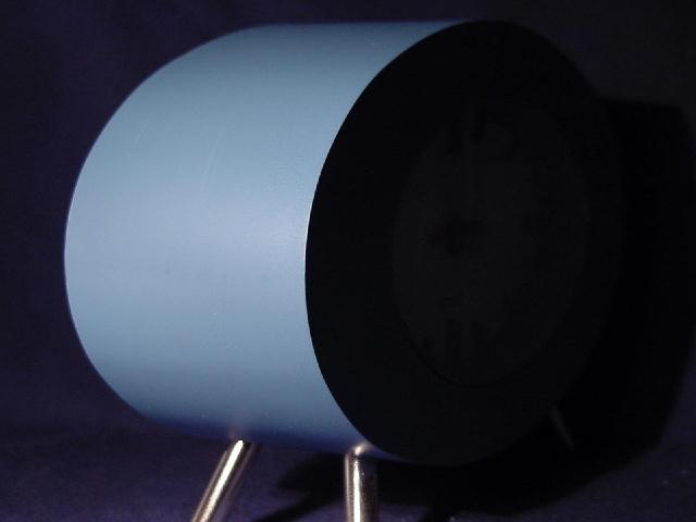
| Intesting photo. Is it a clock? |
|
|
|
04/14/2002 07:23:00 PM |
|
|
|
04/14/2002 03:58:00 AM |
| I like the simple composition here. Makes a statement.....don't know quite what it is....... :) |
|
|
|
04/13/2002 10:48:00 PM |
| I have one of these. Wish I had thought of it. |
|
|
|
04/13/2002 02:15:00 PM |
|
|
|
04/10/2002 01:51:00 PM |
| nice curves but can't help looking into dark areas for more detail - presumably you did not want to show detail there? |
|
|
|
04/10/2002 12:38:00 PM |
| The right leg needs some cleaning. :) I would have pulled the top of the clock away from the edge of the picture just a little. |
|
|
|
04/10/2002 10:08:00 AM |
| Very nice, but why not a vertical composition? The negative space doesn't entirely work here, IMO. |
|
|
|
04/10/2002 08:32:00 AM |
| Good focus and shadowing. |
|
|
|
04/09/2002 07:08:00 PM |
| I see the curve, but it doesn't really do anything for me. Sorry. |
|
|
|
04/09/2002 11:33:00 AM |
| Great balance of lighting contrasts |
|
|
|
04/09/2002 11:15:00 AM |
| i love ikea. to bad the front legs are out of focus. |
|
|
|
04/09/2002 09:16:00 AM |
|
|
|
04/09/2002 07:45:00 AM |
| Great lighting effect and color |
|
|
|
04/09/2002 03:19:00 AM |
| Good idea, but the colors are sort of bland with not much going on. |
|
|
|
04/08/2002 09:19:00 PM |
| nice blue curve, but what is it? The right half of the picture is way too dark. Either lighten that part up or crop it out. |
|
|
|
04/08/2002 08:53:00 PM |
| Nice lighting, neat photo even if I have no idea what this is... |
|
|
|
04/08/2002 08:52:00 PM |
| Nice use of light and dark. What is it? |
|
|
|
04/08/2002 04:35:00 PM |
Hmm... what is it? It almost plays tricks with the eyes.
Great photo. :) |
|
|
|
04/08/2002 04:16:00 PM |
| I'm not sure if the surface has a texture or not, but the clarity of the nearest edge is superb. |
|
|
|
04/08/2002 02:49:00 PM |
|
|
|
04/08/2002 01:21:00 PM |
| This is a very interesting curve. If I am correct, this is a clock. I can barely see the face and the hands in the dark part of the image. Maybe a little more or a little less light on this side of the image would have created a more interesting shot... |
|
|
|
04/08/2002 11:12:00 AM |
| Is it something you sit on? I can't even tell how big it is from the shot. It seems a little out of focus as well. |
|
|
|
04/08/2002 08:43:00 AM |
|
|
|
04/08/2002 12:37:00 AM |
| this is really cool! i like the starkness. |
|
|
|
04/08/2002 12:13:00 AM |
| Love the curve, hate the legs. |
|
Home -
Challenges -
Community -
League -
Photos -
Cameras -
Lenses -
Learn -
Help -
Terms of Use -
Privacy -
Top ^
DPChallenge, and website content and design, Copyright © 2001-2025 Challenging Technologies, LLC.
All digital photo copyrights belong to the photographers and may not be used without permission.
Current Server Time: 03/12/2025 04:03:34 PM EDT.