| Author | Thread |
Comments Made During the Challenge  |
|
|
04/14/2002 07:32:00 PM |
| can't wait to find out where this is. nice framing |
|
|
|
04/13/2002 12:54:00 PM |
Nice shot! good focus. I've visited that park before, it was fun to see it in the contest.
|
|
|
|
04/12/2002 10:22:00 AM |
| I love framing photos :) ... you probably noticed when u got home, but this is slightly tilted |
|
|
|
04/11/2002 12:37:00 PM |
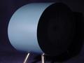
| did you try taking this shot with the circle smack dab in the middle of the frame? I'd try to darken the exposre as well, overcast skies are a pain to work with. |
|
|
|
04/10/2002 11:52:00 AM |
| This is a great photo, I don't know what you could have done to seperate the sky from the roof, but its just too bright. |
|
|
|
04/10/2002 08:37:00 AM |
| Nice framing but not sharp. |
|
|
|
04/10/2002 08:35:00 AM |
| Good framing center of focus |
|
|
|
04/10/2002 08:14:00 AM |
| I really like this. Dramatic frame |
|
|
|
04/09/2002 08:36:00 PM |
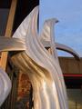
| nice idea, and nice curves. Too bad the sky and roof are washed out. Could of used some "levels" adjustment to bring out the darks a bit more. |
|
|
|
04/09/2002 04:08:00 PM |
| Great idea, humorous title, and good execution. Unfortunately, my eyes are lead to the building rather than the the nice curves. |
|
|
|
04/09/2002 12:30:00 PM |
| nice shot! I like the shadows and the light on the rock wall. The building in the back is not in focus, plus not quite centered. Nice concept of the theme! |
|
|
|
04/09/2002 09:56:00 AM |
| This is a bit overexposed at the top. |
|
|
|
04/09/2002 08:03:00 AM |
|
|
|
04/09/2002 06:18:00 AM |
|
|
|
04/08/2002 09:22:00 PM |
| Interesting stonework ... might try playing a bit with the reflections in the polished portion too ... because of the darkness of the stonework, your sky was a bit overexposed. |
|
|
|
04/08/2002 08:51:00 PM |
| Nice curve, would have been better if you took it at a different time of day ( early morning or evening ) could have gotten some color to the sky insted of bleached out. |
|
|
|
04/08/2002 07:35:00 PM |
| neat picture. not a lot i would change. |
|
|
|
04/08/2002 04:36:00 PM |
| good idea, a lot overexposed |
|
|
|
04/08/2002 04:08:00 PM |
|
|
|
04/08/2002 03:51:00 PM |
| Good positioning - the gap at the top of the piece stabs into the curves, yet you can't see the faces of the gap. |
|
|
|
04/08/2002 03:08:00 PM |
| Great photo. Is it a little lopsided? |
|
|
|
04/08/2002 01:12:00 PM |
| Great Concept. However, nothing seems to be truely in focus. |
|
|
|
04/08/2002 11:13:00 AM |
| I feel the sidewalk could've been better centered inside the sculpture. Otherwise a fine photograph. |
|
|
|
04/08/2002 09:20:00 AM |
| I like your choice of subjects for the curves challenge. The amount of light in your photo is very high and maybe a polarizer or a neutral density filter of some sort would have helped some. The top of the building in the background is washed out wiht light and the definition is not quite where I would like to see it... Your 'eye' for the challenge is very good :) |
|
|
|
04/08/2002 08:46:00 AM |
| Horizon seems slightly tilted. You could have been a bit tighter on the curves too. |
|
|
|
04/08/2002 07:06:00 AM |
|
|
|
04/08/2002 12:33:00 AM |
| Ouch! This shot is very washed-out. I can't even make out the roof of the building, or the reflections in the rock. Try turning down the white balance on your auto mode. |
|
Home -
Challenges -
Community -
League -
Photos -
Cameras -
Lenses -
Learn -
Help -
Terms of Use -
Privacy -
Top ^
DPChallenge, and website content and design, Copyright © 2001-2025 Challenging Technologies, LLC.
All digital photo copyrights belong to the photographers and may not be used without permission.
Current Server Time: 03/12/2025 05:50:32 PM EDT.