| Author | Thread |
Comments Made During the Challenge  |
|
|
04/01/2008 12:34:00 PM |
|
|
|
03/31/2008 10:56:53 PM |
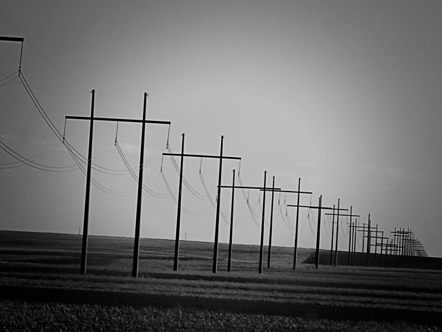
| A good shot, but the dark around the edges is a little annoying. |
|
 Photographer found comment helpful. Photographer found comment helpful. |
|
|
03/31/2008 07:17:11 PM |
| I like that you put this in black and white. I think it adds a lot of value in the picture. |
|
| Photographer found comment helpful. |
|
|
03/31/2008 09:33:40 AM |
| Would like to see this on a straight horizontal. |
|
| Photographer found comment helpful. |
|
|
03/31/2008 09:27:23 AM |
| the lines in this photo define the positive characteristics of this image. |
|
| Photographer found comment helpful. |
|
|
03/31/2008 05:06:29 AM |
| I think this will do better if you straighten up the horizon |
|
|
|
03/31/2008 01:21:34 AM |
| Great idea, but it would work better if the horizon was straight. |
|
| Photographer found comment helpful. |
|
|
03/30/2008 05:52:54 PM |
| nice shot i think making then horizon strait would give a little bit more to this photo but i love the b/w nice job. |
|
| Photographer found comment helpful. |
|
|
03/29/2008 09:59:02 PM |
|
|
|
03/29/2008 10:41:44 AM |
| This reminds me of drives to my Grandparent's home in a very stark area of Kansas. Lovely conversion and great lines. |
|
| Photographer found comment helpful. |
|
|
03/28/2008 10:48:15 AM |
| Prefer a leveled horizon, this would also correct the verticals. CRop tighter (do not need so much sky) to emphasize the patterns more |
|
|
|
03/28/2008 06:11:03 AM |
| Not a lot of interest. Cool pattern, but common, everyday view. |
|
|
|
03/27/2008 02:17:52 PM |
| I like the vignetting, it adds mood |
|
| Photographer found comment helpful. |
|
|
03/27/2008 09:56:17 AM |
| The tilting doesn't look so good here but i like the b & w compo. a lot |
|
| Photographer found comment helpful. |
|
|
03/26/2008 10:06:33 PM |
| I wish you had straightened the horizon. Other than that, very nice shot. |
|
| Photographer found comment helpful. |
|
|
03/26/2008 11:29:36 AM |
| I like the tilt and the march of the poles into the distancee. 7 |
|
| Photographer found comment helpful. |
|
|
03/26/2008 10:28:50 AM |
| Good idea for this challenge however I think it would do better if the tilt were either corrected or more deliberate. As it is it just looks like a mistake. |
|
| Photographer found comment helpful. |
|
|
03/26/2008 09:46:45 AM |
| I like the choice of black and white. Maybe if the black fade on the sides wasn't there it could be better. good shot |
|
| Photographer found comment helpful. |
Home -
Challenges -
Community -
League -
Photos -
Cameras -
Lenses -
Learn -
Help -
Terms of Use -
Privacy -
Top ^
DPChallenge, and website content and design, Copyright © 2001-2025 Challenging Technologies, LLC.
All digital photo copyrights belong to the photographers and may not be used without permission.
Current Server Time: 03/18/2025 01:25:39 AM EDT.