| Author | Thread |
Comments Made During the Challenge  |
|
|
05/02/2004 05:36:17 PM |
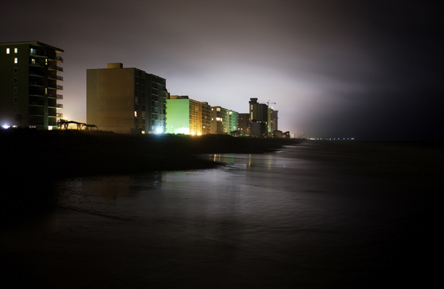
| Kind of a cool feel with the gray tones of this shot. I would correct the tilt. |
|
|
|
05/01/2004 10:56:39 PM |
| I love the quality of the light in the sky. |
|
|
|
05/01/2004 05:48:00 PM |
| Love the colors in the sky. Nicely done, but did you consider cropping a bit closer on the right -- not much, just enough to bring the central lighted area over more toward the third line. |
|
|
|
05/01/2004 03:31:39 PM |
| I wonder how this might have looked with a tighter crop... The darkness on the right really pulls my eyes away from the beautifully captured building all the way to the left. I love the highlights of the terraces. Nice image |
|
|
|
05/01/2004 11:46:52 AM |
| i think you'll get dinged for sharpness, but the lighting and composition and great. |
|
|
|
04/30/2004 08:51:50 PM |
| The mood is so unique, and it hits me perfectly. |
|
|
|
04/30/2004 04:56:28 PM |
| nice highlights but why is it dark on the right |
|
|
|
04/29/2004 03:53:00 PM |
| Superbe long exposure, I like how you composed it too, those buildings are not so interesting, but I guess you didn't made them :) |
|
 Photographer found comment helpful. Photographer found comment helpful. |
|
|
04/28/2004 05:55:59 PM |
| Very unusual light, I like it ;-) |
|
|
|
04/27/2004 04:54:43 PM |
Composition: Subject Placement, Cropping, Background 8
Technical: Focus, Exposure, Lighting, Processing 8
Appeal: Is it Interesting, Motivating, Etc.? 8
How well does it meet the challenge: 10
Total Averaged Rating 8 Autool
|
|
|
|
04/27/2004 12:38:12 PM |
| Eerie and cool. One of the best cityscapes in this challenge. |
|
|
|
04/27/2004 11:44:56 AM |
| Strange light, with so much darkness around the edges. Nothing really interesting to look at. Would not attract many tourists in my opinion. |
|
|
|
04/27/2004 02:46:00 AM |
| Ooooh, this is awesome I really like how smooth and metalic it all feels |
|
|
|
04/27/2004 12:16:01 AM |
| beautiful and simple-looks like florida-probably not |
|
|
|
04/26/2004 03:31:48 PM |
| The nighttime exposure is done very well, but I don't care for the darker areas at the right side or the bottom of the frame. They make the whole thing feel a bit out of balance to me. |
|
|
|
04/26/2004 03:28:29 PM |
| the darkness from the right side overpowers the far better elements shown in the lighter portion |
|
|
|
04/26/2004 06:00:10 AM |
| Great shot, I like how the edges get darken. |
|
Home -
Challenges -
Community -
League -
Photos -
Cameras -
Lenses -
Learn -
Help -
Terms of Use -
Privacy -
Top ^
DPChallenge, and website content and design, Copyright © 2001-2025 Challenging Technologies, LLC.
All digital photo copyrights belong to the photographers and may not be used without permission.
Current Server Time: 03/12/2025 04:57:47 PM EDT.