| Author | Thread |
|
|
09/14/2004 07:14:51 PM |
i like the home-made remedy for the lighting solutions! good shot. i would've taken the brand name out of the shot if possible. the black is off, but its probably just my monitor. great work!
|
|
|
|
09/14/2004 04:23:43 PM |
| I think you should try this in black and white. |
|
|
|
05/27/2004 09:13:34 AM |
Hi John:
This shot came up in forums as we typed in random image numbers. You win! LOL
Interesting shot, and I really like reading how you accomplished it.
Cheers!
Karen |
|
Comments Made During the Challenge  |
|
|
10/27/2002 07:56:00 PM |
| This woulda been good ths coming week too! |
|
|
|
10/24/2002 10:02:00 PM |
| the light source is distracting or uninteresting or something. |
|
|
|
10/24/2002 12:30:00 PM |
| Really nice job. 9 smshats |
|
|
|
10/24/2002 12:18:00 PM |
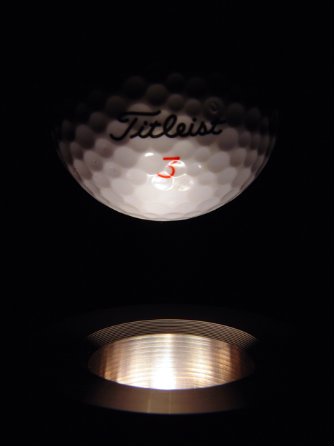
| Excellent lighting, love the ridges on the "tee" and the knobbly bits on the ball. Gonna have to mark this up 1 'cos it gets better every time I see it. |
|
|
|
10/24/2002 09:43:00 AM |
| Great shot! Love the creativity (but have I seen this concept before? :P) I wonder if it woudln't look even better if you had softened the light a bit to eliminate the harsh reflection around the 3. One of my favs this week :) 10 Lisa |
|
|
|
10/23/2002 04:36:00 PM |
| Good shot for the challenge. Well done. |
|
|
|
10/23/2002 01:54:00 PM |
| this gets a 9 - sojourner |
|
|
|
10/23/2002 10:11:00 AM |
Very creative.
Vote8
Sonifo |
|
|
|
10/22/2002 10:49:00 AM |
| cool illusion ;-) have ya tried the new Nike balls? they are awesome-8 |
|
|
|
10/22/2002 12:27:00 AM |
| Very clean. Very professional. Great technically. Subject doesn't have a lot of pull for me, but it is an excellent use of light. 9 ~indi |
|
|
|
10/21/2002 05:56:00 PM |
| Ah yes. I love golf. Sadly, the season is almost over. Nice composition. 8 |
|
|
|
10/21/2002 03:46:00 PM |
| nice idea. still, uninspiring. very dark. 4 |
|
|
|
10/21/2002 03:10:00 PM |
| Striking photo. 7 kathleenm |
|
|
|
10/21/2002 02:41:00 PM |
| Great lightning. Good exposure. One of my favourites this week. Well done! /carsten |
|
|
|
10/21/2002 01:09:00 PM |
| how do you think of this stuff? ; ) would it have been better to have overexposed your highlight a little bit if it had meant the overall scene would be lighter? mag99 |
|
|
|
10/21/2002 03:26:00 AM |
|
|
|
10/21/2002 03:00:00 AM |
| Creative! Your picture came up after the "The Time" shot for me...LOL No, seriously, very clear photo and well executed. About the only thing that I would do differently is turn the golf ball around where the Titleist logo wasn't showing. A golf ball is very distintive and would have been cool to have the texture without the distraction of the writing. Just my thoughts....9 |
|
Home -
Challenges -
Community -
League -
Photos -
Cameras -
Lenses -
Learn -
Help -
Terms of Use -
Privacy -
Top ^
DPChallenge, and website content and design, Copyright © 2001-2025 Challenging Technologies, LLC.
All digital photo copyrights belong to the photographers and may not be used without permission.
Current Server Time: 03/12/2025 08:21:25 PM EDT.