| Author | Thread |
|
|
03/18/2009 04:20:18 AM |
"I wonder if he got as much negative unhelpful snarky comments as he gave me."
comment form one of my previous challenges..
gee Stu.. .okay it was negative but I couldnt explain it... you know what? I will mark the things I dont like in red and post it on other portal and send you link, maybe you will understand...
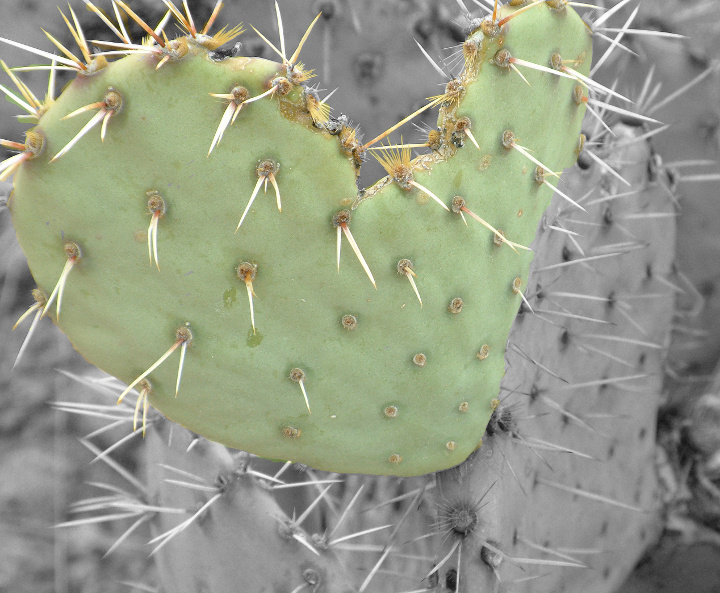
top lef spike ... you can clearly see there that wrong postprocessing there is green colour to be seen over it . I dont know how where you doing this selective colour but its wrong. and you can clearly see the boundaries of the green heart too.. its nice idea but not very well performed. there is another unidentified line on the left side and the bw conversion is flat. I didnt want to insult you or to be rude, Im just trying to explain you that the initial purpose wasnt achieved ...
have a great day ;)
brano |
|
|
|
03/18/2009 03:07:13 AM |
Originally posted by andrewt:
nice effort at doing the selective desat to highlight the shape. Unfortunately the overall image has an unattractive washed out look.
try bumping up the green slightly, For the B&W portion , play with the contrast and make it look even more out of focus to artificially exaggerate shallow DOF. |
Very helpful i tried that and it made a ton of difference Thank you for your time |
|
|
|
03/18/2009 01:14:17 AM |
Originally posted by zoodiac:
oh no no sorry for three but the bw conversion is totally flat and the selective colours didnt help it rather unlucky combination btw, is badly cropped too , coz you cant see the whole thing from the left and top
just the idea is nice
okay Ive changed it to one... the post processing is terrible sorry...
good luck though and take care ;)
brano |
Worthless bit of input. |
|
|
|
03/18/2009 01:11:18 AM |
Thank you most of you for the constructive input and i tried it and it works looks much better
here is my edit after your input
 |
|
Comments Made During the Challenge  |
|
|
03/17/2009 08:42:55 PM |
| Interesting shapes and patterns. Nicely done. |
|
|
|
03/17/2009 08:32:13 PM |
| Sharp. Color combo is interesting. |
|
|
|
03/17/2009 02:33:01 PM |
| Interesting... Not sure if want to hold it... it may hurt :) |
|
|
|
03/17/2009 11:53:03 AM |
|
|
|
03/17/2009 11:29:50 AM |
| Cactus heart, cool use of selective desat. |
|
|
|
03/17/2009 07:28:45 AM |
oh no no sorry for three but the bw conversion is totally flat and the selective colours didnt help it rather unlucky combination btw, is badly cropped too , coz you cant see the whole thing from the left and top
just the idea is nice
okay Ive changed it to one... the post processing is terrible sorry...
good luck though and take care ;)
brano |
|
|
|
03/16/2009 02:29:49 PM |
| Good unique shot. Good color. |
|
|
|
03/16/2009 07:05:27 AM |
| Cute heart, nice use of selective desat. |
|
|
|
03/16/2009 02:54:13 AM |
| kinda flat not a lot of color maybe you could have boosted that in PP |
|
 Photographer found comment helpful. Photographer found comment helpful. |
|
|
03/16/2009 12:46:27 AM |
| Okay, I grew up in a place where this was a noxious weed. It's a technically okay photo but I can't work up much enthusiasm for it. |
|
|
|
03/16/2009 12:43:10 AM |
| Good take on this prickly subject! |
|
|
|
03/15/2009 09:41:02 PM |
nice effort at doing the selective desat to highlight the shape. Unfortunately the overall image has an unattractive washed out look.
try bumping up the green slightly, For the B&W portion , play with the contrast and make it look even more out of focus to artificially exaggerate shallow DOF. |
|
| Photographer found comment helpful. |
|
|
03/15/2009 10:33:58 AM |
| good idea, I might have added a little saturation to the color though, jmo |
|
| Photographer found comment helpful. |
|
|
03/15/2009 05:45:30 AM |
| nice part desat - great focus - wish a little more intense color |
|
| Photographer found comment helpful. |
|
|
03/14/2009 05:52:38 PM |
| Cute shape you found. I think a bit more contrast might work. |
|
| Photographer found comment helpful. |
|
|
03/14/2009 04:01:35 PM |
| interesting shapes in nature |
|
|
|
03/14/2009 03:07:52 PM |
| I like the selective color desat but feel the contrast could also been stronger |
|
| Photographer found comment helpful. |
|
|
03/14/2009 11:36:50 AM |
| What a great find. I think if you booster the colour a bit, this would really "pop". |
|
| Photographer found comment helpful. |
|
|
03/14/2009 11:25:00 AM |
| I ain't hold'n that...but it is a wonderful edit, crisp focus...just different |
|
|
|
03/14/2009 08:32:12 AM |
| This is one to think about! Nice heart and I like the title! |
|
|
|
03/13/2009 11:25:16 PM |
| Selective desat hasn't added much, composition seems wrong - sorry |
|
|
|
03/13/2009 04:54:19 PM |
| Good job with the desaturation. |
|
|
|
03/13/2009 02:59:02 PM |
| Not something I want to hold :-) I like the desat to focus on the heart shape, but I would have liked to have seen that piece a little more saturated. |
|
| Photographer found comment helpful. |
|
|
03/13/2009 01:41:33 PM |
| Nice idea, good sharp focus. |
|
|
|
03/13/2009 01:22:02 PM |
| The photo itself appears to be well taken and a nice close up of the ol' prickly pear, but I'm not a fan of selective desat on the best of days. I realize you did it to emphasize the heart shape, but it just doesn't do it for me. The selection is pretty sloppy as well. |
|
|
|
03/13/2009 12:32:24 PM |
| nice selective desaturation |
|
|
|
03/13/2009 10:38:21 AM |
|
|
|
03/13/2009 09:40:18 AM |
|
|
|
03/12/2009 12:06:50 PM |
| selective desat does not work very well here, the colors look flat |
|
| Photographer found comment helpful. |
|
|
03/12/2009 08:42:14 AM |
| Not liking the tones but the subject is really cool shaped like a heart! |
|
| Photographer found comment helpful. |
|
|
03/11/2009 10:23:19 PM |
|
|
|
03/11/2009 03:59:03 PM |
| Nice selective desat to bring out the hand-heart. nicely accomplished. |
|
|
|
03/11/2009 02:05:28 PM |
| Oh a love cactus, interesting find. |
|
|
|
03/11/2009 11:14:41 AM |
| do not like the selective desat |
|
|
|
03/11/2009 07:36:04 AM |
| Nice use of selective desat but I would have liked the green to have been stronger. The photos perspective is interesting too. Best of luck. |
|
| Photographer found comment helpful. |
|
|
03/11/2009 04:30:52 AM |
|
|
|
03/11/2009 02:42:23 AM |
| not digging the slective desat does nothing for this shot |
|
Home -
Challenges -
Community -
League -
Photos -
Cameras -
Lenses -
Learn -
Help -
Terms of Use -
Privacy -
Top ^
DPChallenge, and website content and design, Copyright © 2001-2025 Challenging Technologies, LLC.
All digital photo copyrights belong to the photographers and may not be used without permission.
Current Server Time: 03/12/2025 03:05:03 PM EDT.