| Author | Thread |
Comments Made During the Challenge  |
|
|
05/23/2004 04:15:55 PM |
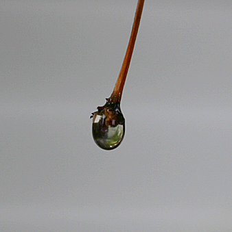
It's centered so it fits the theme. And plain background futher calls attention to
the drop. Good Macro shot, but not the best. I give it a 7. |
|
|
|
05/18/2004 10:40:12 AM |
| It's a nice idea, but there just isn't enough to hold interest. The background seems a little dull, maybe if it were brighter or a different color that could really catch the eye and draw you in. |
|
|
|
05/18/2004 04:22:48 AM |
| Small image, and even then appears to lack detail and clarity. Appears focussed, but nevertheless has an impression of not being in focus. 4 |
|
|
|
05/17/2004 10:37:35 PM |
| Cool shot but it would present much better if you sized it up to 640X640 also you could adjust the Levels to brighten up the gray background. |
|
|
|
05/17/2004 09:12:06 AM |
| Seems like a focus / sharness problem. Could use some more lighting as well to bring out more detail in the subject. |
|
|
|
05/17/2004 12:35:31 AM |
| Very nice, I wish I could see a tad more detail in the drop and then again, I find it interesting that I can almost make something out in the drop but the background is solid. May instead of removing the background I might have gaussian blurred it severly. Still a very good. |
|
 Photographer found comment helpful. Photographer found comment helpful. |
Home -
Challenges -
Community -
League -
Photos -
Cameras -
Lenses -
Learn -
Help -
Terms of Use -
Privacy -
Top ^
DPChallenge, and website content and design, Copyright © 2001-2025 Challenging Technologies, LLC.
All digital photo copyrights belong to the photographers and may not be used without permission.
Current Server Time: 03/15/2025 06:28:10 PM EDT.