| Author | Thread |
Comments Made During the Challenge  |
|
|
05/25/2004 09:27:26 PM |
Composition: Subject Placement, Cropping, Background (20% Weight): 5
Technical: Focus, Exposure, Lighting, Processing (20% Weight): 4
Appeal: Is it Interesting, Motivating, Etc. (30% Weight): 3
How well does it meet the challenge (30% Weight): 8
Total Rating (Rounded) 5
|
|
 Photographer found comment helpful. Photographer found comment helpful. |
|
|
05/24/2004 02:48:30 PM |
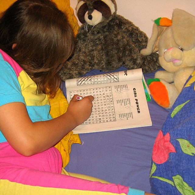
| sorry dude, thats a wordsearch. |
|
| Photographer found comment helpful. |
|
|
05/23/2004 04:02:14 PM |
| You're likely to get a lot of these comments over and over, but here it comes again... That's a word search, not a crossword. The blandest aspect of the shot is you subject, and your viewer is being pelted with some of the harshest colors availible. And the shot as a whole comes across as a "snapshot" rather than a composed piece. But you did manage to capture an action, which is what a habit is, unlike a lot of the other entrants here, so I feel that I should mark up for that. |
|
| Photographer found comment helpful. |
|
|
05/21/2004 11:50:45 AM |
This is a visually cluttered snap shot.
By cluttered I mean there are too many colors and patterns that don't harmonize well. For instance, the blue flowered comforter adds absolutely nothing of visual interest to this shot. Nor does that yellow jacket or shirt she is laying on that also seems to be showing up behind her head. The lighting is flat and uninteresting.
You can't see the subject's face which may have helped a little toward making it more appealing as a snap shot. Unfortunately, it's not even a good snap shot. Sorry. |
|
| Photographer found comment helpful. |
|
|
05/21/2004 11:29:30 AM |
| AH - an original take on the challenge. Nicly composed and exposed. Model shows great concentration. Not sure I like the furry animal and light-colored pillow behind her head. And a real minor point - it's not a cross-word puzzle. |
|
| Photographer found comment helpful. |
|
|
05/21/2004 07:41:27 AM |
| Not being able to see the girl's face seems awkward for a main subject. An engrossed expression would have really helped the image to be more engaging. There is also a slightly washed out quality to the image, although I'm not exactly sure what the fix would be. |
|
|
|
05/19/2004 09:35:17 PM |
| Great idea but I think that it could be better composed.. |
|
| Photographer found comment helpful. |
|
|
05/19/2004 07:53:50 PM |
| too much stuff is in this picture... and the colors are too out there |
|
| Photographer found comment helpful. |
|
|
05/19/2004 08:07:30 AM |
| Cool idea. I like the vibrant colors. I'd work on the lighting (too harsh) and the framing (maybe something closer up would work better). Good job... |
|
| Photographer found comment helpful. |
Home -
Challenges -
Community -
League -
Photos -
Cameras -
Lenses -
Learn -
Help -
Terms of Use -
Privacy -
Top ^
DPChallenge, and website content and design, Copyright © 2001-2025 Challenging Technologies, LLC.
All digital photo copyrights belong to the photographers and may not be used without permission.
Current Server Time: 03/12/2025 07:41:44 PM EDT.