| Author | Thread |
Comments Made During the Challenge  |
|
|
04/14/2002 08:20:00 PM |
| un-interesting, carpet detracts from image |
|
|
|
04/13/2002 10:34:00 PM |
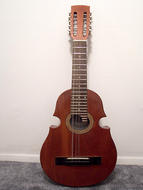
| Sorry... by the time i get to the third or fourth musical instrument, they lose their appeal. |
|
|
|
04/13/2002 02:25:00 PM |
| The colors are too washed out. |
|
|
|
04/13/2002 01:44:00 AM |
| Angle is just too simple. There's nothing interesting about this picture. |
|
|
|
04/12/2002 06:58:00 PM |
| This might have been a bit better if the frame was cropped in tighter against the portion of the guitar with curves, maybe even taking a different angle than head on (maybe from below and to the right) |
|
|
|
04/12/2002 02:50:00 PM |
| A different angle that utilized the shadows would have made this a little more effective. |
|
|
|
04/10/2002 03:40:00 PM |
| Don't just show us a guitar, show your original vision. |
|
|
|
04/10/2002 12:17:00 PM |
| the wall is not perfectly square with the camera, and it detracts from what could be a very nice formal presentation. I would also try moving the guitar away from the bottom edge of the picture just a bit. the lighting could be made more dramatic if it weren't directly above the guitar, but hit it at a 45 degree angle so it cast a shadow on the wall. |
|
|
|
04/10/2002 11:20:00 AM |
| Is this the Puerto Rico " Cuatro " ??? This is one of my favorite instruments. I have a friend that plays the cuatro here in Orlando. |
|
|
|
04/10/2002 03:11:00 AM |
| Perhaps a more interesting angle would have emphasized the curvature and shape of the instrument |
|
|
|
04/09/2002 08:48:00 PM |
| too plain. look at some of the other close ups of items like this for some really great ideas. |
|
|
|
04/09/2002 05:28:00 PM |
| Beautiful instrument crying out for better setting up - needs lighting also to bring out its shape - has no impact full face on. If it had been leant at 50% against the wall then lit from one side and pic taken from other it would have been better instead of just a record shot. |
|
|
|
04/09/2002 01:08:00 PM |
|
|
|
04/09/2002 11:39:00 AM |
| see some of the other guitar photos in this challenge for ideas on how you could have made this more interesting: shadowy lighting, different angles, crops of select parts of the guit, etc. |
|
|
|
04/09/2002 11:36:00 AM |
| Great guitar to shoot,... try some diffenent angles and lighting to make it more exciting. |
|
|
|
04/09/2002 07:16:00 AM |
This subject matter has the potential of making a nice picture. Try adding some different lighting, or perhaps a different angle to make the picture much more interesting.
|
|
|
|
04/09/2002 03:00:00 AM |
| The angle of the shot is pretty boring. It would have been nicer had you found a way to emphasize the curves with a different angle. |
|
|
|
04/08/2002 09:14:00 PM |
| I would have tried to get in a little tighter on this shot. It's in good focus but there is not a whole lot there. Maybe try it from a different perspective. |
|
|
|
04/08/2002 04:31:00 PM |
| this looks like a shot you might have taken to sell this on ebay. nice snapshot, but not really anything to it. |
|
|
|
04/08/2002 04:27:00 PM |
| The lighting needs to be adjusted to pick up the lower, more curved body of the guitar, rather than emphasising the metallic frets against the neck. |
|
|
|
04/08/2002 01:26:00 PM |
| A better background may help. |
|
|
|
04/08/2002 12:48:00 PM |
| Interesting photo... I believe that you have a glare in the upper portion of the photo... If you had shot this from a little different angle, it would have taken care of the glare, introduced some more depth to the photo and accented the indentions in the side of the instrument, adding some more 'curve' to your work :) |
|
|
|
04/08/2002 12:36:00 PM |
|
|
|
04/08/2002 09:59:00 AM |
| You could have used different lighting to make the picture better. dont get me wrong, it is a good pic. |
|
|
|
04/08/2002 09:48:00 AM |
| bit too 'documentary' Need to consider just a part of the guitar and needs more interesting lighting |
|
|
|
04/08/2002 06:56:00 AM |
did you also use this picture to sell this thing on ebay?
Cripes. Yawn. |
|
|
|
04/08/2002 01:13:00 AM |
|
|
|
04/08/2002 12:48:00 AM |
| Needs some very judicious cropping, and a much better setting than carpet. |
|
Home -
Challenges -
Community -
League -
Photos -
Cameras -
Lenses -
Learn -
Help -
Terms of Use -
Privacy -
Top ^
DPChallenge, and website content and design, Copyright © 2001-2025 Challenging Technologies, LLC.
All digital photo copyrights belong to the photographers and may not be used without permission.
Current Server Time: 03/12/2025 05:26:04 PM EDT.