| Author | Thread |
|
|
06/01/2009 07:26:04 AM |
| Congrats Kelli! Love this! |
|
 Photographer found comment helpful. Photographer found comment helpful. |
Comments Made During the Challenge  |
|
|
05/31/2009 04:44:15 PM |
| WOW! It's Intimidator! Great work! :) |
|
| Photographer found comment helpful. |
|
|
05/31/2009 03:11:52 PM |
|
| Photographer found comment helpful. |
|
|
05/30/2009 02:04:40 PM |
| A different background for sure would improve this shot a lot! |
|
| Photographer found comment helpful. |
|
|
05/30/2009 01:19:55 PM |
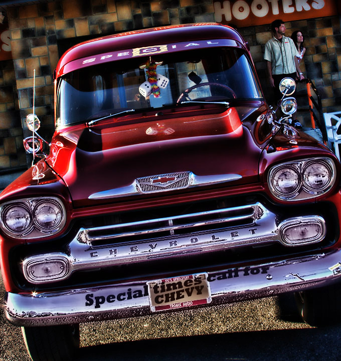
| Nice shine on this old truck, well done |
|
| Photographer found comment helpful. |
|
|
05/30/2009 11:45:22 AM |
| well taken and well processed. |
|
| Photographer found comment helpful. |
|
|
05/29/2009 12:55:02 PM |
| am I the only one getting HDR tone mapping fatigue here? but on this it really works. nice job. license plate frame clone out would have helped. 8. |
|
| Photographer found comment helpful. |
|
|
05/28/2009 10:49:07 PM |
| An interesting angle of this photo, which I am not sure it works. It helps add interest, but is seems awkward as well. Cropping out the edges of things (the left headlight surround, the right bumper) doesn't work for me and gives an incomplete feel. |
|
| Photographer found comment helpful. |
|
|
05/28/2009 02:23:03 PM |
| Do you have one I can buy? Brilliant picture. |
|
| Photographer found comment helpful. |
|
|
05/27/2009 01:58:54 PM |
| classic all the way through..but wondering if hooters was around then? still, love the look of this.. |
|
| Photographer found comment helpful. |
|
|
05/27/2009 06:32:57 AM |
This was the first one up on my screen when I came to voting and what a great one to start with!
Great shot with beautiful colours! I like everything about this apart from the slight darkening across the top left hand side, and while I know that's just the pattern on the wall, it takes away from the overall picture for me (yep, call me fussy!).
I can't actually tell if the text along the front bumper is something you added in photoshop or something that's physically on the car, I'm leaning towards the latter as it's not completely straight towards the end but I might be wrong.
I think you might lose some points on this for cutting out the left and right sides, but I like it, I think it suits the style of shot!
Overall, 9 from me. |
|
| Photographer found comment helpful. |
|
|
05/26/2009 01:20:55 PM |
i really like the shiny and high contrast treatment here - very glossy and dramatic - the couple in the upper right is a nice touch
i wonder if white text at the bottom instead of the black text on the bumper would have even worked better... |
|
| Photographer found comment helpful. |
|
|
05/26/2009 11:39:48 AM |
| great headlights. Special times at hooters?-7 |
|
| Photographer found comment helpful. |
|
|
05/25/2009 08:40:10 AM |
| I really like the graphic sense of color. The slight tilt is great. That cherry red is to die for. |
|
| Photographer found comment helpful. |
Home -
Challenges -
Community -
League -
Photos -
Cameras -
Lenses -
Learn -
Help -
Terms of Use -
Privacy -
Top ^
DPChallenge, and website content and design, Copyright © 2001-2025 Challenging Technologies, LLC.
All digital photo copyrights belong to the photographers and may not be used without permission.
Current Server Time: 04/02/2025 06:18:40 PM EDT.