| Author | Thread |
Comments Made During the Challenge  |
|
|
11/17/2002 08:58:00 PM |
| Great concept, a little over exposed for my taste, I�d love to see this with some rich color. � good luck, Gotcha |
|
|
|
11/16/2002 02:30:00 PM |
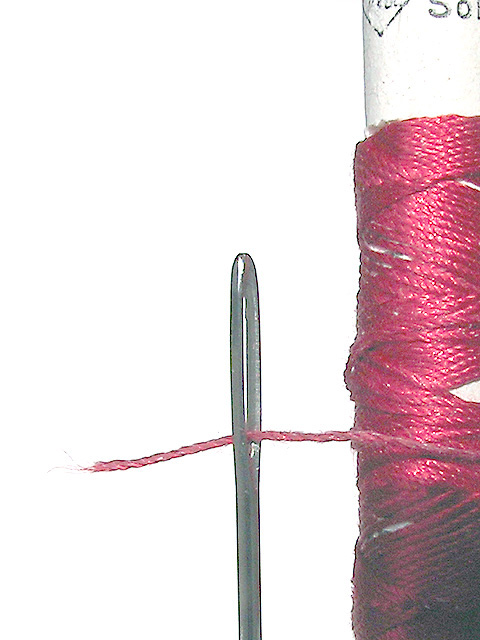
| funny, the all-white background makes it look just a little fake, does something funny to the edges of the objects. real nice though, seven for you. |
|
|
|
11/15/2002 02:22:00 AM |
| feels like it could use some Curves work... |
|
|
|
11/14/2002 08:56:00 AM |
|
|
|
11/14/2002 07:30:00 AM |
| Nice shot, but overexposed. |
|
|
|
11/13/2002 06:03:00 PM |
|
|
|
11/13/2002 05:53:00 PM |
| something is a little off here. the edges of the needle oversharpened, maybe? I'd love to have seen the color a little crisper too, but the composition is excellent. 6 kathleenm |
|
|
|
11/13/2002 03:56:00 PM |
| Great shot, but it's too bright. 7 |
|
|
|
11/13/2002 01:43:00 AM |
| Good shot but too out of balance, lopsided - in my opinion. Not eye appealing to me. Technically decent shot. 5 for that. PTL |
|
|
|
11/13/2002 12:15:00 AM |
| just a tad washed out for my tasted. Very unique subject matter. |
|
|
|
11/13/2002 12:04:00 AM |
| Odd lighting, could use some "levels" work. |
|
|
|
11/12/2002 07:21:00 PM |
| nicedetail, sharpness, etc. But flawed in the contast/levels somehow. No black? |
|
|
|
11/12/2002 04:23:00 PM |
| whoa, nice detail, wish the color was better. |
|
|
|
11/11/2002 10:25:00 PM |
| This has huge potential, it is in desperate of contrast. I think you got something here. |
|
|
|
11/11/2002 09:55:00 PM |
| unfortunately quite a bit over exposed, otherwise excellent |
|
|
|
11/11/2002 07:51:00 PM |
| I'm wondering if you tweaked the brightness just a little too much? Otherwise an interesting shot, good use of colour, and good focus. |
|
|
|
11/11/2002 07:40:00 PM |
| Nice idea, but seems washed out and oddly flattened. |
|
|
|
11/11/2002 03:16:00 PM |
| cool shot, its a bit blurry and blown out. |
|
|
|
11/11/2002 02:39:00 PM |
| I think this would have been much better without the editing. Nice idea and sharp. |
|
|
|
11/11/2002 01:12:00 PM |
| I like this very much, however, the dullnes of color takes away from a great shot. I am sure that was purposeful, but I would like to see the "before". |
|
|
|
11/11/2002 10:01:00 AM |
| great idea.. too bad for the overex... 6 |
|
|
|
11/11/2002 08:31:00 AM |
| Eityher overexposed or over brightened, nasty fringing on the corron reel. Could have had a better crop, there is too much white space to the left and top of the frame |
|
|
|
11/11/2002 08:15:00 AM |
| the brightness lets this otherwise great picture down.. everything seems a little too washed out.. |
|
|
|
11/11/2002 07:00:00 AM |
| What is the reason for being able to see the pixels around the perimeter of the needle? |
|
|
|
11/11/2002 05:05:00 AM |
| Looks too bright. I guess that you increased the brightness in order to make the background as white as possible but I feel that this has affected the subject too much. |
|
|
|
11/11/2002 04:56:00 AM |
| Something is not right with this photo, and it might be on purpose that way. The color of the needle looks like the color of bare steel. It looks like it's been oversharpened and is quite grainy. Unfortunate really, it was a great idea. - Inspzil |
|
|
|
11/11/2002 01:18:00 AM |
| The colors seem a bit muted. Maybe brightened a tad too much? Overall though, the angle and framing/cropping are nice, and the focus seems good. Definately a close up. Maybe would have liked to see it toned down just a bit. Good luck in the challenge. ~Hbunch7187~ |
|
Home -
Challenges -
Community -
League -
Photos -
Cameras -
Lenses -
Learn -
Help -
Terms of Use -
Privacy -
Top ^
DPChallenge, and website content and design, Copyright © 2001-2025 Challenging Technologies, LLC.
All digital photo copyrights belong to the photographers and may not be used without permission.
Current Server Time: 03/12/2025 06:17:16 PM EDT.