| Author | Thread |
|
|
11/01/2009 11:29:07 AM |
Originally posted by snaffles:
Frankly I thought Phantom looked cut-and-paste and posed. |
but but but ... that's what's so cool about it!! |
|
 Photographer found comment helpful. Photographer found comment helpful. |
|
|
10/29/2009 09:42:54 PM |
Greetings from the Critique Club!
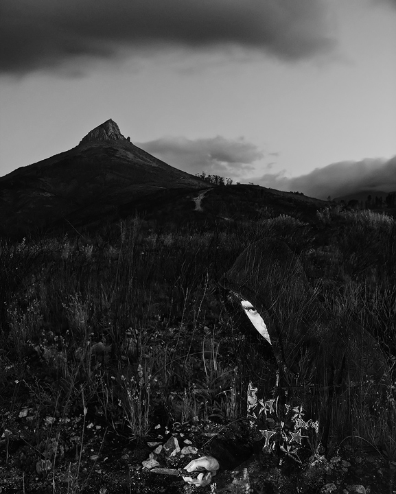
Initial impression: Menacing b/w of the hills and sky behind, which only seems to play up the lack of similar varied tones in the Phantom. Had to look for the blade.
Technical: Great light, good use of thirds, nice dof...though a 30-second exposure seems a little long! I think that a lesser exposure, esp with the phantom in the pic, would have resulted in a more multi-tonal and powerful image.
Aristic: Frankly I thought Phantom looked cut-and-paste and posed. However you placed in the top 20 in this challenge, so can't argue with that :-)
Overall: Great concept, I just feel execution could have been a little stronger to make the phantom more menacing. good work!
Feel free to PM me with any questions,
Susan |
|
| Photographer found comment helpful. |
Comments Made During the Challenge  |
|
|
10/25/2009 11:19:22 PM |
| good concept here the ghost image works well with B&W using rule of the third and having the mountain in the background well done |
|
| Photographer found comment helpful. |
|
|
10/25/2009 11:13:36 PM |
| this is wonderful - is my favorite |
|
| Photographer found comment helpful. |
|
|
10/25/2009 10:35:32 PM |
|
| Photographer found comment helpful. |
|
|
10/25/2009 09:53:47 PM |
| Love how your guy looks like an opaque overlay. Making him blend in like that adds to the mystery of the scene. I think you could have gotten away without keeping all the extra sky on top. Clever shot. |
|
| Photographer found comment helpful. |
|
|
10/23/2009 12:58:34 PM |
|
| Photographer found comment helpful. |
|
|
10/21/2009 01:52:01 PM |
|
| Photographer found comment helpful. |
|
|
10/21/2009 10:32:12 AM |
|
| Photographer found comment helpful. |
|
|
10/19/2009 08:25:10 PM |
| Very creative, I love it. I like the ghostly appearance of the subject, keep up the awesome work. |
|
| Photographer found comment helpful. |
|
|
10/19/2009 07:16:02 PM |
|
| Photographer found comment helpful. |
|
|
10/19/2009 06:44:56 PM |
| Great effect. Works good for a poster. |
|
| Photographer found comment helpful. |
|
|
10/19/2009 06:24:01 PM |
| Oooh, neat! It took me a minute to see the person... all I saw at first was his hand. |
|
| Photographer found comment helpful. |
|
|
10/19/2009 05:59:26 PM |
Took me a while to see what I was looking at! Very well executed!
Good title - very, very good image match. I like the space at the top and the whole thing has a very effective movie-poster feel. |
|
| Photographer found comment helpful. |
|
|
10/19/2009 04:22:18 PM |
|
| Photographer found comment helpful. |
|
|
10/19/2009 09:02:38 AM |
| Oh!! I had to study this one to get it "right." Good going. |
|
| Photographer found comment helpful. |
|
|
10/19/2009 08:42:21 AM |
| FANTASTIC. Ribbon winner. |
|
| Photographer found comment helpful. |
|
|
10/19/2009 01:26:44 AM |
| don't know how you achieved this within the rules... |
|
| Photographer found comment helpful. |
|
|
10/19/2009 01:06:31 AM |
| Whoa, outstanding camouflage. Double-take city! Feels more like a real movie title than most, as well. Good luck! |
|
| Photographer found comment helpful. |
Home -
Challenges -
Community -
League -
Photos -
Cameras -
Lenses -
Learn -
Help -
Terms of Use -
Privacy -
Top ^
DPChallenge, and website content and design, Copyright © 2001-2025 Challenging Technologies, LLC.
All digital photo copyrights belong to the photographers and may not be used without permission.
Current Server Time: 03/12/2025 01:40:06 AM EDT.