| Author | Thread |
|
|
12/22/2009 04:02:50 AM |
Hello! You have requested a comment from the critique club:
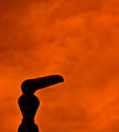
First Impression/Opinion: there is a lot going on here. my eyes are kind of drawn all over the place. The lens flare is also not helping you in this image. I think if you were able to zoom in on just the two main statues it would have improved your image drastically.
Composition: A tighter crop would have helped draw the viewers eyes to the main subjects (statues). i think maybe even a horizontal shot may have helped also to draw the attention right where is should be, because i find myself looking at the lower half of the shot which has nothing really visually appealing.
Post Processing: If it were my image i would have added a lot more emphasis on the sky! those clouds have a lot of potential to be breathtaking! A black and white version of this may have been interesting to see as well.
Challenge Criteria: fits the challenge.
My Vote: I gave this image a 6 during voting
Good luck on your future challenges! |
|
 Photographer found comment helpful. Photographer found comment helpful. |
Comments Made During the Challenge  |
|
|
12/15/2009 05:57:33 PM |
| very flat (no contrast), the composition is a bit weak |
|
| Photographer found comment helpful. |
|
|
12/15/2009 01:01:08 AM |
| Image meets challenge but washed out. Try place your hand or a newspaper, hat, something over the lens to reduce flare. |
|
| Photographer found comment helpful. |
|
|
12/13/2009 02:49:43 PM |
| Very strong, dramatic image. I love the composition. |
|
| Photographer found comment helpful. |
|
|
12/09/2009 04:44:29 PM |
|
Home -
Challenges -
Community -
League -
Photos -
Cameras -
Lenses -
Learn -
Help -
Terms of Use -
Privacy -
Top ^
DPChallenge, and website content and design, Copyright © 2001-2025 Challenging Technologies, LLC.
All digital photo copyrights belong to the photographers and may not be used without permission.
Current Server Time: 03/12/2025 07:50:42 AM EDT.