| Author | Thread |
|
|
07/07/2004 04:29:19 PM |
from the critique club:
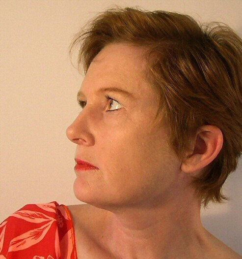
First: the composition is strong excepting the ambiguity of the angle. Just a little more to the right to concentrate on the profile. The lighting is very nice and gentle and suiting the pensive mood you are portraying. Minor improvements include asking the model to wet lips just before shooting. Personally, I would have requested a slight curl of the slip to suggest an incipient smile. Not complete, not halfway. The very start. However, this would make it a different portrait. Placing subject just further from background would have also elimitated the shadow detail at bottom of head. Since you cropped a part of the head, the eye will linger at the visible part.
The major fault with this image is its color balance. Whenever a portrait is done you will find color differences between face and neck and shoulders and arms. The best advise I can give is to opt for a slight desaturation and make certain you have a white balance reference. For example, the red and yellow have crept into the eyes. This is more prevalent when the shot is done with incandescent light.
Since this is your first attempt, rest assured that you did very well for you managed to introduce character and the idea for the angle was good. |
|
 Photographer found comment helpful. Photographer found comment helpful. |
Comments Made During the Challenge  |
|
|
07/04/2004 12:36:48 PM |
Very nicely composed and light. Love the tonality here. Your choice of background goes very well with her skin tones. THe only thing that I find distracting is her pose. The fact that you can barely see her right eye makes this shot seem off somehow. I think it would benefit from either full profile (only seeing one eye) or even better a three quarters profile (almost like you have here, but you can see both eyes.)
TC |
|
| Photographer found comment helpful. |
|
|
07/03/2004 01:08:20 PM |
| I'm not sure I understand the reason for the rather unusual profile composition. Exposure, detail, etc. seem good. |
|
| Photographer found comment helpful. |
|
|
07/03/2004 08:47:52 AM |
| I would have preferred had you not cut off the back of her head. Skin tone appears a bit too orange. I do like the gaze and look of your model. |
|
| Photographer found comment helpful. |
|
|
07/02/2004 11:59:38 AM |
| Good pose, lighting seems to work well; there's just something I can't put my finger on that seems a bit harsh. Perhaps a bit too much warmth or red? I don't know. Excellent focus and detail. :o) |
|
| Photographer found comment helpful. |
|
|
07/01/2004 07:30:49 PM |
| Just a little too grainy. Great pose, and expression. |
|
| Photographer found comment helpful. |
|
|
07/01/2004 05:41:31 PM |
| Good strong face on your subject! I think this could be improved in the pose in one of two ways: 1. have the subject look more toward the camera so the eye can be enjoyed or 2. turn the head a bit farther away so it becomes a true profile. The lighting is even without being flat and seems to do its proper job of flattering the subject. |
|
| Photographer found comment helpful. |
|
|
07/01/2004 06:32:13 AM |
Lighting: Lighting is well balanced, with a nice catchlight. But there seems to be a bit of a color-cast to the image as a whole, and the harshness of the lighting is not flattering her skin tone. Judging from the contrast and the well-defined shadow on the background, the portrait would have benefitted from the use of something to diffuse the light more.
Pose: Having her look up is good as it flatters the face and neck. However, with the raised head, the shot should be taken from above her level with her head tilted toward you (revealing both eyes) instead of away. Also, lifting the right shoulder gives me a feeling of her pitching backwards, so the left shoulder would have been better.
Background: The background is a nice neutral shade and fits the subject quite well. The only thing I would sugest on this would be to put more distance between the model and the background; this would have reduced or eliminated the shadow behind her.
It is a shame the cropping did not include the back of her head. |
|
| Photographer found comment helpful. |
|
|
06/30/2004 02:24:56 PM |
| the lighting seems too harsh to me |
|
| Photographer found comment helpful. |
|
|
06/30/2004 12:44:27 PM |
| A darker background would be better. |
|
| Photographer found comment helpful. |
|
|
06/30/2004 10:41:16 AM |
She is beautiful! Doesn't look 49!
Critique: To close to the background. Not sure I like the side view. I would really like to see her smile and some eye contact, but that's just me. :-) Great lighting! |
|
| Photographer found comment helpful. |
|
|
06/30/2004 09:14:34 AM |
| The color seems off a bit and she's too lose to the background and causing a shadow on it. I think moving her away a little and having her look more at the camera would have helped. |
|
| Photographer found comment helpful. |
|
|
06/30/2004 06:59:57 AM |
Nice focus and lighting on the model in this portrait. I would have preferred a less neutral colored background, the model's skin almost seems to blend in with it. I feel that posing her with her chin raised very slightly would have given a more flattering line, also maybe having the shoulders a little more level.
Overall though a nice color studio portrait |
|
| Photographer found comment helpful. |
|
|
06/30/2004 02:40:37 AM |
| If this is the age she certainly retains her youth very well, great shot |
|
| Photographer found comment helpful. |
|
|
06/30/2004 02:16:47 AM |
| Nice colors - great model. Not a lot of impact for me though. |
|
| Photographer found comment helpful. |
|
|
06/29/2004 11:15:38 AM |
|
|
|
06/29/2004 05:31:23 AM |
| Can't really tell if the noise is actually noise or if that's the texture of the wall. |
|
|
|
06/29/2004 01:18:45 AM |
| Cropping the back of the subject's head loses the balance in this picture. |
|
| Photographer found comment helpful. |
|
|
06/28/2004 04:56:25 PM |
| Very nice profile portrait. She dissapears a bit in the background. |
|
| Photographer found comment helpful. |
|
|
06/28/2004 04:53:16 PM |
I think if you had turned the models face slightly more towards the camera it would have been a nicer and softer picture. At the moment there is a really harsh line down her nose.
Nice idea though, i do like it
good luck |
|
| Photographer found comment helpful. |
|
|
06/28/2004 04:28:52 PM |
| Quite a nice portrait! I like the drape over the shoulder, it goes well with the lip stick. I think a different color backdrop would have made all the difference in this picture - it is so similar to the skin tone that the person doesn't show up as well as they should. I think if the head were turned slightly more towards the camera so one could see the other eye more would have also made this even better. Or perhaps, a full profile where you couldn't see the other eye at all. However, I think I'd prefer to see more of the other eye. The colors and soft focus are lovely. |
|
| Photographer found comment helpful. |
|
|
06/28/2004 12:55:56 PM |
| Looks more like 35-40 ... |
|
|
|
06/28/2004 10:52:09 AM |
| Two things I see that could of improved this. One the focus is not pin sharp and the blouse/dress on the shoulder. I think with her lovely coloring, a softer color would of been more complimentary to her. Good luck in the challenge. |
|
| Photographer found comment helpful. |
Home -
Challenges -
Community -
League -
Photos -
Cameras -
Lenses -
Learn -
Help -
Terms of Use -
Privacy -
Top ^
DPChallenge, and website content and design, Copyright © 2001-2025 Challenging Technologies, LLC.
All digital photo copyrights belong to the photographers and may not be used without permission.
Current Server Time: 03/15/2025 01:46:16 AM EDT.