| Author | Thread |
Comments Made During the Challenge  |
|
|
07/04/2004 11:47:35 PM |
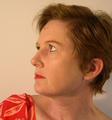
| This is a lovely shot and I like the posing and cropping very much. The lighting seems a bit bright though and the focus, if you were going for a soft focus came out more of a blur to me than soft. A 5 |
|
|
|
07/04/2004 09:54:14 PM |
| Kat, you look wonderful, if the picture was just a tad sharper, you'd look perfect. A big 9 for your score. Nice Job! |
|
|
|
07/04/2004 03:08:39 PM |
A lovely model! Nearly flawless lighting, and classic pose make this a technically superior shot, but it is somehow lacking in something. I think a more creative pose would take this one step beyond. I do think the soft focus is a touch much here.
TC |
|
|
|
07/03/2004 06:40:25 PM |
Lighting: The light is bright enough to keep the image evenly lit; however, even with it being difused, it seems you only had one light source. Several smaller light sources from different angles would have prevented the harshness in her skin tones.
Pose: The pose works, although a more genuine smile would have worked much better.
Background: The background works well with the model. I would suggest putting more distance between the model and the background; which would have virtually eliminated the shadow and blue glow around some of the hair caused by light reflecting back on her from behind. |
|
|
|
07/03/2004 01:56:49 AM |
| Focus seems just a bit short, like the right shoulder is focused but not the face. Shame. It is a really nice photo otherwise. Maybe cropped too close at top. |
|
|
|
07/02/2004 10:18:53 AM |
| This is a nice portrait...she seems a bit close to the background, creating some shadowing/halo looking effect around her shoulders and neck. I understand that you were probably going for a soft focus look, which is great, but it is just a touch too soft for my taste around her eyes, which I think should appear sharper and more detailed. It works well for the rest of the portrait, however. Very good effort. :o) |
|
|
|
07/01/2004 02:20:08 PM |
| Looks like you've achieved the softness effect with a slight out of focus lens, but I think you would have been better off with a lens diffusing filter |
|
|
|
07/01/2004 11:12:10 AM |
| whole shot seems blurry ? |
|
|
|
06/30/2004 10:09:53 PM |
| Model's expressive eyes and mouth capture interest. Do facial and body skin tones mismatch a little? Softness is a little distracting. Would be better if the top of her head were entirely in frame. |
|
|
|
06/30/2004 05:52:19 PM |
| The soft focus blurs too much in my opinion |
|
|
|
06/30/2004 05:31:52 PM |
| Soft focus isn't my personal favorite for portraits, but this is a good shot anyway. It might help the effect a little if the background had little more blur relative to the subject. |
|
|
|
06/30/2004 04:34:46 PM |
| good shot , a little soft |
|
|
|
06/30/2004 12:40:18 PM |
|
|
|
06/30/2004 03:52:40 AM |
| Focus is a bit soft, especially at her eyes. Your background is so close to the subject, I see the shadow and the texture in the drop. |
|
|
|
06/30/2004 02:19:52 AM |
| I'm guessing you wanted this to be soft focus, but it seems to just be blurry. Maybe reading up and experimenting a little more with soft focus could help out. |
|
|
|
06/30/2004 01:55:28 AM |
| Kat is a nice-looking model - shot with a single light (flash?) For a portrait - try to get the eyes in 100% sharp focus. It would also be better if you included all the hair at the top. |
|
|
|
06/29/2004 11:20:09 PM |
| I think you may have been trying for a soft-focus effect, but it just looks out of focus. Check out the 'Soft-Focus' challenge some months ago or search for soft focus in the forums, there are lots of ways to do it and I can certainly see how it might have worked here. Better luck next time! |
|
|
|
06/29/2004 10:51:36 PM |
| Pretty even lighting and minimal shadows give you a good exposure. This seems as though it "can't decide" whether to be sharp or a soft-focus portrait -- it seems kind of in-between without being OOF either ... I also can't tell if your model is relaxed or tense ... |
|
|
|
06/29/2004 10:46:04 PM |
| I think her shoulder is sharper than the rest of her. Lighting seems OK |
|
|
|
06/29/2004 05:25:33 PM |
| The glare on her eyes seems to be a bit distracting. Also photo seems out of focus. |
|
|
|
06/29/2004 02:42:14 PM |
| Seems nothing is in focus and the lipstick is a little bright. She has very pretty eyes. |
|
|
|
06/29/2004 01:34:11 PM |
| I like the look on her face. The focus needs to be onto the eyes. A soft focus works good, but it is throughout the shot and makes it lok blurry. Bringing her away from the wall to about 3 feet or so would eliminate the shadow, too. |
|
|
|
06/29/2004 01:14:54 PM |
| focus is soft, color is great, 6 |
|
|
|
06/29/2004 11:55:07 AM |
| The lighting seems pretty good as does the models pose and expression, but the focus seems a little soft. Which can be a nice effect, but I feel the eyes should always be sharp and in focus. Might also be cropped a little close to the top of the head, just a matter of taste though. Overall, it could be a pretty nice portrait. |
|
|
|
06/29/2004 11:28:55 AM |
This doesn't look like soft focus, it looks like out of focus
put more distance between your subject and the background to prevent shadows like you have, about 2-3 feet should do, also try moving the light more to the camera right and use a second light/or reflector to help reduce shadows |
|
|
|
06/28/2004 10:15:34 PM |
| A nice try at soft focus, but the image seems too soft in some parts, especially around the eyes. I will suggest a good resource if you would like to perfect the technique of softening portraits without losing too much focus: "The Photoshop Book for Digital Photographers" by Scott Kelby. This book has sections on easy to use techniques to produce better portraits. |
|
|
|
06/28/2004 09:58:26 PM |
Shouldn't have cut off the top of the image.
Nice portrait, though. |
|
|
|
06/28/2004 09:02:31 PM |
| Beautiful, but I would have focused a little more sharper. |
|
|
|
06/28/2004 04:59:10 PM |
| a bit out of focus. beautiful "open" look. |
|
|
|
06/28/2004 04:48:12 PM |
| Too bad it isnt in sharper focus! I would have given it a 10 ..... |
|
|
|
06/28/2004 04:42:32 PM |
I think this shot could have benifited from your model being a little futher away from the background
good capture though |
|
|
|
06/28/2004 02:05:55 PM |
| Out of focus. The eyes should be in focus. Also she is too close to the wall/background, makes for harsh distracting shadows. Nice pose though. |
|
|
|
06/28/2004 12:44:09 PM |
| Out of focus and the color on background is not good. try to get the model to stand a few feet away from the background to avoid shadows. |
|
|
|
06/28/2004 12:03:38 PM |
| Love everything but wish the eye where sharp. Too soft but other then that it's a nice entry. Good luck~ |
|
|
|
06/28/2004 08:01:38 AM |
| I like it but the focus is just a little too soft. You have a beautiful model here and I think a sharper focus would have shown her off better. |
|
|
|
06/28/2004 07:19:01 AM |
Is this soft focus or out of focus?
I would like to see more sharpness in her eyes and mouth... |
|
|
|
06/28/2004 01:47:34 AM |
| She's a bit too close to the background. Next time, try having the model stand about a foot away from the background. To avoid the shadows you can direct a seperate light at the background. |
|
Home -
Challenges -
Community -
League -
Photos -
Cameras -
Lenses -
Learn -
Help -
Terms of Use -
Privacy -
Top ^
DPChallenge, and website content and design, Copyright © 2001-2025 Challenging Technologies, LLC.
All digital photo copyrights belong to the photographers and may not be used without permission.
Current Server Time: 03/13/2025 02:30:32 AM EDT.