| Author | Thread |
|
|
12/03/2002 06:19:00 AM |
~~~~Critique Club Comment~~~~
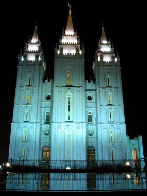
*Composition (content)*
The composition needs some work.
The horizon isn't straight, remember to get a straight horizon when composing the shot or leave room for cropping with post processing. Straighten by arbitrary rotation, either guessing or using a measure tool (Photoshop). It should be a slight bit rotated to the left.
The building looks distorted, like it is falling backwards and like all the walls want to meet at a point in the sky. The fence screems wideangle barrel distortion. It is a result of using a wideangle setting. The solution is to stand back and zoom in, using telephoto from a distance takes away the distortion.
Take a look at this photo: //www.dpchallenge.com/image.asp?IMAGE_ID=3353 to see what I mean.
Contrast between light and dark area's is good.
*Background*
Nothing to say something about. Altough, like you can see on the picture from the link a late evening or early morning sky might be more interesting.
*Camera Work (Technical)*
See other comments.
Focus is good, sharpness a bit on the soft side, aperture choice good.
*Digital Processing (technical)*
I think that the soft I see is because of slight jpeg compression image degradation. Remember to save it as close to 150kb as you can get, it is really important for the fine detail, especially when you portray such a large building in a 640x480 image.
Because of the colors in Patella's image I loaded this picture in Photoshop and did some color corrections. Adding red and yellow, but taking out green gave a much more balanced color and got rid of that blue/green cast. It could very well be that the lights are blue, but I doubt it.
*My opinion*
Reasonable picture of a building if it weren't for the distortion and heavy green/blue cast. |
|
 Photographer found comment helpful. Photographer found comment helpful. |
Comments Made During the Challenge  |
|
|
12/01/2002 06:30:00 AM |
| Very pretty photo. It seems to be leaning to the right though. DPz |
|
| Photographer found comment helpful. |
|
|
11/29/2002 07:30:00 PM |
| Very nice color and subject. Vote 7 Sonifo |
|
| Photographer found comment helpful. |
|
|
11/28/2002 11:35:00 PM |
| Feels slightly unlevel... |
|
| Photographer found comment helpful. |
|
|
11/27/2002 09:14:00 PM |
| niiiiiiice reflection, picked the right time of night, will be watching for how long your exposure was it was just right for the finer details on the church. |
|
| Photographer found comment helpful. |
|
|
11/27/2002 12:32:00 PM |
| A great shot for this title. Just a touch too bright right in the center. 8 nards656 |
|
| Photographer found comment helpful. |
|
|
11/27/2002 10:50:00 AM |
| Hmm..the church is leaning. :-) |
|
| Photographer found comment helpful. |
|
|
11/27/2002 10:32:00 AM |
| The whole picture seems to be leaning right somewhat, but the reflection is excellent. muckpond |
|
| Photographer found comment helpful. |
|
|
11/26/2002 03:42:00 AM |
| Look its the Leaning Church of the Plaza. this really is a good shot. Best one I have seen yet. What is causing the lean effect. |
|
| Photographer found comment helpful. |
|
|
11/25/2002 10:59:00 PM |
a really nice photo, but for me there is no "impact of the moment" as stated in the challenge
~anachronite |
|
| Photographer found comment helpful. |
|
|
11/25/2002 04:13:00 PM |
| Neat shot. Maybe the bottom <fence> could of been cropped out. This is really pretty. SLC? Nice night shot. Justine |
|
| Photographer found comment helpful. |
|
|
11/25/2002 12:08:00 PM |
| A very striking photo but I have no idea what the issue is about-but does it matter with such a beautiful shot andrewm |
|
| Photographer found comment helpful. |
|
|
11/25/2002 11:12:00 AM |
|
| Photographer found comment helpful. |
|
|
11/25/2002 09:00:00 AM |
Composition: Subject Placement, Cropping, Background6,
Technical: Focus, Exposure, Lighting, Processing7,
Appeal: Is it Interesting, Motivating, Etc.? 6,
Total Averaged Rating6. Autool
|
|
| Photographer found comment helpful. |
|
|
11/25/2002 05:58:00 AM |
| beautiful shoot just needed more reflection |
|
|
|
11/25/2002 05:51:00 AM |
| i don't understand your healine but the photo looks good |
|
|
|
11/25/2002 05:23:00 AM |
| I'm not seeing the journalism part. The photo part you have down pat. I figured there would be quite a few stretches in this challenge. Very nice pic - Inspzil |
|
|
|
11/25/2002 01:33:00 AM |
| Beautiful photo, not really front page news, though the title helps it. |
|
| Photographer found comment helpful. |
Home -
Challenges -
Community -
League -
Photos -
Cameras -
Lenses -
Learn -
Help -
Terms of Use -
Privacy -
Top ^
DPChallenge, and website content and design, Copyright © 2001-2025 Challenging Technologies, LLC.
All digital photo copyrights belong to the photographers and may not be used without permission.
Current Server Time: 03/12/2025 08:33:12 PM EDT.