| Author | Thread |
|
|
12/15/2002 03:07:32 PM |
For the Critique Club:
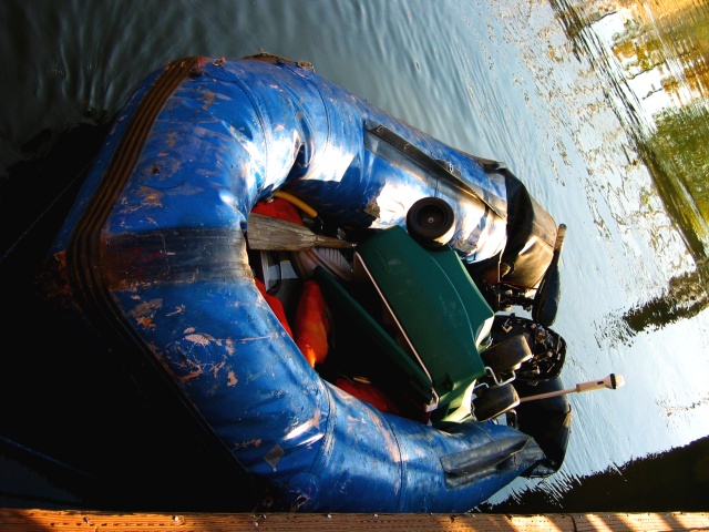
Composition: This is a really challenging angle. One is obliged to assume it was deliberate (the dock at the very bottom is level with the frame), and then one is equally obliged to say that in this reviewer's opinion, it didn't come off. Even turning one's head, it is doesn't work for me as the water is at yet another angle. The shadows in the water are a bonus.
Technical: The photograph is well focused, and the colours are well caught. There are some blown-out areas on the boat which detract, but they were probably impossible to deal with given the range of exposures required across the image.
Challenge: The boat is definitely blue!
Message edited by author 2002-12-15 15:08:21. |
|
Comments Made During the Challenge  |
|
|
12/08/2002 11:26:09 PM |
| i\'m gonna give you an 8 just for daring to use such a drastic angle, and pulling it off. and i like the wood at the bottom. |
|
|
|
12/08/2002 12:20:27 AM |
| Is there a reason you decided to submit this on its side? |
|
|
|
12/07/2002 11:56:52 AM |
| THis isn't the angle I'd expect to see this photo. I think it needs a left rotation. The focus seems ok, but lighting is very harsh. the shadows are too dark, and there are hot bright spots in the raft. definately blue though. Good luck in the challenge. |
|
|
|
12/04/2002 12:32:00 AM |
the angle of the boat makes this pic really hard to look at
~anachronite |
|
|
|
12/03/2002 08:24:00 PM |
| are ya sick of hearing it should be vertical? i like it maybe a bit too much stuff in the boat kind of makes my eye wander |
|
|
|
12/03/2002 04:53:00 PM |
challenge ~ met
composition (content) ~ i'm sure you get asked this a lot, but did you deliberately submit this photo on its side? i'm assuming you did, but i have to admit that i don't quite 'get' why. i guess it's interesting that, even when rotated, the water level is not straight, and significantly not, so i'm sure that wasn't an oversight either.
background ~ like the reflections in the water, as well as the different tonalities of it. would like it to be just a little more exposed in the bottom left, but i suspect that wasn't possible w/out blowing it out in other places.
camera work (technical) ~ good focus and colors.
digital processing (technical) ~ no digital artifacts or anything like that, so you did a good job.
my opinion ~ i'm puzzled (i think that already came through in my comments ;) will check out your comments on monday.
~~ gr8photos
Message edited by author 2002-12-13 16:34:50. |
|
|
|
12/03/2002 12:32:00 AM |
| Strange pic...Looks like it should have been rotated 90 degrees to the left? |
|
|
|
12/02/2002 11:48:00 PM |
I don't really see the benefit of using this horizontal orientation. I makes me have to turn my head, and that is irritating to my neck. I'm assuming you did this by accident and will overlook it, though it is difficult.
This has a lot of potential. I see a well used craft, and nice reflections in water. Certainly meets the challenge. The wood on the bottom which I assume is a dock is a bit distracting. Perhaps showing a little more of it or cropping it out completely would make the composition more cohesive. I really like those reflections and wish there was more of it.
Anyway, best of luck in the composition.
Grayce |
|
|
|
12/02/2002 11:34:00 PM |
| the angle of the photo is too much. |
|
|
|
12/02/2002 10:47:00 PM |
| i think this is horizontal when it is supposed to be vertical...as a result it is hard to vote this one. |
|
|
|
12/02/2002 09:27:00 PM |
| I just don't like the un-natural angle |
|
|
|
12/02/2002 09:06:00 PM |
| Did you forget to rotate this image? Would have been much more pleaseing to the eye if it were vertical. Nice lighting on the boat though! |
|
|
|
12/02/2002 08:05:00 PM |
| I wish you had turned this picture upright. The positioning throws me off. |
|
|
|
12/02/2002 08:00:00 PM |
| Some people just love risk :) I'd like to see the picture in the right angle. I find it a bit disorienting. Jacko |
|
|
|
12/02/2002 12:21:00 PM |
| HARD FOR ME TO LOOK AT...MAYBE IF IT WAS FLIPPED |
|
|
|
12/02/2002 11:33:00 AM |
| The angle of the picture is a bit distracing. I think, maybe, if you posted the picture in portrait mode instead of landscape mode, it would all come together better. |
|
|
|
12/02/2002 11:27:00 AM |
| I don't care for the angle this was taken at... it bothers me to look at it this way. Also the hotspots, and the very bright right side of the photo are distracting. Too busy in my opinion... you could have tried getting down and shooting the front of the boat? |
|
|
|
12/02/2002 09:42:00 AM |
| Good photo but don't like the angle |
|
|
|
12/02/2002 09:08:00 AM |
| the angle's really interesting in this one. I was confused for a second |
|
|
|
12/02/2002 02:08:00 AM |
| I don't like the rotation of the canvas on this picture. it looks too weird. |
|
|
|
12/02/2002 01:45:00 AM |
| Hmm...wish you would have rotated this first. byetko. |
|
|
|
12/02/2002 12:46:00 AM |
| I hate to be Critical but this is not pleasing to the eye. |
|
|
|
12/02/2002 12:41:00 AM |
| would have been GREAT if it was rotated. |
|
|
|
12/02/2002 12:30:00 AM |
ooohhh. please rotate your photo before submission when you have a vertical shot.
in an attempt to view it sideways, I can also see that the horizon is slanted... that could be fixed easily too. the perspective on the boat is average.. perhaps next time shoot from a bit lower angle. love the worn area of the boat.. this would've been interesting to frame in a shot by itself excluding the rest of the clutter of the shot including the contents of the boat, and may have made a nice abstract... This is the first thing my eye lands on, so I would say it is the best aspect of the subject, and thus should get more attention. :0) |
|
Home -
Challenges -
Community -
League -
Photos -
Cameras -
Lenses -
Learn -
Help -
Terms of Use -
Privacy -
Top ^
DPChallenge, and website content and design, Copyright © 2001-2025 Challenging Technologies, LLC.
All digital photo copyrights belong to the photographers and may not be used without permission.
Current Server Time: 03/14/2025 03:37:18 PM EDT.