| Author | Thread |
|
|
12/09/2002 07:17:27 PM |
thank you for the critique, Azrifel. I was not using a tripod, and the wind was blowing, as well as the light was obstructed, so I had to use a large apeture, so that the flower did not blur, as well as bring the subject out, but which i think is a bit exagerated now... i appreciate your critique.
Thanks,
Chris |
|
|
|
12/09/2002 02:36:53 PM |
~~~~Critique Club Comment~~~~
Composition (content)
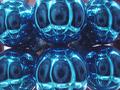
The flower fills the frame well, altough I wonder what it will look like when it is shot even more from the side. The blue stands out against the green/yellow/white background (good and meets the challenge). I guess those colored patches are other flowers.
Was it on a tripod? The stem and leave suggest a small bit of camera shake or wind (a tripod would not be of any help there, only faster shutters). It could be that it is enhanced by the rather high compression.
The focus is on the top flower and it is well in focus. You complained in the forums about the comments regarding the focus and dof. I will repeat what I said there: I think that the commenters ment that a slightly smaller aperture (F2.8-F4) would have brought more of the flower in the field of focus, only an inch more or so, to make a stronger impact on the viewer, without sacrificing your blurred stem, leave and background. The eye is drawn to the single bit in the frame that is really sharp, while the rest is blurred and therefore uninteresting.
Background
The soft colored blurred background gives a natural feel about the surroundings of your subject. It is easy on the eyes and does not draw the attention away from your subject.
The various blobs of color are nice, as they suggest that there are other flowers there and give variation. When you don't like the white on the left, include more of the blue, yellow and purple on the right.
Camera Work (Technical)
Focus and exposure are good.
Digital Processing (technical)
I notice that your picture is only 33kb in size. The limit is 150kb.
Submit a picture of a higher jpeg quality next time, get as close as possible to 150kb to retain detail sharpness and color consistency.
A higher jpeg quality would possibly have made the edges a bit sharper and would give a more consistent background (When you look in the green in the upper right corner you can see that the jpeg compression square blocks break the color consistency, it is visible as a light corona around the flowers too). It is not wrong as it is, but you want to go for the highest quality I suppose.
My opinion
Nice shot of a flower, but I'd personally like to see a couple of centimeters more field of focus (dof). The background is nice.
Message edited by author 2002-12-09 14:39:58. |
|
Comments Made During the Challenge  |
|
|
12/08/2002 11:52:58 PM |
| I like the DOF. The color is very pretty. Lighting and angle and framing/cropping are good. I wonder how this would look off to one side or the other? Nice job. good luck in the challenge. |
|
|
|
12/08/2002 09:52:59 AM |
Where is the depth of field here?
|
|
|
|
12/07/2002 07:10:13 PM |
| I realize you probably made this out of focus on purpose to emphysize the 5 sided parts of the flower. But there is not enough of the flower in focus. I believe the other would have come thru any way. Background messy. Should have been a clear something hung behind the flower so the flower would stand out and the background would be clear. PTL 2 |
|
|
|
12/06/2002 06:38:52 AM |
|
|
|
12/06/2002 03:29:29 AM |
| Lovely blue. Would have liked more DOF. |
|
|
|
12/05/2002 06:28:57 PM |
|
|
|
12/05/2002 06:02:51 AM |
| Good control of depth of field. Some people will probably complain about the lack of focus, but I like that most of it is blurry except a couple of the pentagon clusters.. |
|
|
|
12/05/2002 02:39:24 AM |
| Very interesting use of dof. I think I'd prefer more, but I understand that it is your artistic decision. The white spot on the left side is a little distracting b/c it is so bright. Better than most. |
|
|
|
12/03/2002 04:30:00 PM |
| Wow, this picture looks familiar :) I like the selective focus, normally I'd aim for a little more focus than such a small area, but having just one flower out of all of them in focus is pretty neat too. An offset composition or perhaps a vertical frame may have suited the picture better. All in all a very nice capture. |
|
|
|
12/03/2002 08:57:00 AM |
|
|
|
12/03/2002 03:24:00 AM |
| a little more depth of field might have helped. the composition is very good as is the lighting. |
|
|
|
12/02/2002 11:53:00 PM |
| glad you submitted this pic, but i still woulda gone with the suggestion to crop differently. as much as i loathe to say this, it's a rule of thirds issue. the shallow dof works, but it is a bit exagerated. but i think it's well worth a 7. |
|
|
|
12/02/2002 11:22:00 PM |
| I wish a bit more was in focus. |
|
|
|
12/02/2002 04:38:00 PM |
| Nice. Extreme shallow DOF would normally bother me, but is surprisingly comfortable here. 8 |
|
|
|
12/02/2002 11:57:00 AM |
| Nice macro... looks like you used the macro setting... I wish a little more was in focus, but thats ok. The part thats in focus is nice and clear. I don't like the fact that it is very centered... but the blue is beautiful, and I like the name. Good job, and good luck! |
|
|
|
12/02/2002 10:17:00 AM |
| Hummmmm where have I see this before. <g> Pretty blue color. I think the shot could of been sharper. The focus is very narrow. Justine |
|
|
|
12/02/2002 02:17:00 AM |
| I think I would have liked to see more of the flower in focus. I absolutely love the blur of hte background though, and the short dof is nice, but a little more in focus would have been good. |
|
|
|
12/02/2002 01:45:00 AM |
| Saw this in the forum earlier and I still like it! Great use of DOF, with only a few bits of the flower in focus! |
|
|
|
12/02/2002 12:58:00 AM |
| I would like to see a little more depth of field which would bring out the beautiful shades of blue. |
|
|
|
12/02/2002 12:27:00 AM |
ahhh you did submit it... I won't count you lower, for one I didn't mind, and 2 you didn't know.... it's a beautiful shot, but my preference would be to have the focused part of the flower to be a larger part of the pic. perhaps crop out more of the back ground? The only problem with that it appears is that to maintain the aspect ratio you would be cropping into the flower... thankfully the new dpc2 will allow different sizes! good luck!
~anachronite |
|
Home -
Challenges -
Community -
League -
Photos -
Cameras -
Lenses -
Learn -
Help -
Terms of Use -
Privacy -
Top ^
DPChallenge, and website content and design, Copyright © 2001-2025 Challenging Technologies, LLC.
All digital photo copyrights belong to the photographers and may not be used without permission.
Current Server Time: 03/12/2025 11:06:18 AM EDT.